Archive | Design Tips RSS feed for this section

The Island – Kitchen Design Trend Here To Stay

More and more the kitchen is the hub of a home. It’s where guests mingle, family meetings are held, and meals are prepared and enjoyed. For this reason, designers are getting back to the basics of functional kitchen design. One element with a perfect mix of form and function is the kitchen island. In fact, according to the National Association of Home Builders (NAHB), islands are one of the most popular kitchen design features among today’s consumers. They claim reports that state approximately 80 of home buyers consider a kitchen island to be a must.

Many of today’s kitchen islands have unique design styles of their own. Most include storage, sinks {prep or main}, appliances and/or seating areas. Kitchen islands can have the same design as the main counter and cabinets or it can have a look all its own.

Here are some examples of great kitchen designs that have an island {or two}:

This beautiful open kitchen by architect, Steve Giannetti features a large island with a sleek custom sink and warm wooden countertop. It is balanced nicely with two large industrial pendants. Gorgeous!

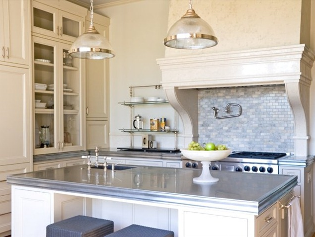
Interior design blog, Things That Inspired recently posted an excellent article on Kitchen Sinks and my heart started racing when I saw this kitchen. Designer and architect, William Hefner created it with a stunning island topped in what is thought to be zinc. I just love how the gray surface plays off the two light pendants, dark gray upholstered stools and White Carrara Marble tiled backsplash. Hefner places a small prep sink in the corner of the island {opposite a main sink on the other side of the room}.

In this white kitchen designed by Mark J. Williams, the pale gray island resembling a table takes center stage. Not only does the island’s paint color differ from the other cabinetry, it’s white marble countertop contrasts with the dark countertop on the cabinets flanking the range. The heavy steel pendant hangs off center over the island and makes me wonder if there is a matching pendant to balance the look not visible in the image. The wooden bench with upholstered seat is my favorite design element in this room. I love how it warms up this otherwise cool space. The image via Traditional Home and photo credit Michael Garland, was first spotted it on Things That Inspire.

In this stunning {and large} kitchen, the dark stained center island stands out from the soft sage green perimeter cabinetry. The slate flooring pulls the color palette together beautifully. The island counter’s rounded edge echos the arch in the hood for the range. Picture via flickr.

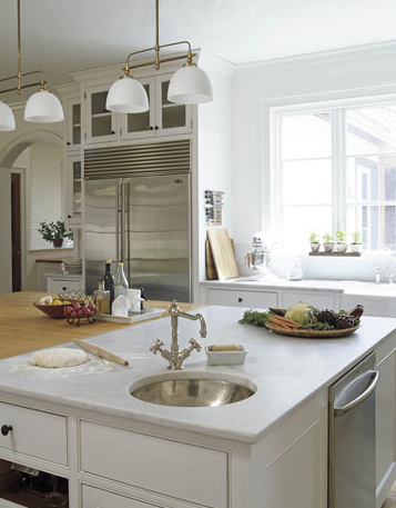
The former editor in chief of Food & Wine magazine, Carole Lalli designed this large island topped with butcher-block and marble in her Connecticut kitchen. Not only does it provide plenty of space for prep cooks, it houses a sink and dishwasher. Love this! Featured in House Beautiful’s January 2008 issue.

Also featured in House Beautiful, Architect Steven Laurin’s design for this kitchen’s island was inspired by a farm table. The dark CaesarStone countertop and warm wood saddle stools contrast beautifully with the white colored island. Designer Meg Braff also balances the island by selecting a large double pendant fixture.

Seeing double? Designer Anne Miller incorporates two islands in her own kitchen design. Coordinating with the room’s other cabinets, both islands are painted white and are topped with white marble. Providing task lighting and a pop of color, Miller hangs two pairs of copper pendants with blue gingham prints above each work area. The islands not only give Miller loads of prep space, but provide seating areas at kitchen dinner parties. Image courtesy of House Beautiful.

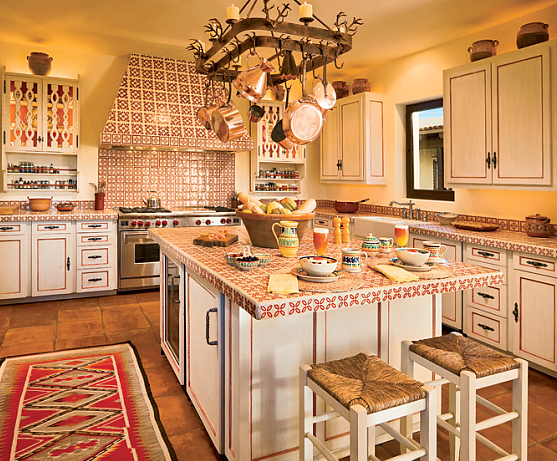
This gourmet kitchen in Ted Turner’s private desert lodge on Armendaris Ranch sits on his 350,000-acre wild animal preserve along the Fra Cristobal Mountains. Laura Hunt Design created this space featured in Architectural Digest and inspired by historic kitchens of Spanish colonial house in San Miguel de Allende, Mexico. The tiled center island offers sitting for two {great rush seat stools}, a beverage refrigerator {or two, depending what is hiding behind the wood panel} and of course additional space for food preparation.

This highly functional kitchen by Atlanta-based designer, Jo Rabaut is stunning and recently won Atlanta Homes Magazine’s 2010 Kitchen of the Year Contest. The color palette of warm walnut floors, soft vanilla cabinetry and pale aqua walls gives this busy room a calming feeling. But it is the large island, Rabaut used that anchors the room. The island’s dark soapstone countertop focuses our attention and provides a tactile surface for food prep. A custom double trough sink housed in the island also makes food preparation more efficient. A table {on wheels} is placed at one end and can be easily moved to serve as an additional workstation or buffet.

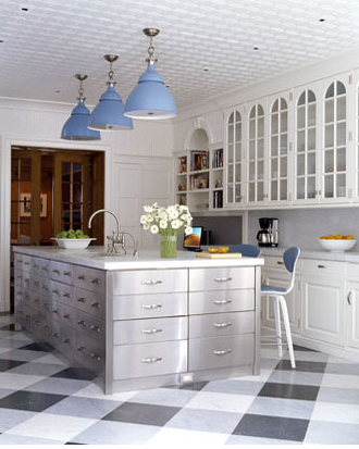
his NY townhouse kitchen by New-York-based design team, William Diamond and Anthony Baratta of Diamond Baratta Design is beautifully eclectic. The white kitchen with pops of ice blue features a stunning stainless steel island. This sleek modern centerpiece is topped with a white countertop {marble?}, under mounted sink and provides numerous drawers for much needed storage. The glass-front kitchen cabinets would have been perfect for this post.

I love kitchen islands. Do you?

Related Posts Plugin for WordPress, Blogger...
Read full story By on February 8, 2010 in Design Tips, interior design, kitchens

Top Ten Ideas for Decorating Your Apartment Rental

Anyone who has rented an apartment desires to feel comfortable, no matter how large or small the space. Decorating an apartment can be difficult as there is often little to work with and only so much change allowed. Every apartment complex is different. Some complexes resemble the styles of Pleasanton apartments in California, with varying sizes, yet functional and luxurious. Others reflect the high class busy lifestyle of Manhattan apartments, often in a one-room loft layout. Whatever the location or floor plan, remember these top ten ideas for making the best out of your space and making it your own.

1. Use multi-functional furniture – For small spaces, a futon sofa bed will give your guests a place to sit and a place for you to sleep at night all in one piece of furniture.

2. Purchase storage type furniture – Beds, couches, and loveseats are available with extra storage options. Storing away miscellaneous items can de-clutter a space and make it appear larger.

3. Wall hangings – Most rentals do not allow paint on the walls. Unique wall hangings can add the expression you are looking for without damaging the walls. Large panels with fabric in your color of choice will work for any wall.

4. Minimal window coverings – Many apartments lack windows as they are connected to other units in the building. Do not cover the windows with excess fabric or curtains. This will block any natural light coming in. Practice minimalism on the windows.

5. Floor lamps – Don’t underestimate the power of adequate lighting. Invest in a few floor lamps and bring your apartment to life. All of your decorating will be evident in a well-lighted room.

6. Add warmth with plants – Studio and loft apartments can be a little “drab” and cold. Add warmth to a space with a few green plants. Plants also help to clean up the air in your apartment, which can be beneficial for apartments in pollution-filled cities.

7. Use room dividers for open spaces – One room apartments can be segmented into separate areas through the use of room dividers, folding screens, or curtains suspended from the ceiling.

8. Pay attention to the small details – Limited budgets mean limited decorating. Small touches such as adding new light switch covers or cabinet hardware can make a big difference without stressing your pocketbook. Make sure to keep those covers and hardware because you will have to replace them when you leave.

9. Create one focal point for each room – Every room should have at least one item that centers the room and makes everything around it pale in comparison. This could be a fireplace, a painting, a statue, or even a large piece of furniture.

10. Mirrors – Use mirrors to reflect light and create the look of a bigger space. Hanging mirrors on the wall or balancing them on the floor against a focal wall can add elegance and style to any room.

The most important thing to remember is to relax. Be open to new ideas and take the limits off of what you think your space should look like. Get creative and turn that apartment into the home of your dreams.

*article written by Avalon Communities and product samples by Simplified Bee – this is not a paid advertisement.
Related Posts Plugin for WordPress, Blogger...
Read full story By on October 21, 2009 in decorating small spaces, Design Tips, home accessories, interior design

Colorful Designer Front Doors and Paint Samples

Have you thought about painting your front door? It can be a great place to add color and communicate your personal sense of style. Lately, I have been attracted to colorful front doors. Here are some examples paired with a similar paint color to help you in the selection process.

This sweet pink front door looks great with the cottage’s gray shingle siding and white trim – pink would certainly not go with just any color scheme. It definitely evokes a welcoming, relaxed and more feminine feeling. Now picture this same door in black. Still a great color choice, but would give off a more formal feeling. Thanks to The Pinque, Inc Diaries for this lovely image!

Here is a striking luscious red door by designer Suzanne Tucker. She used a high quality gloss by Dutch Boy that resists dirt, oil and grease. The red really works with the gray siding and white trim. In Feng Shui, a red door symbolizes the mouth of the home. It is thought a red door attracts chi – positive energy – to the house. We all can use some of that!

This Baltimore home with dark gray siding and white trim – hey a pattern here! – looks stylish and modern with a vibrant front door in orange. The color orange denotes energy, warmth and cheerfulness. An orange front door would also look great with another opposing exterior color scheme like light blue siding and navy blue trim.

Sunny, cheery and inviting. This natural brick home with white trim looks stunning with a bright canary yellow door. If you like this look Benjamin Moore’s Yellow Tone might do the trick.

This home found on Real Simple was painted a softer yellow. The pale yellow accent is a perfect choice for the muted gray shingle siding and white trim. Love it.

This chic foyer designed by Albert Hadley features a bright chartreuse front door. It is not clear what color the exterior siding and trim is, but this door color would look great with shades of gray, blue or brown with a white trim.

Designer Kathryn Ireland brightens a Spanish Colonial Revival in Southern California with a stunning teal painted door. It is a perfect color selection for the home’s white exterior.

The front door of designer Miles Reed’s New York townhouse has been blogged about many times before, but it is one of my favorites. The soft shade of turquoise is brilliant with the brick in muted gray and trim in white. The door’s nickel hardware is exquisite too. A turquoise door would also look great on a house with tan siding and white white trim.
What color do you like for a front door?

Related Posts Plugin for WordPress, Blogger...
Read full story By on October 14, 2009 in color, Design Tips, home exterior / curb appeal, interior design

Tips on Decorating the Fireplace Mantel

Even when not in use, a fireplace is a natural focal point in a room that can’t be ignored. Decorating the fireplace mantel is a wonderful place to incorporate your room’s overall design scheme. Determining what décor is going to be showcased and how is often a challenge for many homeowners. Here are a few tips to help you determine what look is right for your space.

The first step is to select décor that will convey the kind of feeling you want the room to have – formal, casual, clean lines/minimalist or eclectic/busy. You will need to work with the fireplace’s existing architecture and decide if you’d like to enhance it or subdue it. Another important consideration when decorating a fireplace mantel is to keep the design balanced and proportional.

Symmetrical design is the most popular way to decorate a fireplace mantel. Formal rooms typically follow symmetry when arranging mantel décor, but it works in a more casual setting as well. In this master bedroom above, the fireplace mantel by Norman Davenport Askins is symmetrically decorated with British 19th century botanical prints centered on the wall and antique Chinese vases on either side.

Symmetry is easy on the eye and conveys a sense of calm throughout this formal living room designed by Dana Lyon. The fireplace mantel is also symmetrically designed with original artwork flanked by candlesticks.

Dallas, Texas-based designer Shannon Bowers created a gorgeous living room in a neutral palette collection of European furnishings and accessories. The Louis XV inspired limestone mantel is also decorated symmetrically. The large mirror is in perfect proportion and nicely balanced by vases of fresh pink roses.


An asymmetrical layout is another way to arrange your mantel. It conveys a less formal and more rigid feeling, yet still requires balance to achieve an aesthetic design. Objects on both sides of the mantel can vary, but should still be proportional – in the center you may have a mirror with a set of smaller candlesticks on one side and a single taller vase on the other.


The fireplace mantel (above) in this Normandy-style house in Atlanta decorated by Suzanne Kasler demonstrates an asymmetrical design. A dreamy mixed-media work on wood and Plexiglas by Dusty Griffith is centered over the fireplace and is flanked by a tall candlestick and smaller crystal figurines. The powder blue pair of 19th-century painted bergères in the Louis XVI style are divine and further emphasizes the room’s fireplace focal point.


Designed by Stephen Shubel, this living room’s fireplace mantel is also asymmetrical. Gorgeous 19th-century girandoles sit on either side of the mirror by Two’s Company. Alone these items would be symmetrical, however Shubel brilliantly adds a pair of seashells on one side and a small bird figurine on the other. On another note, the walls painted in Benjamin Moore’s Bridal Pink and perfectly balanced by the deep browns in the room. I particularly like the Hanna chairs in leather flank from Oly.


Another option is to create an eclectic mantel by displaying décor of varying size. If this is the look you are trying to achieve, it is still important to arrange the objects to ensure it has balance and flow.

In this contemporary sitting room designed by Eric Cohler, the mantel decor is busy, but inviting. It showcases an eclectic mix of art and photography in various sizes and frames. The small sculpture centered on the mantle is a critical element that balances out the frames. This busy style works here because the room already has lots of visual activity throughout, like the Han dynasty figurines atop the gilded bookshelves. Cohler also brings some old world charm by adding an antique English fireplace grate. I must say, the macassar ebony klismos-style chair by Hinson & Company is fabulous!

This mantel in this casual living room designed by Cristine Gillespie is also eclectic. The 1930s Eiffel Tower model on the mantel is from Indigo Seas. Gillespie and her sons made the small silver one from an Erector set and magnets.

Some fireplaces may have little or no mantel. This is most common in contemporary design. If you do not have a mantel simply hang art or a mirror centered above the fireplace to draw your eye up. However, you may decide to keep the space bare especially if you have a stunning stone fireplace that you don’t want to detract from. In either instance keeping the mantel decor minimalistic will convey a sense of calm and order.
In the contemporary living room by Shirley Parks Design (above), artwork was hung off center and a pair of simple white vases were added to balance out the look.
Before hanging artwork or mirrors above your mantel, it is best if you play around with different designs to find what arrangement works best for you and your room. Have fun with it!


Related Posts Plugin for WordPress, Blogger...
Read full story By on September 18, 2009 in Design Tips, home accessories, interior design, living rooms, mantels, original artwork