Tag Archives | Designer Wallpaper

One Room Challenge :: Week 4

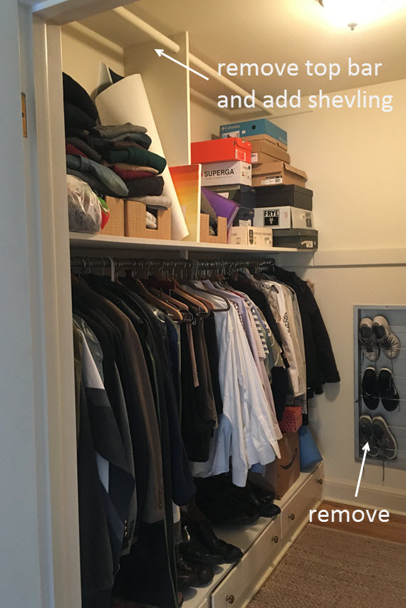
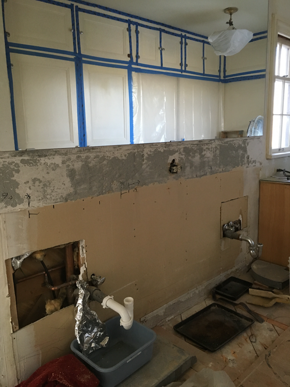
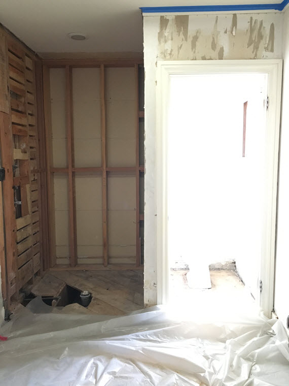
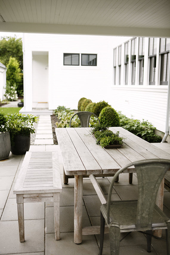
Holy cow, it’s week four of the One Room Challenge. It is amazing how when you lay a line in the side to get something done, the date seem to creep up faster and faster! Our master bathroom and walk-in closet project is well underway and I wanted to share with you some of the progress.

master bathroom // mosaic marble tile // @simplifiedbee #oneroomchallenge

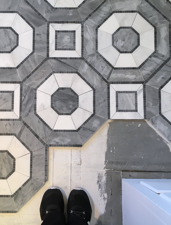
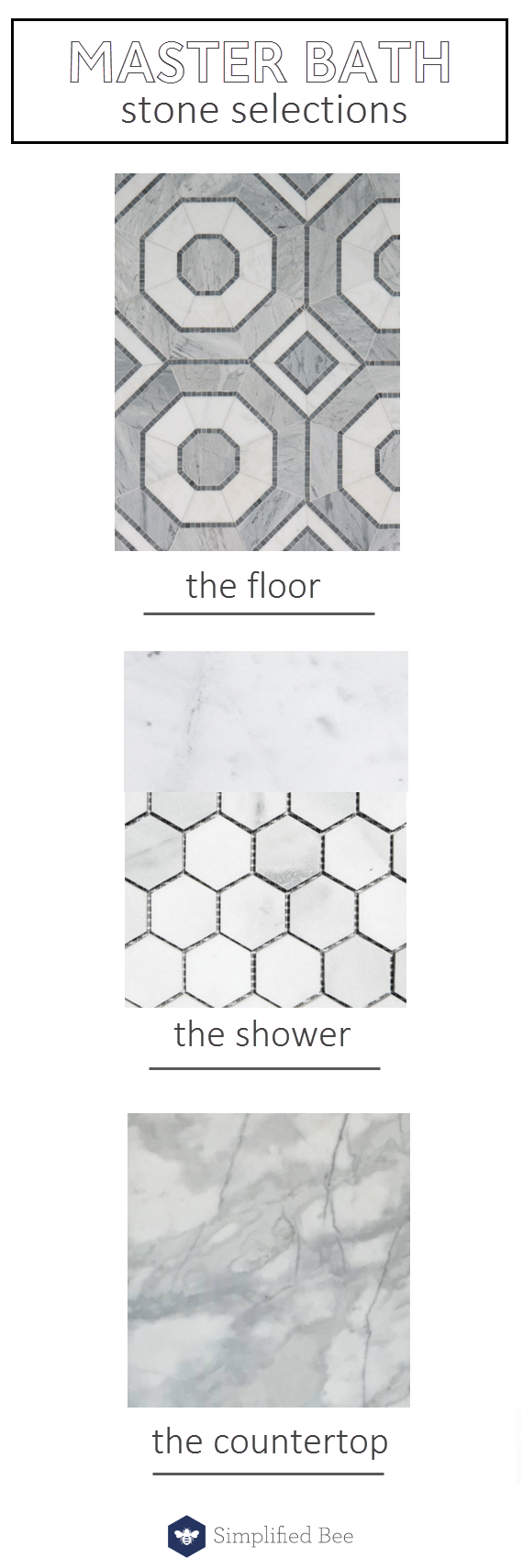
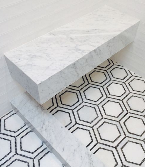
As you may have seen on my Instagram feed where I’m sharing sneak peeks, the mosaic marble floor has been installed. Here is an image of the tile before grouting. You can see me standing on a white material that is an adhesive for the heated floor mats. Yep, during the colder months, our feet will stay warm.

master bathroom // marble hex tile // @simplifiedbee #oneroomchallenge

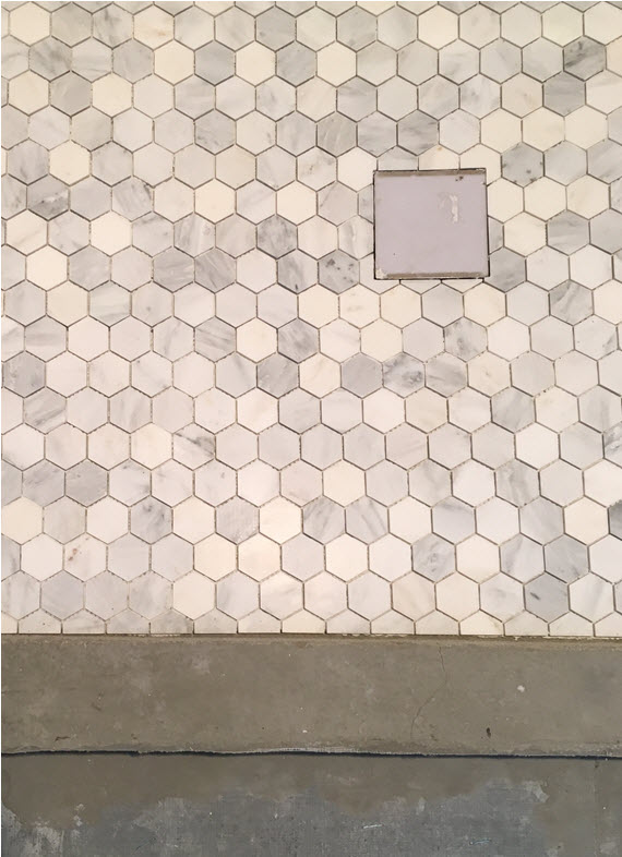
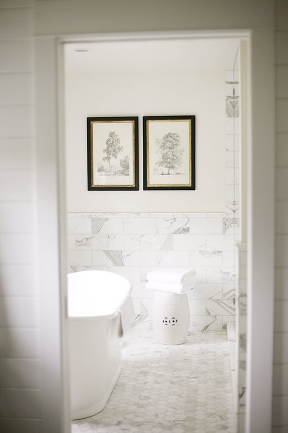
Here is an image of the hexagon marble tiles that went on the shower floor. I love how they coordinate with the large octagon patterned floor.

master bathroom // rohl faucet and kohler sink // @simplifiedbee

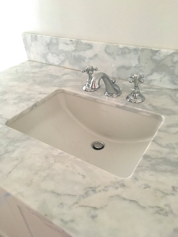
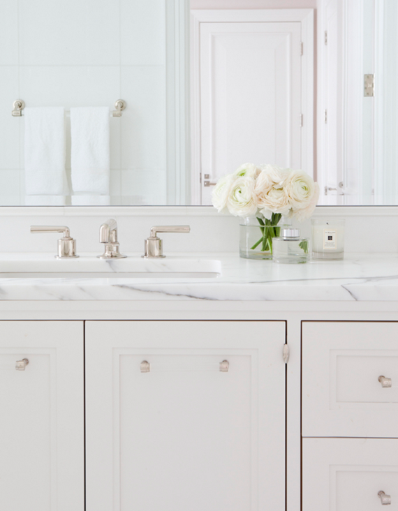
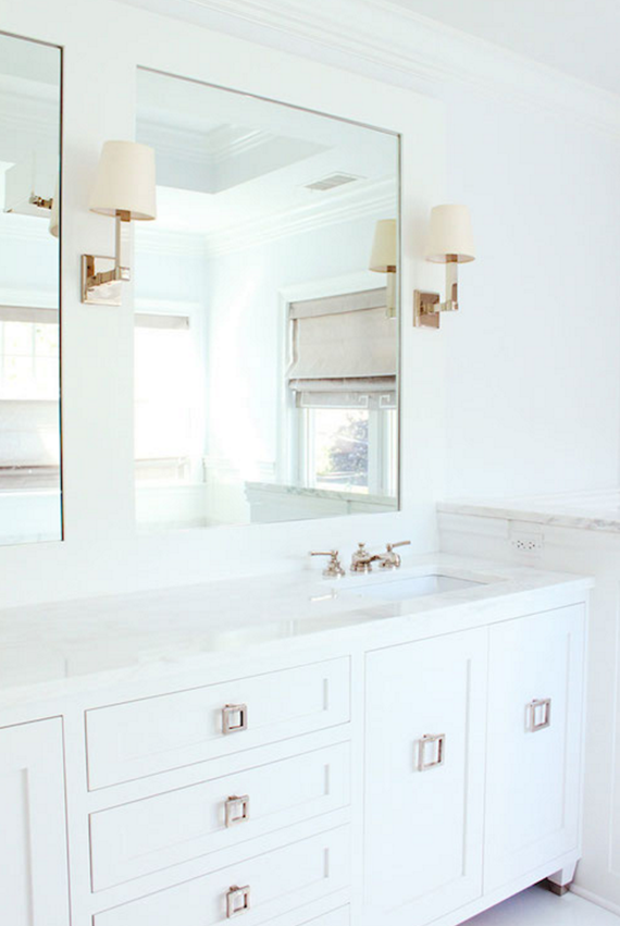
The calacatta marble counter top, faucet by Rohl and Ladena under-mount sink by Kohler were installed. I purchased the pair rectangular of Kohler sinks through a generous ORC sponsor, Lowes – many thanks! They are a generous size and have a transitional look which I love.

vanity hardware // master bathroom // @simplifiedbee #oneroomchallenge

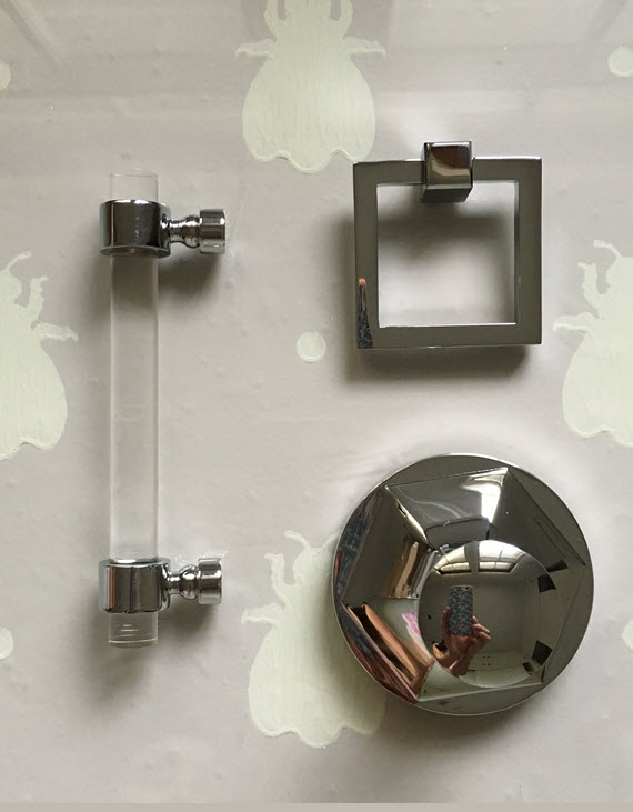
Sourcing hardware for the master bathroom was like shopping for jewelry. It’s so much fun. For the most part I followed the lead of the original hardware finish throughout the bathroom – polished chrome. I did this mainly because the hinges on my closet were not being changed out and are in that finish. The towel hook shown above is from Rejuvenation and is from their Canfield collection. For the main vanity, I selected polished chrome square pulls for a modern touch. I wanted the make-up vanity however to feel different – more feminine and more romantic. I therefore choose the chic lucite and polished chrome drawer pulls from ORC sponsor, LuxHoldups. This image does not due the pull justice – it’s high-quality and gorgeous! Not pictured is a stunning lucite shower door pull that is at the glass shop. I’m crossing my fingers the shower doors are going to be installed in time – we have had some hiccups!

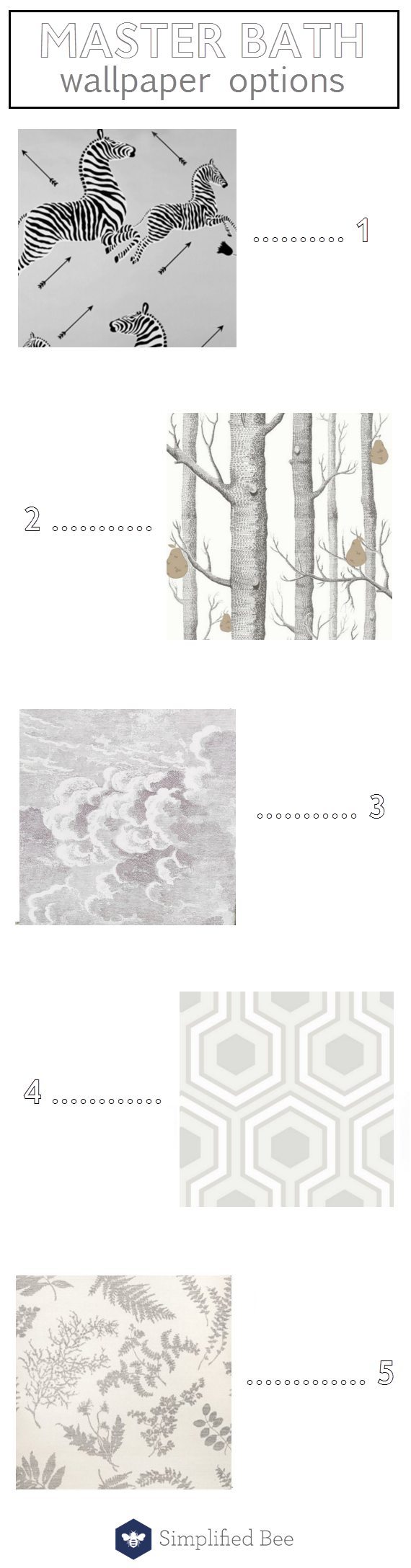
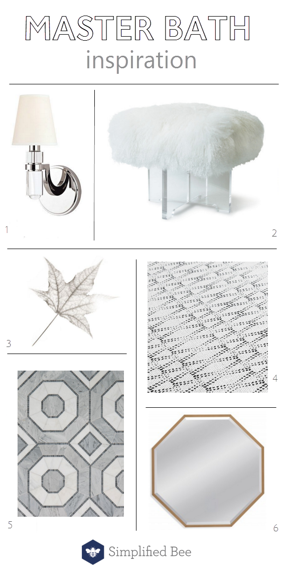
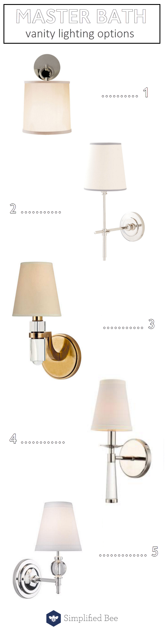
As for lighting selections, I had quite a few to make for the spaces. Over the vanity in the master bathroom, I was on the hunt for a single sconce that would be placed between a pair of mirrors. The finish of the fixture was in question and so I sourced a variety. Here are the ones that made the final cut:

lighting options // master bathroom vanity // @simplifiedbee #oneroomchallenge


product links:

1 cuff sconce // 2 bryant sconce // 3 brass sconce // 4 baxter sconce // 5 muses sconce

In the end, I selected the Baxter sconce (#4 above) through ORC sponsor Crystorama. I was drawn to the glass detail in the torch design. It’s really a good looking sconce and I’m so pleased.

For my husband’s walk-in closet, I definitely wanted a fixture that was flush or semi-mount and had a brass finish. It also needed to have a masculine quality. Here are a few of the fixtures I considered for the space:
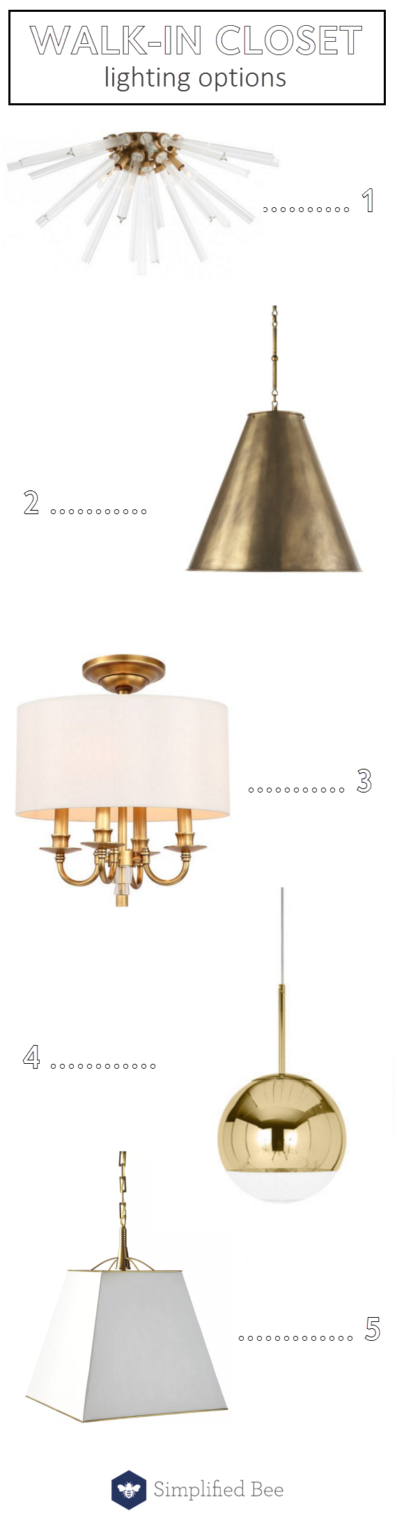
walk-in closet // lighting options // @simplifiedbee #oneroomchallengeproduct links:

1 flush-mount sunburst // 2 goodman pendant // 3 semi-flush mount in aged brass // 4  globe pendant// 5 gardner pendant

I selected Crystorama’s Lawson semi-mount in aged brass (#3 above). It had a timeless and stately quality that my husband liked. It also has some crystal detail that I liked. A win-win!

flush mount sputnik light fixture // lucent light shop // @simplifiedbee #oneroomchallenge

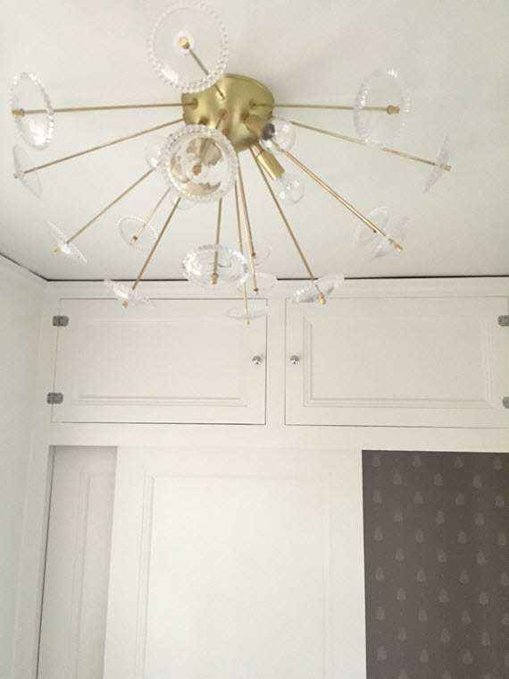
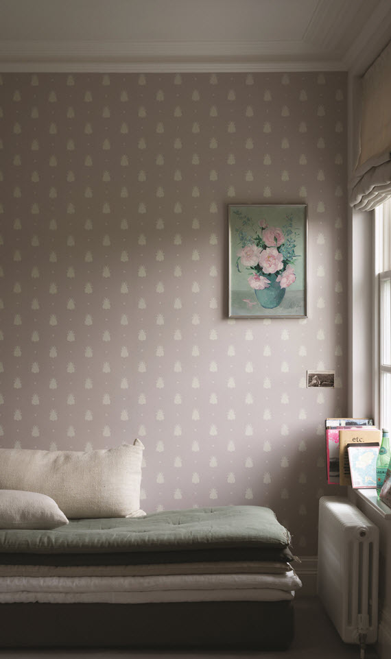
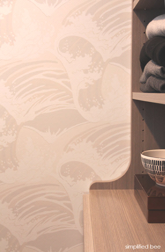
Above the make-up vanity in the master bath I replaced a vintage crystal chandelier with a mid-century inspired flush-mount sputnik light fixture from Lucent Light Shop (another fab ORC sponsor) I wanted to incorporate hints of brass and modern touches in the space, so the fixture was a perfect choice. I also love the romantic feel that the custom glass accents deliver. Isn’t it the best? In the image above, you also get a glimpse of the Bumblebee wallpaper by Farrow & Ball that lines the back of my closets.

flush-mount bamboo light // master bathroom // @simplifiedbee@yahoo.com #oneroomchallenge

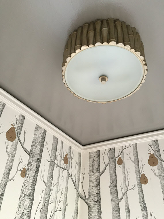
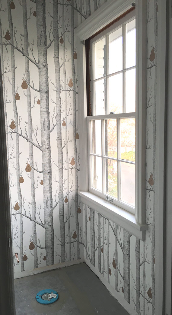
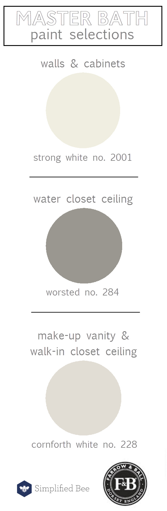
In the water closet with the Woods & Pear wallpaper and Farrow & Ball’s Worsted on the ceiling, I hung Crystorama’s Masefield light fixture in antique silver. It’s just the right scale and the faux bamboo finish is my fave!

ink stripe in black // caroline cecil textiles

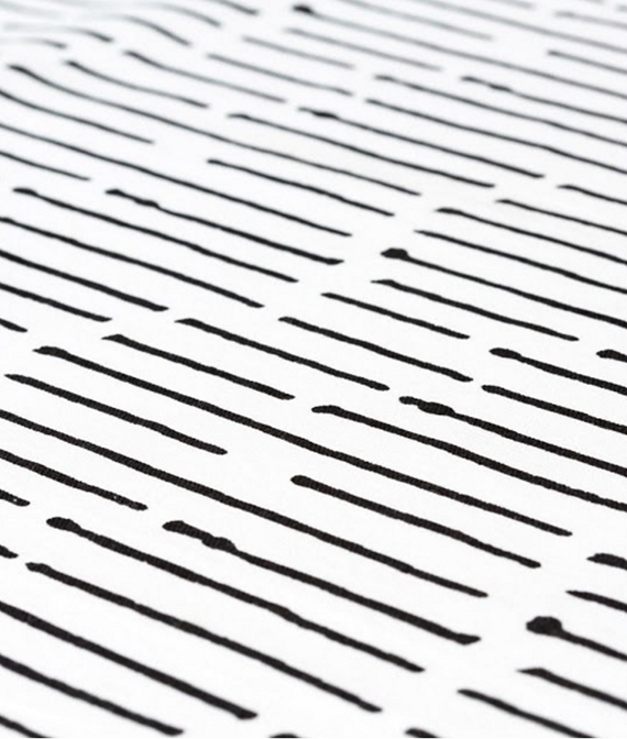
For two windows in the master bathroom, I wanted them covered in Roman shades. Selecting a fabric with a pattern was quite tricky because of the strong octagonal floor tile and the vertical wallpaper in the water closet. Going with a solid would have been easy, but of course I like to play with patterns so decided against that. I fell in love with Caroline Cecil Textiles a few months ago and inquired to see if she would be willing to work with me. I was thrilled when she said yes. We scheduled a call to discuss my vision and after looking over several beautiful samples, I selected her ikat inspired Ink Stripe in black (above) for the shades.  I adore the pattern’s painterly twist on a classic stripe. So fun!

There is more to come next week! I’ll be sharing the more progress and all the fabulous accessories! Also, be sure to follow along on Instagram where I’m sharing more images! If you are just joining us, here are links to the first three weeks of the One Room Challenge:

One Room Challenge :: Kick-off  //  One Room Challenge :: Week 2  //  One Room Challenge :: Week 3

The other 19 ORC participants have been busy creating some fabulous rooms! Be sure to check out their progress…

Media Partner House Beautiful | TM by CIH
* disclosure: some links in this post may be affiliate links
Related Posts Plugin for WordPress, Blogger...
Read full story By on April 27, 2016 in Bathroom, bathrooms, brass, interior design, Interiors, lighting, Uncategorized

One Room Challenge :: Week 3

It’s week three of the One Room Challenge and our master bathroom + walk-in closet makeover is in full swing! Last week I unveiled the design direction for the project and demolition process. Today I’m excited to share with you selections made for the bathroom’s wallpaper, paint and stone.

As for the stone selection, I started with the floor tile. I fell in love with the mosaic octagonal tile Villa D’Oro by Walker Zanger. It features beautiful shades of gray and white. I paired the bold patterned floor with a simple white carrara in 2″ x 2″ hexagon and 12″ x 24″ field tile for the shower. I also found a gorgeous calacatta marble slab for the vanity countertop, shower bench and doorway threshold.

stone selections // master bath // @simplifiedbee #oneroomchallenge

First, I knew I wanted to use pops of wallpaper in both the bathroom and closets. As you know, I have already selected Great Wave in stone by Cole & Son available through ORC sponsor, DecoratorsBest. In the bathroom we have a small water closet that I wanted to incorporate a bold pattern using wallpaper. Below are a few that were options.

master bathroom // wallpaper option // @simplifiedbee #oneroomchallenge

product links:

1 zebras in silver // 2 woods & pears in black, white and bronze // 3 nuvole mural // 4 hicks grand in dove gray // 5 wildflowers on sisal

In the end, I selected Woods & Pears in black, white and bronze by Cole & Son (also available through ORC sponsor, DecoratorsBest). I have loved the Woods wallpaper for along time and was thrilled to see that it had been updated with whimsical pears in bronze. The mix of color was perfect because it would compliment all the mixed finishes in fixtures, hardware and accessories throughout the bathroom and closet. Here’s a peek at the water closet with the new wallpaper. Typically I would have the wallpaper hung last, but in this case the space was so small, the hanger wanted to go in before the tile floor, base boards and toilet were installed.

cole & son woods + pear wallpaper // one room challenge // @simplifiedbee

As you can see from the before images, our bathroom was pink and I loved the metallic pink wallpaper. My husband didn’t care for an all pink master bathroom however, so it all had to go. One area that I thought would be fun however to add a splash of the feminine color, was in my closets that line the master bathroom and cover the top of the make-up vanity. I’ve always adored their timeless Bumblebee wallpaper by Farrow & Ball (known for their signature paint and wallpapers and fabulous ORC sponsor). When I found out that the pattern was being released in Peignoir – a fabulous gray, pink – I had to incorporate it! I get my pink and my bees! Isn’t it perfect?

Farrow & Ball Bumblebee Wallpaper // @simplifiedbee

As for selecting a color for the walls in both the master bathroom and walk-in closet, I wanted to keep the spaces crisp and contemporary. I desired a neutral white that pulled a hint of gray , yet was warming. Farrow & Ball’s Strong White no. 2001 delivers both elements and was my selection for all of the cabinets, vanity, trim and walls in both spaces. In the walk-in closet, I pulled another warm – yet darker neutral – Cornforth White no. 228 for the walk-in closet’s ceiling (goes amazing with Cole & Son’s Great Wave Wallpaper) and for the base of the make-up vanity in the bathroom. For a little drama, I selected Farrow & Ball’s Worsted no. 284 for ceiling in the water closet – pulls the right shade of gray from the Woods + Pair wallpaper and octagon mosaic floor tile. farrow & ball paint colors // bathroom // @simplifiedbee #oneroomchallengeHere’s a look at the new shelving that was custom built for the walk-in closet and painted in Farrow & Ball’s Strong White. Awe… nothing like a clean closet!

walk-in closet shelving // farrow & ball strong white // @simplifiedbee

Next week I’ll be sharing the selection process for lighting, plumbing and bath fixtures! I’ve also been posting more images of my project on Instagram. And in case you missed the first two weeks, here are the links:

One Room Challenge :: Kick-off // One Room Challenge :: Week 2

I can’t wait to see what the other ORC participants are progressing! Check them out for loads of inspiration…

Media Partner House Beautiful | TM by CIH
* disclosure: some links in this post may be affiliate links
Related Posts Plugin for WordPress, Blogger...
Read full story By on April 20, 2016 in Bathroom, bathrooms, color, interior design, Interiors, wallpaper

One Room Challenge :: Week 2

contemporary bathroom vanity

It’s week two of the One Room Challenge and today I’m sharing what inspired the design for my master bathroom + walk-in closet and the demolition process. Let’s start with the master bath. The space (as you can see from the before images) is a long and narrow – approximately 7.5′ x 24′. The original 1940s bathroom was enlarged and remodeled in the 50s and featured beautiful metallic silver and pink wallpaper. Closets, a double vanity and makeup vanity were added in the process. At first I wanted to removed the closets and add a free standing tub at the far end of the bathroom, but after living in the space I grew to love functionality, storage and high-quality. In the end, I decided to keep the footprint as is and focus on new flooring (the wall-to-wall carpet had to go!), fixtures and finishes (I was a little sad to see that the pink wallpaper had to go).
master bath floorplan // @simplifiedbee

As for the look and feel of the master bathroom, I wanted the space to feel contemporary, yet timeless. As you know, I love the hexagon and really wanted to incorporate the a hex or octagonal pattern somewhere. This tile floor in a bathroom by Grant Gibson (below) served as inspiration. I love the chunky marble bench seat too!
mosaic tile floor // bathroom // grant gibson

This bathroom designed by Laura Tutun also has a look and feel I love. The clean lined vanity with large square pulls are the best!
white bathroom // laura tutun interiors

Once I had a vision in mind, I started sourcing for the bathroom. Here are a few items that caught my eye at first glance:

master bathroom inspiration // one room challenge // @simplifiedbee

product links:

1 wall sconce // 2 lamb bench by jonathan adler  // 3 liquid amber by kamala nahas

4 ketut natural linen from caroline cecil textiles // 5 marble octagon tile // 6 brass octagon mirror

The bones of my husband’s walk-in closet are pretty good. There are a couple tweaks including adding some upper shelving in lieu of a second clothing rack.

master walk-in closet before // ORC // simplified bee

As for the look and feel, I had a good idea what I wanted from the start. We used a neutral wave pattern wallpaper by Cole and Son (available through ORC sponsor, DecoratorsBest) in our last closet and loved it so much I’m using it again. It has a wonderful calming effect that my husband loves and it’s a great starting point for the overall design.

wave pattern wallpaper // closet // @siimplifiedbe

Now onto demolition. Because we have an older 1940s home, several materials (plaster walls, tile, etc) were tested for asbestos and lead before we started the demo process. It’s always best to know what you are dealing with ahead of time for the safety of you and your contract workers. The bathroom’s vintage pink tile was tested and it came back positive for low levels of lead. The lead is actually found in the glaze of the tile and isn’t harmful until it’s disturbed. Therefore, the demo had to be done with special precautions including wearing a toxic barrier respirator, using a HEPA filter vac and covering over vents and doorways to keep dust from contaminating other areas. If you are thinking of having an older home renovated, consult with environmental inspection & control company first. If you do have hazardous materials that need to be removed, they can recommend specialized abatement companies in your area to do the work.

master bath demo // @simplifiedbeemaster bath demo // @simplifiedbee

Once the carpet was removed in the master bathroom we discovered that there was an additional sub-floor that once had linoleum over it. Linoleum floors produced in the 1950s commonly used an adhesive on the back side that contains asbestos. Because we didn’t know what the gray paper material consisted of (see image below), so we had it tested. In a matter of a few hours, I received a call from the environmental inspection company that surprising the material came back negative for asbestos and we could move on safely. Whew! We dodged a bullet that would have set us back a few days.

master bath demo // @simplifiedbee

Tune in next week… I’ll be sharing paint colors, wallpaper and stone selections for the master bathroom.

I’m so excited to see what the other ORC participants are up to! From bedrooms to kitchens – this talented group is transforming some fabulous spaces.

* disclosure: some links in this post may be affiliate links
** first image via kapito muller
Related Posts Plugin for WordPress, Blogger...
Read full story By on April 13, 2016 in Bathroom, bathrooms, brass, Closets, interior design, Interiors, lighting, mirrors, Organization, wallpaper

Interview :: H2 Design + Build

Seeking a one stop shop for architectural drafting and planning, engineering, permitting, construction, landscape design and interior design? Paul and Katie Hackworth the husband and wife team behind H2 Design + Build can deliver! The boutique style design and build company tackles projects ranging from designing interior spaces, to remodels, additions, and new homes. H2’s projects have caught the attention of numerous publications including House Beautiful, Luxe Magazine and Rue Magazine. I’m thrilled to be interviewing them today!

Simplified Bee: I love that you are a husband + wife team! When did you realize that you wanted to work together?

H2 Design + Build: H2 Design + Build wasn’t something we had set out to do. It was basically happening in front of us during our “off” time and we finally made it official in 2010. I had a background in graphic design, and to this day utilize the programs affiliated with the industry. Simply speaking, mastering the architectural ruler was the beginning of it all for me. Paul had many years of project management under his belt, and had learned all the tricks of the construction trade during his time managing a handful of blue collar commercial buildings in need of vaiouus tenant improvements and upgrades. Our first project as a team was in 2006 when we renovated a charming cottage style home for our own family.

modern farm house // H2 Design + Build

SB: Your firm seems to do it all – including architecture, interior design, and landscape design – which aspects do you enjoy the most?
What are your personal styles? How are they similar? Different?

H2: Lucky for me, Paul stays out of the architecture and design realm. He has almost mastered the art of listening to me (no one is perfect, right?) and he definitely knows what I expect quality wise. There really is a solid line between each of our skill sets and job descriptions. I create and/or oversee all the architecture, design, and promo of our company and it’s projects. Paul oversees the scheduling, budgets, and timelines of each. This is probably one of the reasons why we have made the husband and wife thing work. Most importantly, we both admire and respect what the other brings to the table. 

I can’t say I like one area of my job description more than the other. It’s nice to get to move back an forth between them and so rewarding to see it all come together in the end.

timeless kitchen // H2 Design + Build

SB: Who would you most like to collaborate with on a project?

H2: There really is no “one” person. The best collaborations are the ones where both sides respect the others talent and vision. When it works, it works. And it’s usually apparent right of the start.

gray kitchen cabinets // H2 Design + Build

SB: Do you have “go to” paint colors? If so, which ones?

H2: The Full Spectrum Color Collection by Benjamin Moore is my go-to collection these days. The colors feel very European to me and seem to fall into my work seamlessly. Colors like Crisp Linen, Chimichurri, Plantation, Sea Glass, Pinky Swear, Porch Swing, and City Shadow are all, literally, on my desk right now.

simple mudroom entry // H2 Design + Build

SB: Which of today’s interior design trends are here to stay and which ones will we see fade away?

H2: In all honesty, I don’t pay attention to trends because they are just that. I find myself drawn to timeless materials and designs and pair them with modern lines and amenities. Longevity is so important. No one wants to put money into something that will be out of style next year!

breakfast nook // H2 Design + Build

SB: Where do you recommend clients splurge versus save?

H2: Where someone decides to splurge is so personal. Items that you can see handing down to the next generation are a good rule of thumb. Artwork, lighting, an iconic piece like my favorite Saarinen table, for example, all could get put into the splurge category.

Architecturally speaking, you need to splurge on the bones of the house first. You don’t want to put money into something that you aren’t in love with initially.

outdoor living area // H2 Design + Build

SB: What excites you most about landscape design today?

H2: What excites me most about landscaping is how it can set apart a home from it’s neighboring houses. The same principles apply: keep it clean and simple, and don’t overwhelm the landscape with numerous species and focal points. I would guess that all of our favorite homes have a yard to pair with it that is just as lovely. 

One other small piece of advice; natural evergreen hedges are by far more welcoming that a fence.

artwork above bed // bedroom // H2 Design + Build

SB: Fill in the blank. No room is complete without…

H2:  … a personal touch. I love adding quirky, out of place items that reflect my clients’ personality.

marble bathroom // H2 Design + Build

SB: Do you have words of wisdom for those thinking about building or renovating a home?

H2: Start with the bones of the house. Perfect it, and then add on… whether that be spatially speaking or interior furnishing wise.

modern elements dining area // nuvolette wallpaper by cole & sons

SB: What’s next for H2 Design + Build?

H2: We are just going to keep going! We have a small restaurant remodel opening very soon, which is a first for our company. Additionally, we are working on a handful of new homes, plus various remodels and renovations. And of course, interior furnishings for all of the above.

Far too much of the  architecture and design of today has lost the attention to detail that existed in the past. I hope and aspire to bring some of this back, but from a modern perspective.
*all images provided by H2 Design + Build
Related Posts Plugin for WordPress, Blogger...
Read full story By on March 22, 2016 in Bathroom, Features, gallery wall, Garden, home exterior / curb appeal, interior design, Interiors, interview, Interviews, Kitchen, kitchens, Living Room, mid-century modern, mudrooms