Archive | gallery wall RSS feed for this section

Book Review :: Home Decor Cheat Sheets

How high should you hang a chandelier hang above the dining table? What paint finish should you use a kid’s room? What size rug should go under your bed? When it comes to decorating the questions can be endless, but there are definitely some design dos and don’ts I adhere to. Some of these “rules” are easy to remember, but it’s always nice to have a cheat sheet or illustration to reference. Over time I have pinned, cut-out and dogeared pages in decor books, but have never had one single source. So I was thrilled to receive a copy of a newly released book, Home Decor Cheat Sheets by Jessica Probus that contains 300+ colorful, easy-to-understand images aimed at teaching you everything from furniture placement to bathroom lighting tricks, window styles to  how to make a floor plan. I’m loving the practical nature of this book and is a resource I’m looking forward to using for years to come. Decor lovers, you are going to want a copy of this helpful book. It would also make a perfect housewarming gift!

Home Decor Cheat Sheets // Book Review // @simplifiedbeesofa styles // home decor cheat sheets // book review

Just like the completion of any home, the cheat sheets in this book are meant to be used as a process not to be tackled in one day or even one year, but consulted as needed over time to make the kind of slow, purposeful improvements that turn a few walls and some well-hung curtains into an actual home. – Jessica Probus, Author of Home Decor Cheat Sheets

gallery walls // home decor cheat sheets // book reviewtile patterns // home decor cheat sheets // book review

Related Posts Plugin for WordPress, Blogger...
Read full story By on July 13, 2016 in book, book review, decorating small spaces, Design Tips, furniture, gallery wall, interior design, lighting, pattern, Tips/Tricks

Interview :: H2 Design + Build

Seeking a one stop shop for architectural drafting and planning, engineering, permitting, construction, landscape design and interior design? Paul and Katie Hackworth the husband and wife team behind H2 Design + Build can deliver! The boutique style design and build company tackles projects ranging from designing interior spaces, to remodels, additions, and new homes. H2’s projects have caught the attention of numerous publications including House Beautiful, Luxe Magazine and Rue Magazine. I’m thrilled to be interviewing them today!

Simplified Bee: I love that you are a husband + wife team! When did you realize that you wanted to work together?

H2 Design + Build: H2 Design + Build wasn’t something we had set out to do. It was basically happening in front of us during our “off” time and we finally made it official in 2010. I had a background in graphic design, and to this day utilize the programs affiliated with the industry. Simply speaking, mastering the architectural ruler was the beginning of it all for me. Paul had many years of project management under his belt, and had learned all the tricks of the construction trade during his time managing a handful of blue collar commercial buildings in need of vaiouus tenant improvements and upgrades. Our first project as a team was in 2006 when we renovated a charming cottage style home for our own family.

modern farm house // H2 Design + Build

SB: Your firm seems to do it all – including architecture, interior design, and landscape design – which aspects do you enjoy the most?
What are your personal styles? How are they similar? Different?

H2: Lucky for me, Paul stays out of the architecture and design realm. He has almost mastered the art of listening to me (no one is perfect, right?) and he definitely knows what I expect quality wise. There really is a solid line between each of our skill sets and job descriptions. I create and/or oversee all the architecture, design, and promo of our company and it’s projects. Paul oversees the scheduling, budgets, and timelines of each. This is probably one of the reasons why we have made the husband and wife thing work. Most importantly, we both admire and respect what the other brings to the table. 

I can’t say I like one area of my job description more than the other. It’s nice to get to move back an forth between them and so rewarding to see it all come together in the end.

timeless kitchen // H2 Design + Build

SB: Who would you most like to collaborate with on a project?

H2: There really is no “one” person. The best collaborations are the ones where both sides respect the others talent and vision. When it works, it works. And it’s usually apparent right of the start.

gray kitchen cabinets // H2 Design + Build

SB: Do you have “go to” paint colors? If so, which ones?

H2: The Full Spectrum Color Collection by Benjamin Moore is my go-to collection these days. The colors feel very European to me and seem to fall into my work seamlessly. Colors like Crisp Linen, Chimichurri, Plantation, Sea Glass, Pinky Swear, Porch Swing, and City Shadow are all, literally, on my desk right now.

simple mudroom entry // H2 Design + Build

SB: Which of today’s interior design trends are here to stay and which ones will we see fade away?

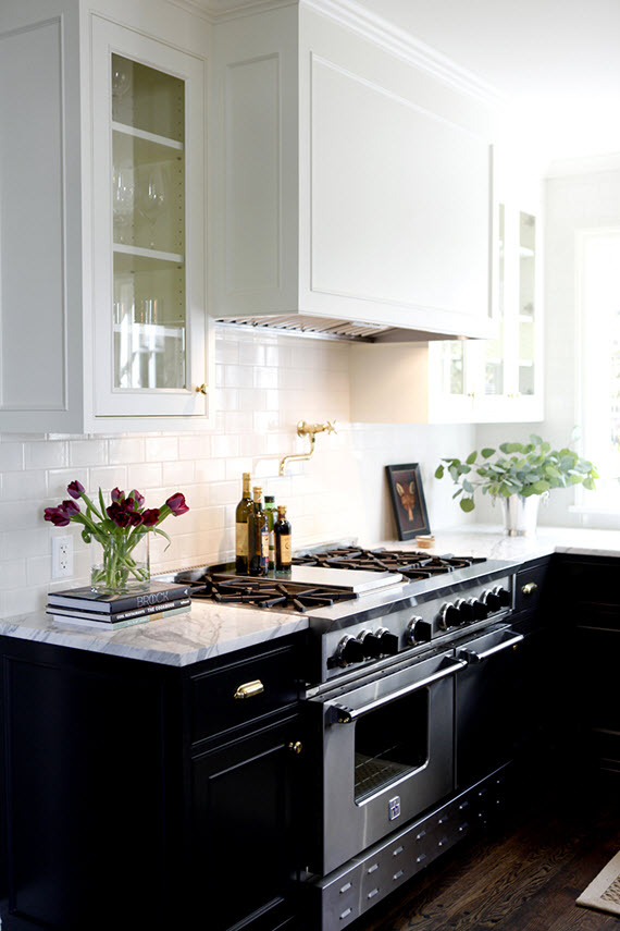
H2: In all honesty, I don’t pay attention to trends because they are just that. I find myself drawn to timeless materials and designs and pair them with modern lines and amenities. Longevity is so important. No one wants to put money into something that will be out of style next year!

breakfast nook // H2 Design + Build

SB: Where do you recommend clients splurge versus save?

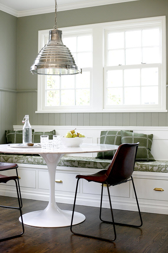
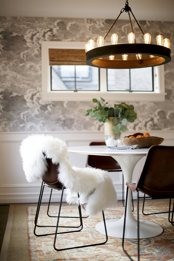
H2: Where someone decides to splurge is so personal. Items that you can see handing down to the next generation are a good rule of thumb. Artwork, lighting, an iconic piece like my favorite Saarinen table, for example, all could get put into the splurge category.

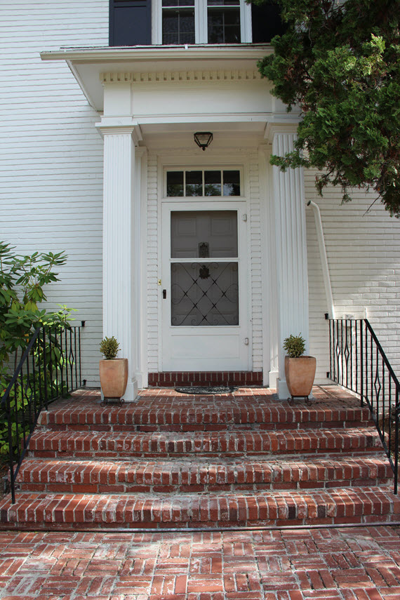
Architecturally speaking, you need to splurge on the bones of the house first. You don’t want to put money into something that you aren’t in love with initially.

outdoor living area // H2 Design + Build

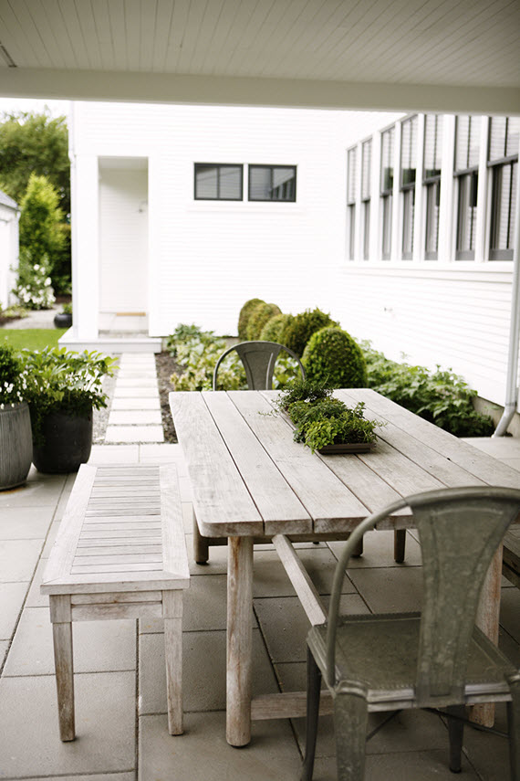
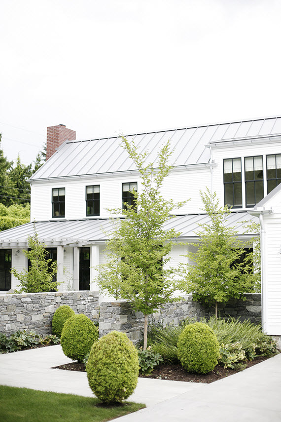
SB: What excites you most about landscape design today?

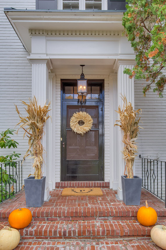
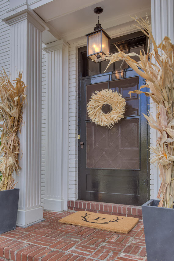
H2: What excites me most about landscaping is how it can set apart a home from it’s neighboring houses. The same principles apply: keep it clean and simple, and don’t overwhelm the landscape with numerous species and focal points. I would guess that all of our favorite homes have a yard to pair with it that is just as lovely. 

One other small piece of advice; natural evergreen hedges are by far more welcoming that a fence.

artwork above bed // bedroom // H2 Design + Build

SB: Fill in the blank. No room is complete without…

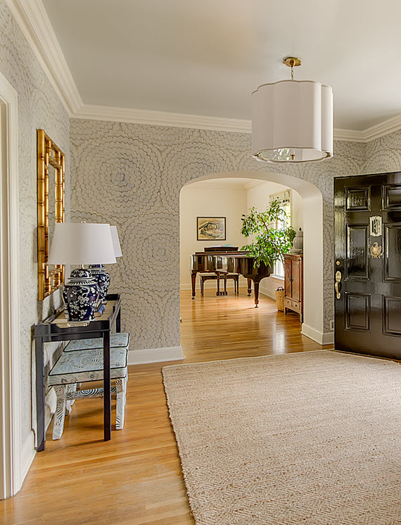
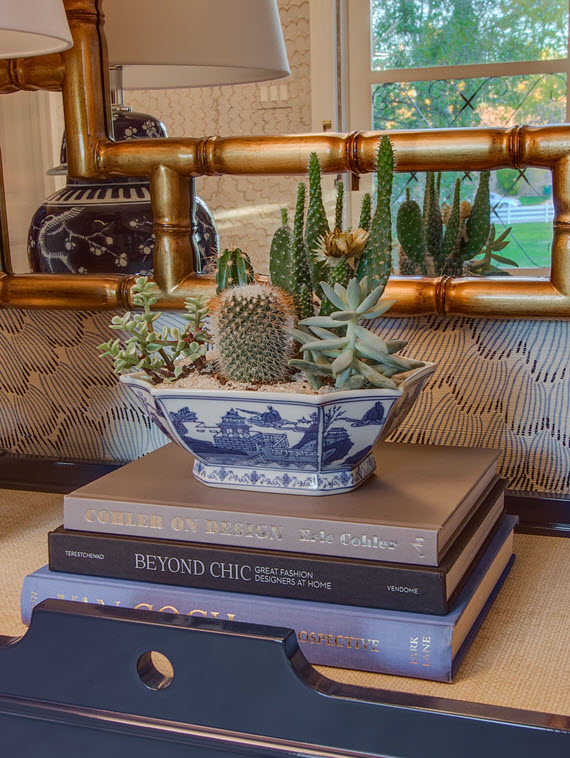
H2:  … a personal touch. I love adding quirky, out of place items that reflect my clients’ personality.

marble bathroom // H2 Design + Build

SB: Do you have words of wisdom for those thinking about building or renovating a home?

H2: Start with the bones of the house. Perfect it, and then add on… whether that be spatially speaking or interior furnishing wise.

modern elements dining area // nuvolette wallpaper by cole & sons

SB: What’s next for H2 Design + Build?

H2: We are just going to keep going! We have a small restaurant remodel opening very soon, which is a first for our company. Additionally, we are working on a handful of new homes, plus various remodels and renovations. And of course, interior furnishings for all of the above.

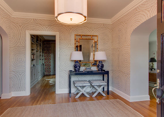
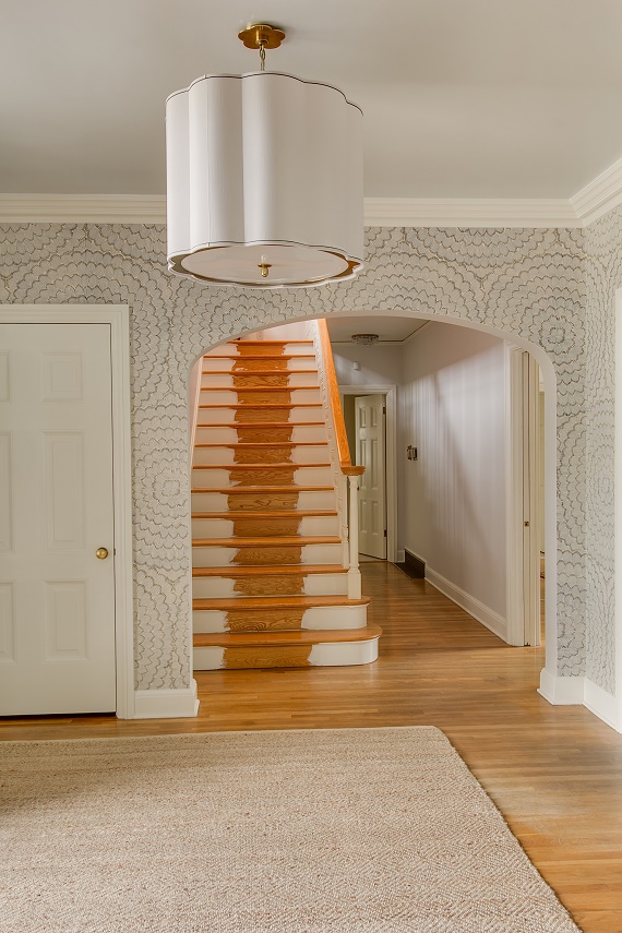
Far too much of the  architecture and design of today has lost the attention to detail that existed in the past. I hope and aspire to bring some of this back, but from a modern perspective.
*all images provided by H2 Design + Build
Related Posts Plugin for WordPress, Blogger...
Read full story By on March 22, 2016 in Bathroom, Features, gallery wall, Garden, home exterior / curb appeal, interior design, Interiors, interview, Interviews, Kitchen, kitchens, Living Room, mid-century modern, mudrooms

One Room Challenge Fall 2015 :: The Reveal

It’s here and all I can think of is how quickly the past six weeks have flown by! Today’s the big reveal of my Foyer for the One Room Challenge and I couldn’t be more excited to share it with you. It’s such a happy space and am thrilled with the result!

formal foyer // one room challenge // @simplifiedbee

As you may know, for the past several weeks I’ve been sharing the whole design process (including all the ups and downs!). In case you’ve miss any and need to catch up, here are the links:

Week One – Foyer Before // Week Two – Wallpaper & Paint // Week Three – Furnishings // Week Four – Lighting // Week Five – Art & Accessories

To refresh your memory and to appreciate the transformation, I’ve included a few before images in combination with the reveal images.

ENTRY BEFORE ::

traditional front door // ORC before // www.simplifiedbee.com

ENTRY AFTER ::

fall front door // one room challenge // @simplifiedbeefall front door // one room challenge // @simplifiedbee

I love the new black door painted in Farrow & Ball’s Pitch Black. It makes such stately entrance to our home. The handsome hanging lantern via Lowes was also a terrific addition. And isn’t the antler doormat by Mark & Graham just perfect?

FOYER & STAIRCASE BEFORE ::

Foyer Before // ORC // www.simplifiedbee.comFoyer Before // ORC // www.simplifiedbee.com

FOYER & STAIRCASE AFTER ::

chinoiserie chic foyer // design by @simplifiedbee

This is really a happy space. I’m in love with it all. The large-scale feather bloom wallpaper by Celerie Kemble for Schumacher sets the tone immediately. The gorgeous navy lacquer console by oomph is the perfect compliment. I’m also so pleased with the chinoserie chic touches in the fabulous x benches in Clarence Houses Tibet Print, gilded faux bamboo mirror, pair of elegant table lamps and vintage blue & white porcelain bowl housing the cacti & succulents.

entry console table // by @simplifiedbeeformal foyer // one room challenge // @simplifiedbeecacti & succulent arrangement // @simplifiedbeefoyer staircase // @simplifiedbee

As I mentioned in this post, the stair-runner got held up in customs. Unfortunately, it still hasn’t arrived. I’m so bummed not to be able to show you a finished project, but the reality is that sometimes we have no control over these things. It’s a great lesson in patience in this need to have it now society. When it is installed, I will be sure to share it with you! I still love this image because it showcases the lovely scalloped pendant from Bellacor and high-gloss painted ceiling in Farrow & Ball’s Borrowed Light so beautifully!

minted artwork // staircase landing // @simplifiedbee

I also love how the staircase landing turned out. The dyptich artwork through Minted compliments the original door chimes which we modernized by adding a clean-lined teak cover. For texture and to balance the space, I added a small bench covered in a cozy sheepskin rug.

vintage chandelier + window valance // staircase landing // @simplifiedbeegallery wall // one room challenge // @simplifiedbeemichelle morin artwork // design by @simplifiedbee

At the top of the stairs, I left the original vintage chandelier – it is so timeless that it didn’t need to be changed out. However, I updated the window valance and have it covered in a beautiful hand-blocked textile from Galbraith & Paul. It’s layered it with a matchstick woven roman shade in white. The adjacent gallery wall filled with Michelle Morin’s whimsical birds and bees is another spot that makes me smile.

SPONSORED SOURCES ::

farrow and ball paint // oomph console table // decoratorsbest fabric for x benches // bellacor pendant light // bassett mirror table lamps & wall mirror // minted dyptich artwork // lowes outdoor lantern // mark & graham doormat

ADDITIONAL SOURCES ::

celerie kemble wallpaper for schumacher // vintage blue & white bowl via chairish // artwork by michelle morin // natural diamond pattern rug // sheepskin rug for bench // corn-husk wreath // seagrass basket for the fiddle fig // x benches by livenupdesign

PHOTOGRAPHY :: candace & kurt williams of photo-tecture

Thank you so much for following my One Room Challenge journey! I’ve been so touched by all the lovely comments and encouragement.

Now to all the other final reveals of the other 19 ORC participants – I’m so excited to see all the gorgeous interiors from this talented group!

A huge thank you to Linda at Calling it Home for organizing everything, securing such fabulous sponsors and including me in The One Room Challenge Fall 2015! It was such an incredible experience and one I’d be honored to do again! 

Related Posts Plugin for WordPress, Blogger...
Read full story By on November 11, 2015 in chinoiserie, console tables, etsy, foyers, furniture, gallery wall, interior design, Interiors, lighting, mirrors, monograms, simplified bee portfolio, textiles, traditional, wallpaper, window treatments

One Room Challenge :: Week 5

Say what?! It’s week five of the One Room Challenge and I’m starting to sweat bullets! In case you are here for the first time, I’ve been designing my Foyer in our new house. Here’s a look at week one, twothree and four.

There is good news and there bad news this week. Let’s just get the bad news out of the way first (sigh).

painted staircase before runner // @simplifiedbee

Until late last week, I completely thought I had this challenge all under control. I’m a stickler for timelines and was realistic about what I could do with the Foyer within the amount of time allotted. But, sometimes even with all the careful planning and detailed timelines, things get out of your control. This is the reality of interior design. My carpet for the stair-runner (which is a showstopper!) is somewhere in customs and will not arrive in time for the photo-shoot (super sad face).  I’m still not giving up hope that it does arrive and is installed before the final reveal, so at least I can take an image myself for you to see. Fingers and toes crossed.

top of the staircase before // @simplifiedbeeetsy artwork // birds // @simplifiedbee

Now onto the good news! I’ve selected some fabulous artwork for the top of the staircase and landing. First, I’ll start with the top of the staircase on the second floor. I knew from the start that I wanted a gallery wall at the top of the landing. I’ve adored Michelle Morin’s illustrations for some time and finally had the opportunity to create a gallery of her work. I selected 5 birds and one bee (had to!) for the collection and had them framed locally in a faux bamboo. Here’s a look at the arrangement before installed. Love, love, love them!

staircase before // @simplifiedbee

The landing needed art desperately, yet was a very tricky spot because of the placement of the doorbell chimes. I could have done a couple things here; 1. Relocate the chimes to have more freedom for artwork or 2. Work with the chimes and place art one either side. I decided for option #2 because it was more cost effective and it didn’t change the original architecture of the home. Because the series of bird illustrations was already committed for the opposite wall, I wanted a pair of larger images to go on either side of the chimes. Here were some of the ones I narrowed down from another fab ORC sponsor, Minted (yes, they offer so much more than just beautiful holiday cards!).

art selections // one room challenge foyer // @simplifiedbee

1 // 2 // 3 // 4 // 5

Selecting the two pieces for the space proved to be challenging. Minted has such an amazing collection, it was super difficult to narrow down. I knew I wanted color and an abstract. But finding two pieces of art that were complimentary, the same orientation (running vertical) and would work with the door chimes was indeed a challenge. In the end, I selected #5 a beautiful dyptich, High Cascades by Amelia Gluba. The abstract image works beautifully with the chimes, pulls blue from the wallpaper in the Foyer and gives a nod to the scenic Sierra Nevada Mountains surrounding our home.

dyptich artwork at Minted // @simplifiedbee

The entry needed a few accessories too. A fresh doormat is always a great way to spruce up the space and welcome guests in style. Here are a few fun doormats I considered:

doormat options // one room challenge // @simplifiedbee

1 // 2 // 3 // 4 // 5

I quickly narrowed down the options to doormats that could be personalized. I’m a sucker for monograms so I ended up selecting the Antlers Graphic Doormat from Mark and Graham (a go to destination for fabulous personalized home decor). It’s was personalized with our family initial. Here’s the image I shared earlier this week on Instagram. Isn’t it perfect for a mountain house?

monogrammed antler doormat // @simplifiedbee

I have a few other accessories to add to the Foyer before the photo-shoot this week. One is a floral arrangement for the console table. I’ve been going back-and-forth on what to do – traditional orchids? cut seasonal flowers? cacti & succulents? I’m still deciding.

cacti + succulents // @simplifiedbee

Again, I’m keeping hope that the stair-runner will be installed soon and would love for you to drop by next week to see the final reveal!

Check out what the other ORC participants are up to – holy cow, there’s so much talent here!

* Big thank you to Minted and Mark and Graham for their support and sponsorship of this challenge!

Related Posts Plugin for WordPress, Blogger...
Read full story By on November 4, 2015 in color, curated look, etsy, foyers, gallery wall, home accessories, interior design, Interiors, monograms, pattern, simplified bee portfolio