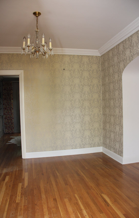
Say what?! It’s week five of the One Room Challenge and I’m starting to sweat bullets! In case you are here for the first time, I’ve been designing my Foyer in our new house. Here’s a look at week one, two, three and four.
There is good news and there bad news this week. Let’s just get the bad news out of the way first (sigh).
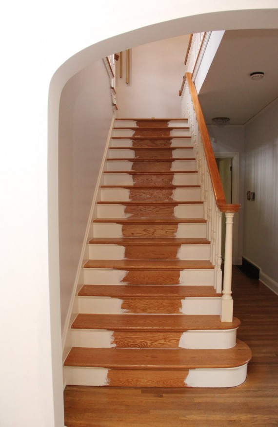
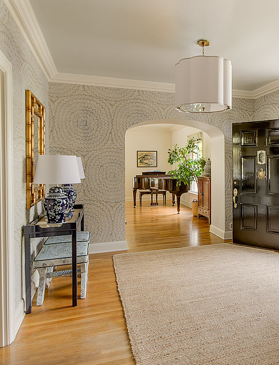
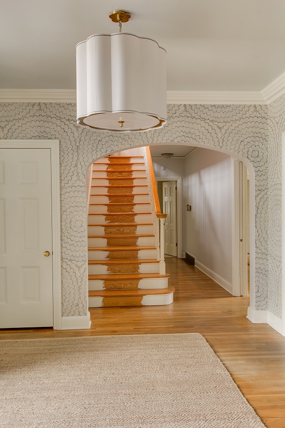
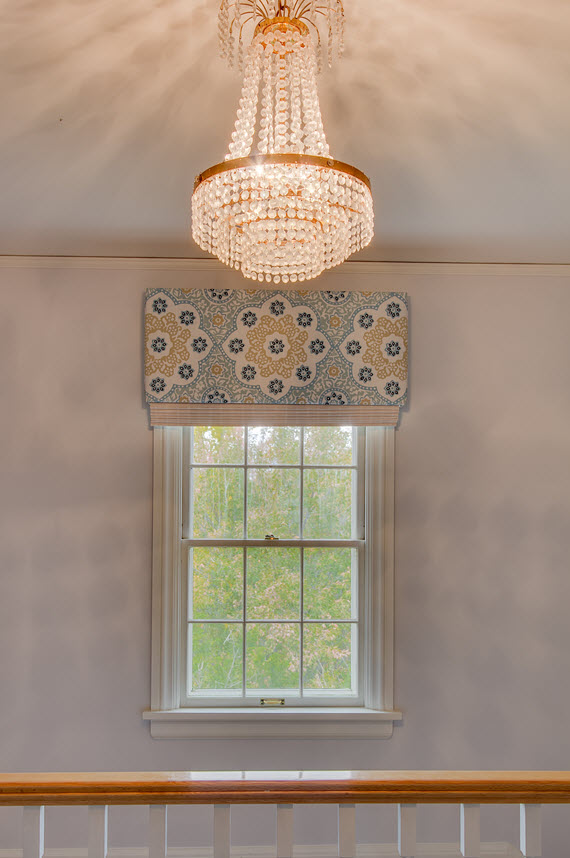
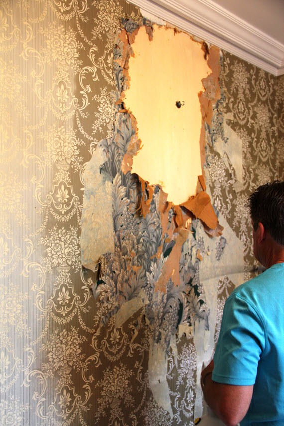
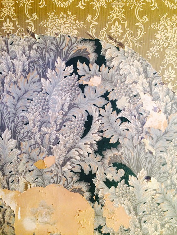
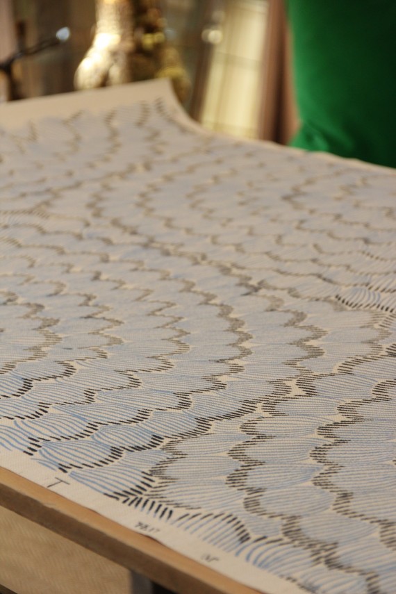
Until late last week, I completely thought I had this challenge all under control. I’m a stickler for timelines and was realistic about what I could do with the Foyer within the amount of time allotted. But, sometimes even with all the careful planning and detailed timelines, things get out of your control. This is the reality of interior design. My carpet for the stair-runner (which is a showstopper!) is somewhere in customs and will not arrive in time for the photo-shoot (super sad face). I’m still not giving up hope that it does arrive and is installed before the final reveal, so at least I can take an image myself for you to see. Fingers and toes crossed.
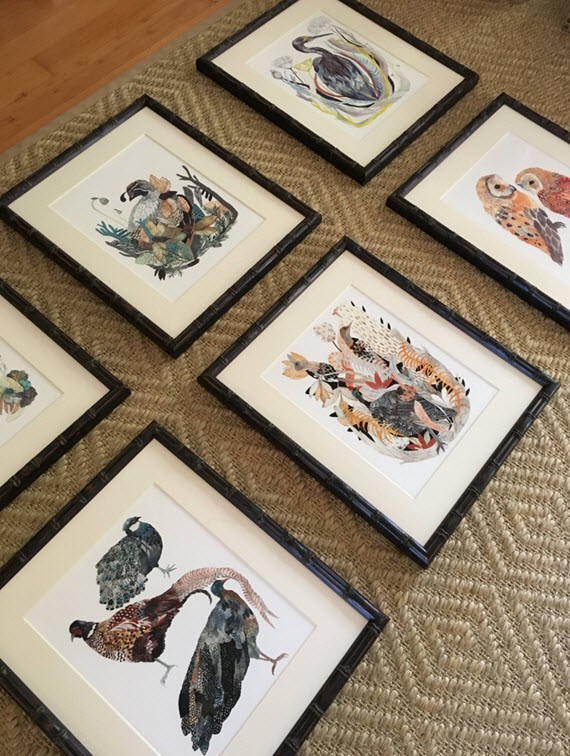
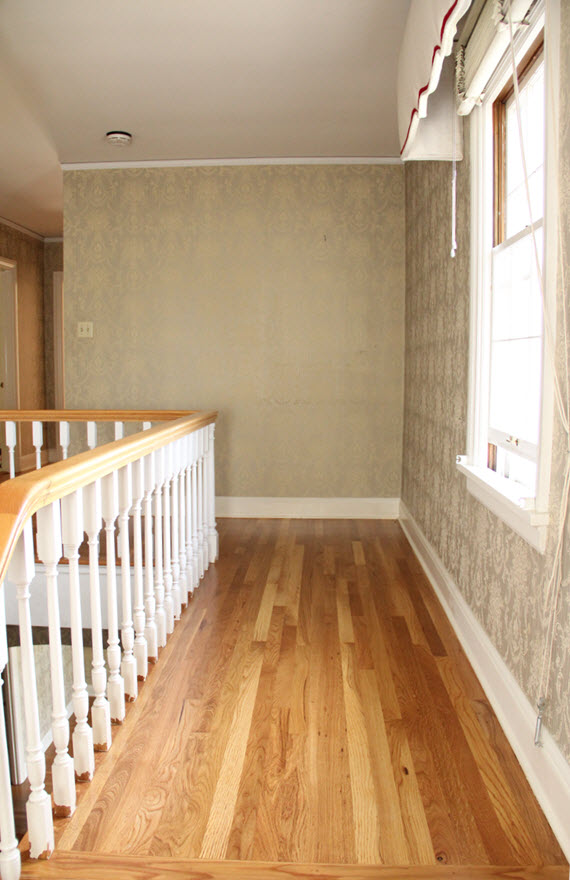
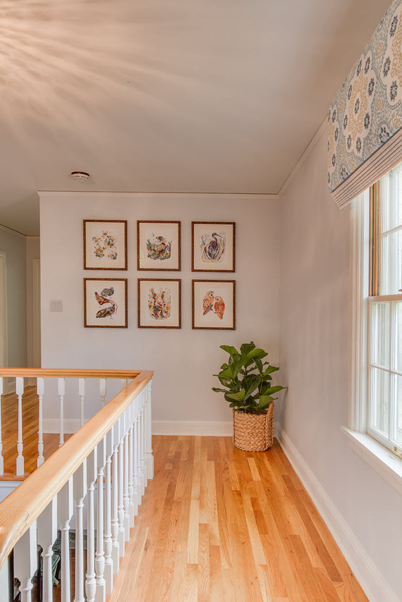
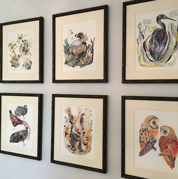
Now onto the good news! I’ve selected some fabulous artwork for the top of the staircase and landing. First, I’ll start with the top of the staircase on the second floor. I knew from the start that I wanted a gallery wall at the top of the landing. I’ve adored Michelle Morin’s illustrations for some time and finally had the opportunity to create a gallery of her work. I selected 5 birds and one bee (had to!) for the collection and had them framed locally in a faux bamboo. Here’s a look at the arrangement before installed. Love, love, love them!
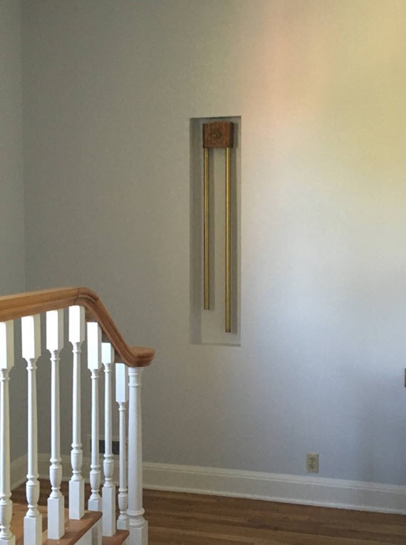
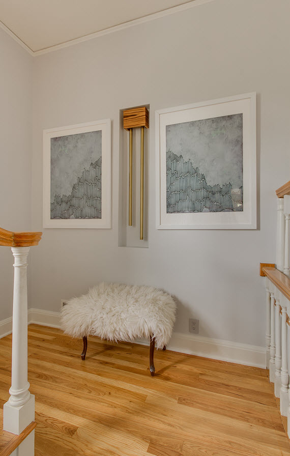
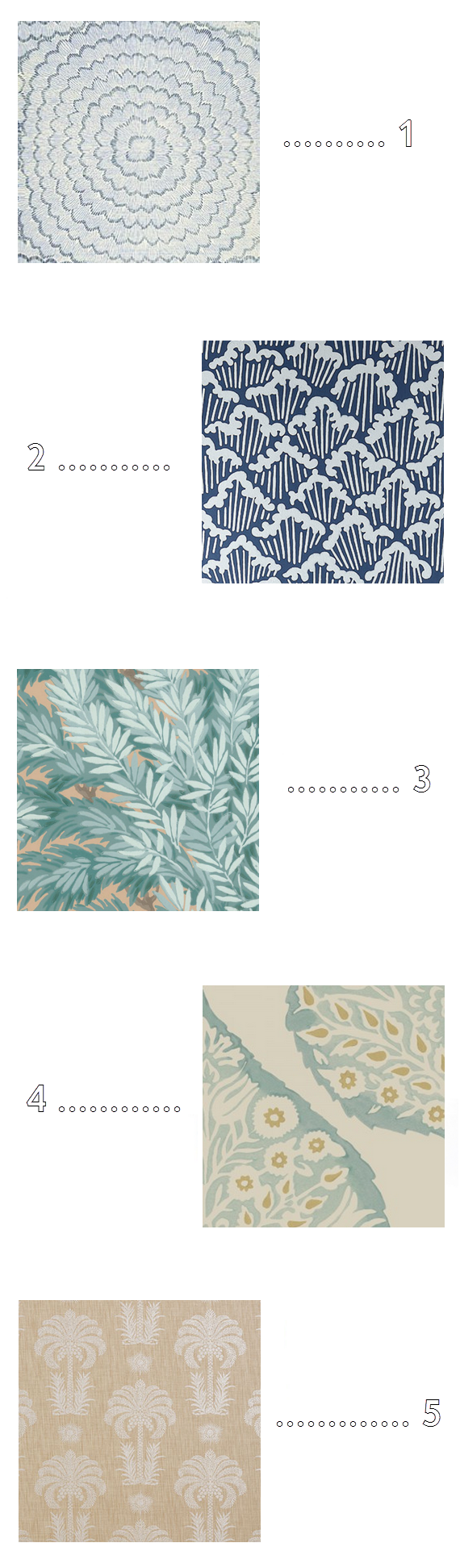
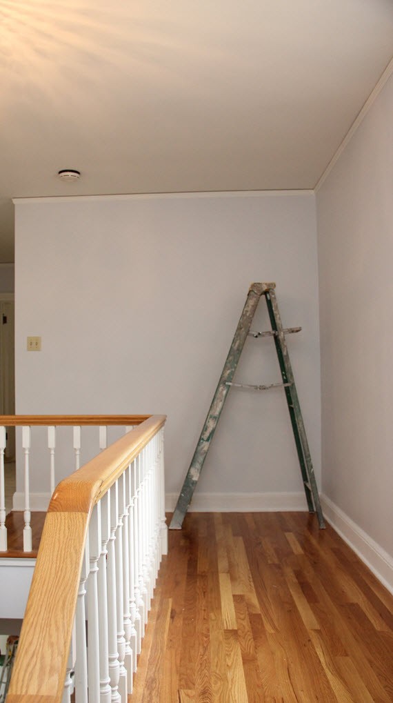
The landing needed art desperately, yet was a very tricky spot because of the placement of the doorbell chimes. I could have done a couple things here; 1. Relocate the chimes to have more freedom for artwork or 2. Work with the chimes and place art one either side. I decided for option #2 because it was more cost effective and it didn’t change the original architecture of the home. Because the series of bird illustrations was already committed for the opposite wall, I wanted a pair of larger images to go on either side of the chimes. Here were some of the ones I narrowed down from another fab ORC sponsor, Minted (yes, they offer so much more than just beautiful holiday cards!).
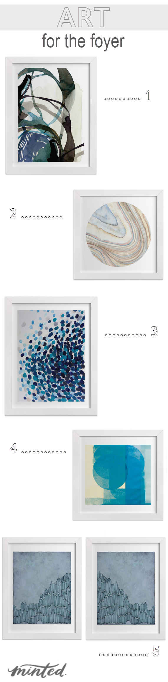
1 // 2 // 3 // 4 // 5
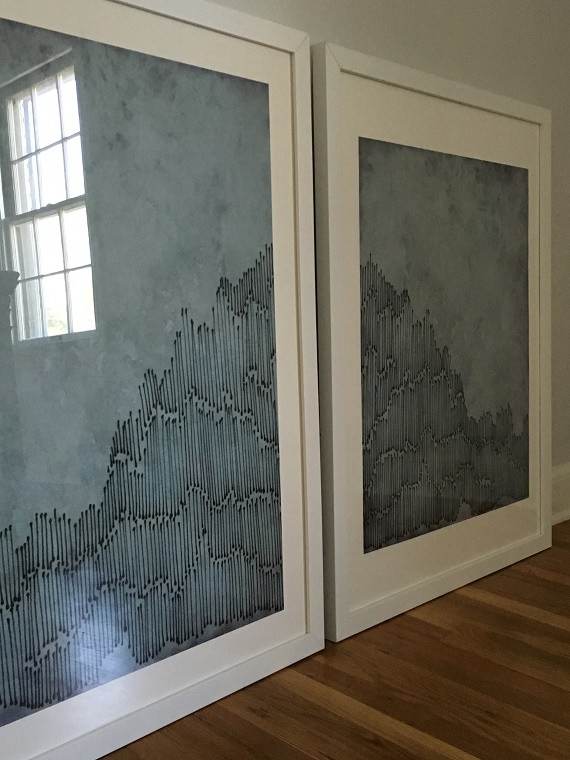
Selecting the two pieces for the space proved to be challenging. Minted has such an amazing collection, it was super difficult to narrow down. I knew I wanted color and an abstract. But finding two pieces of art that were complimentary, the same orientation (running vertical) and would work with the door chimes was indeed a challenge. In the end, I selected #5 a beautiful dyptich, High Cascades by Amelia Gluba. The abstract image works beautifully with the chimes, pulls blue from the wallpaper in the Foyer and gives a nod to the scenic Sierra Nevada Mountains surrounding our home.
The entry needed a few accessories too. A fresh doormat is always a great way to spruce up the space and welcome guests in style. Here are a few fun doormats I considered:
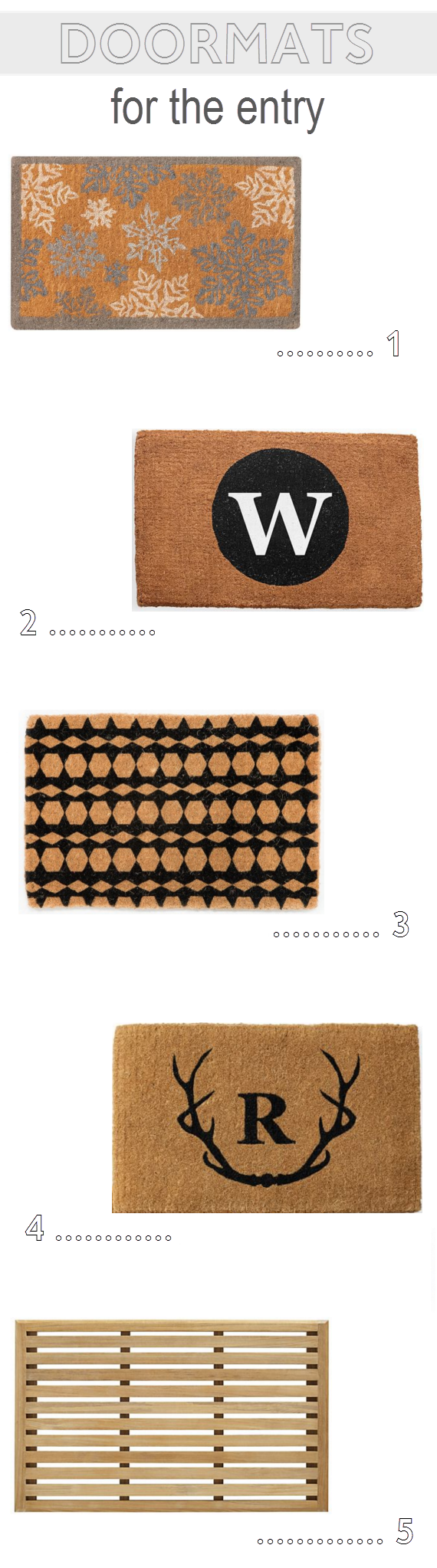
1 // 2 // 3 // 4 // 5
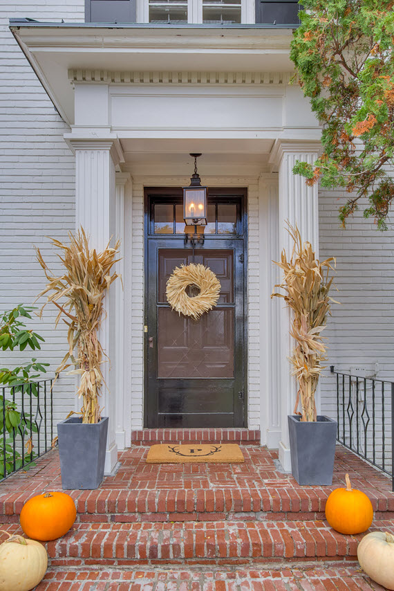
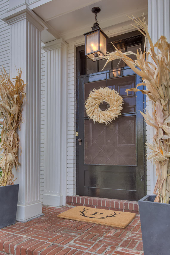
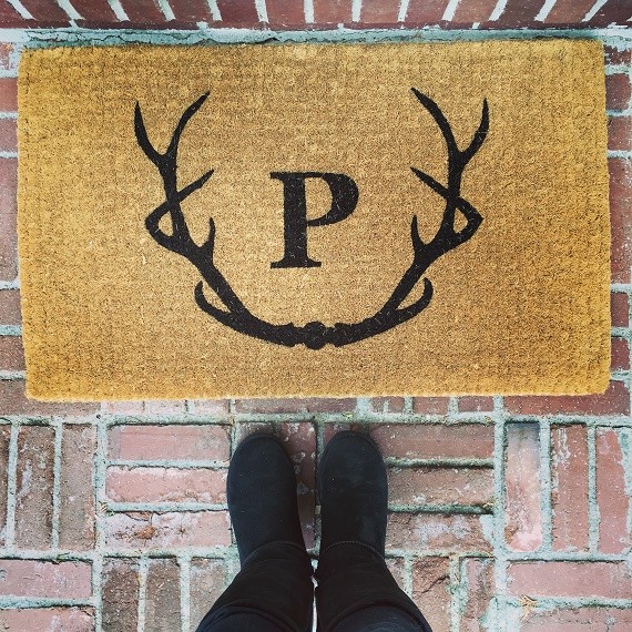
I quickly narrowed down the options to doormats that could be personalized. I’m a sucker for monograms so I ended up selecting the Antlers Graphic Doormat from Mark and Graham (a go to destination for fabulous personalized home decor). It’s was personalized with our family initial. Here’s the image I shared earlier this week on Instagram. Isn’t it perfect for a mountain house?
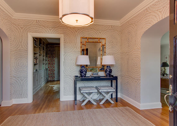
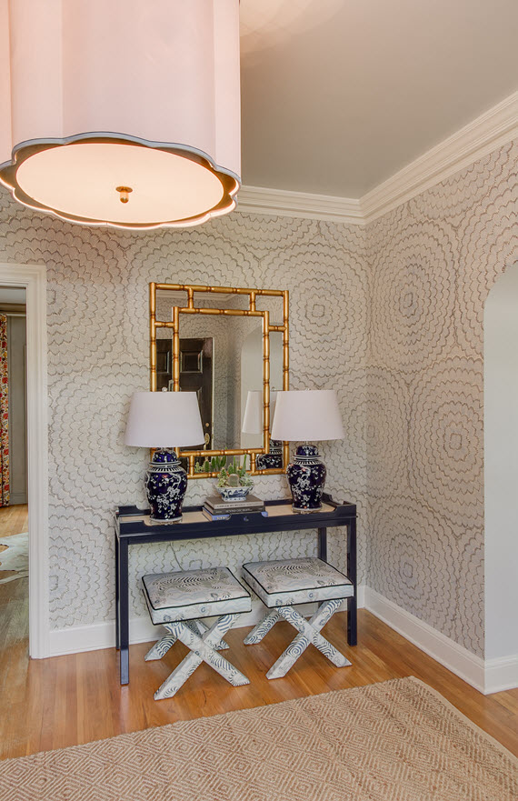
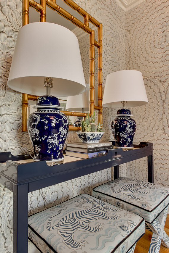
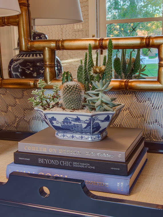
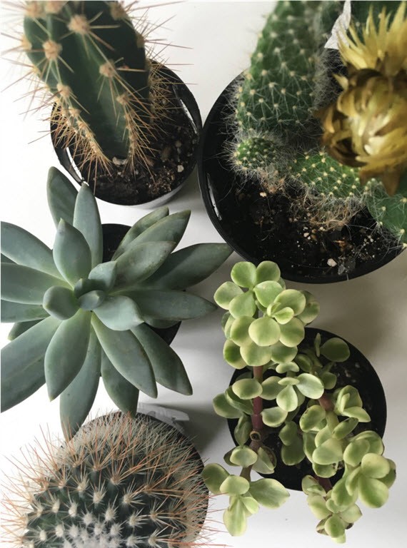
I have a few other accessories to add to the Foyer before the photo-shoot this week. One is a floral arrangement for the console table. I’ve been going back-and-forth on what to do – traditional orchids? cut seasonal flowers? cacti & succulents? I’m still deciding.
Again, I’m keeping hope that the stair-runner will be installed soon and would love for you to drop by next week to see the final reveal!
Check out what the other ORC participants are up to – holy cow, there’s so much talent here!
* Big thank you to Minted and Mark and Graham for their support and sponsorship of this challenge!

 Follow