It’s here and all I can think of is how quickly the past six weeks have flown by! Today’s the big reveal of my Foyer for the One Room Challenge and I couldn’t be more excited to share it with you. It’s such a happy space and am thrilled with the result!
As you may know, for the past several weeks I’ve been sharing the whole design process (including all the ups and downs!). In case you’ve miss any and need to catch up, here are the links:
Week One – Foyer Before // Week Two – Wallpaper & Paint // Week Three – Furnishings // Week Four – Lighting // Week Five – Art & Accessories
To refresh your memory and to appreciate the transformation, I’ve included a few before images in combination with the reveal images.
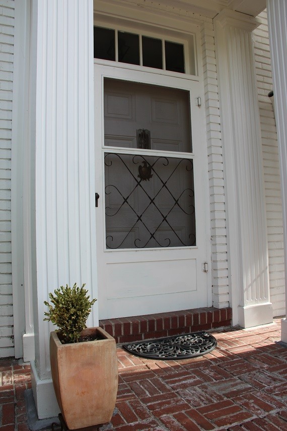
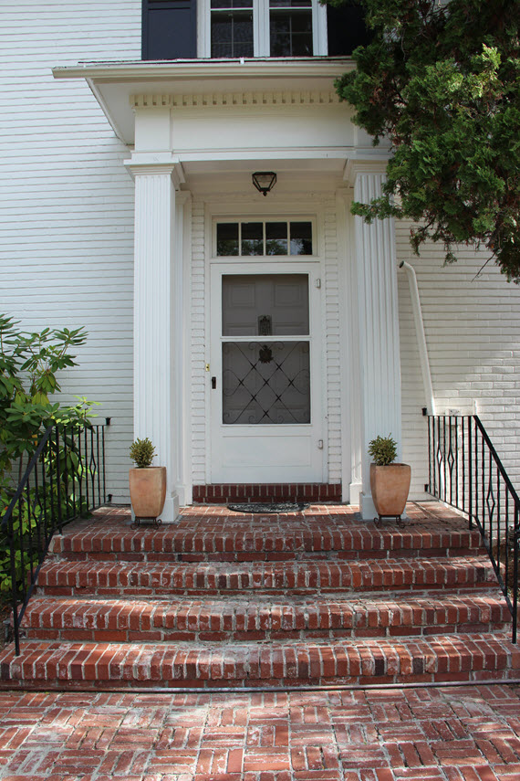
ENTRY BEFORE ::
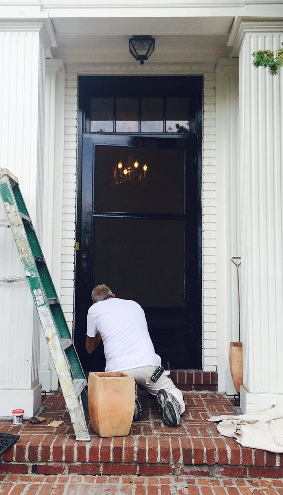
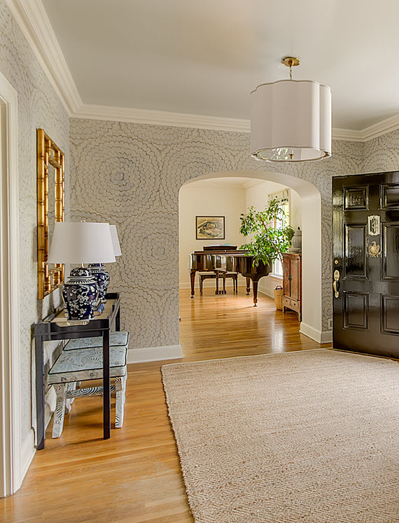
ENTRY AFTER ::
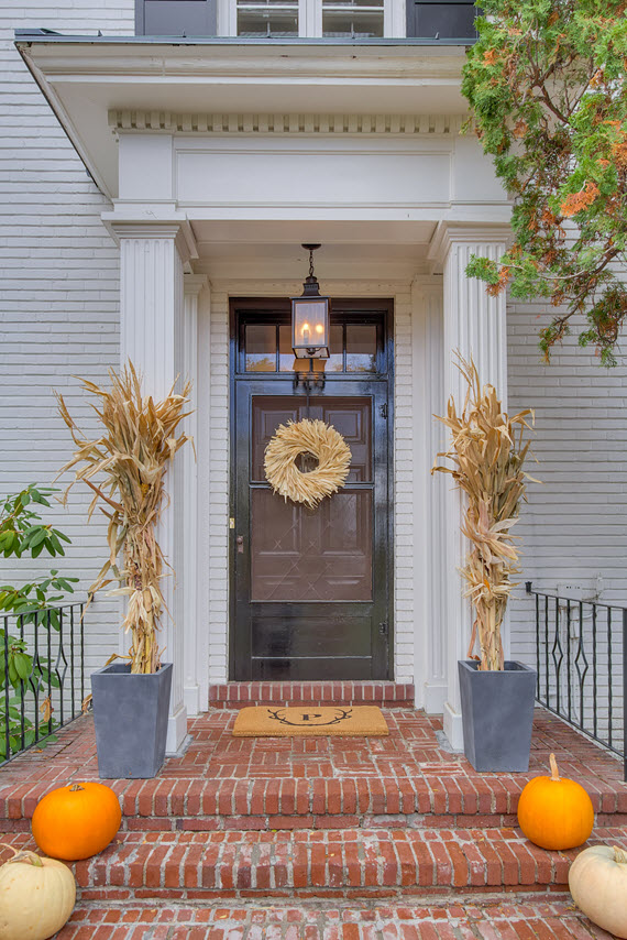
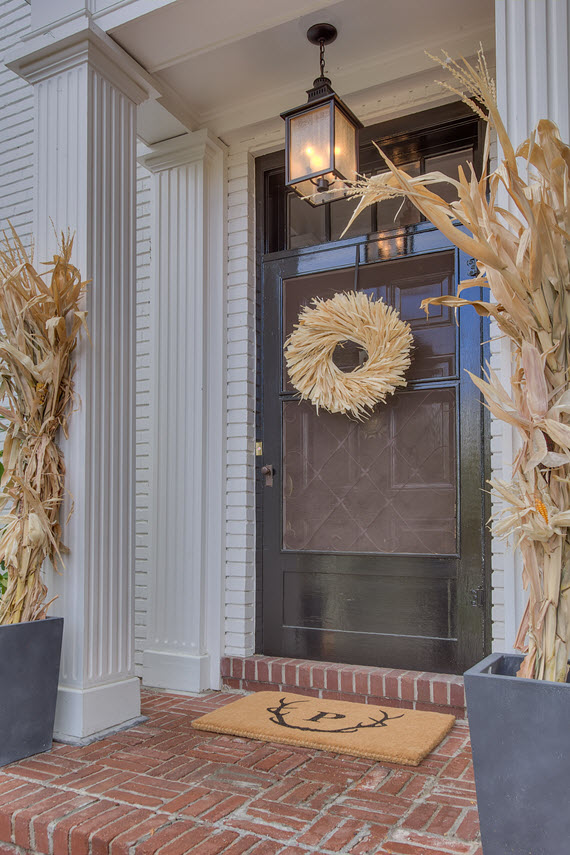
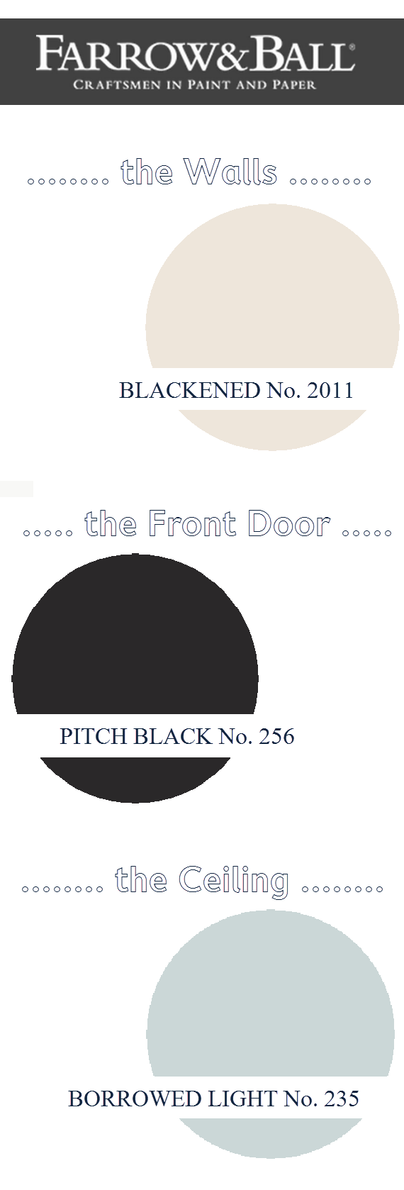
I love the new black door painted in Farrow & Ball’s Pitch Black. It makes such stately entrance to our home. The handsome hanging lantern via Lowes was also a terrific addition. And isn’t the antler doormat by Mark & Graham just perfect?
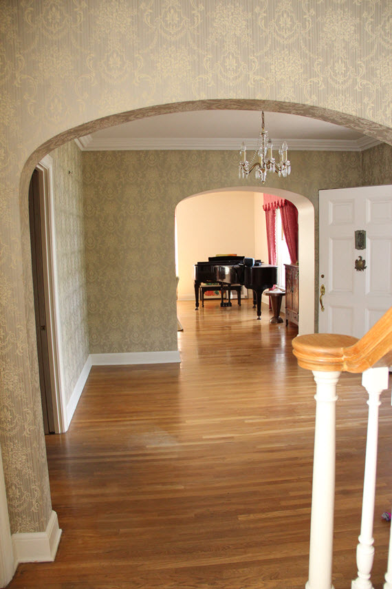
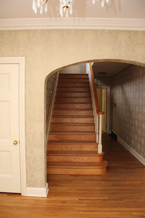
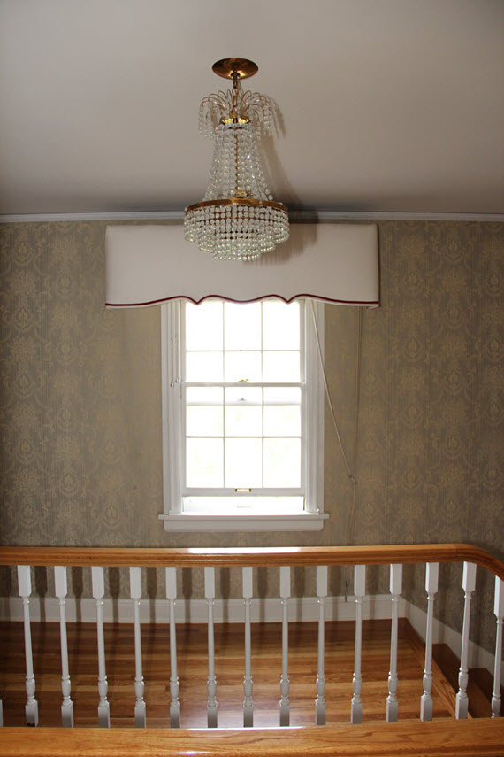
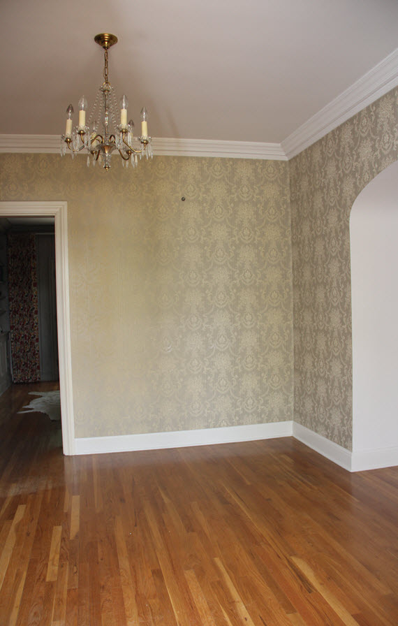
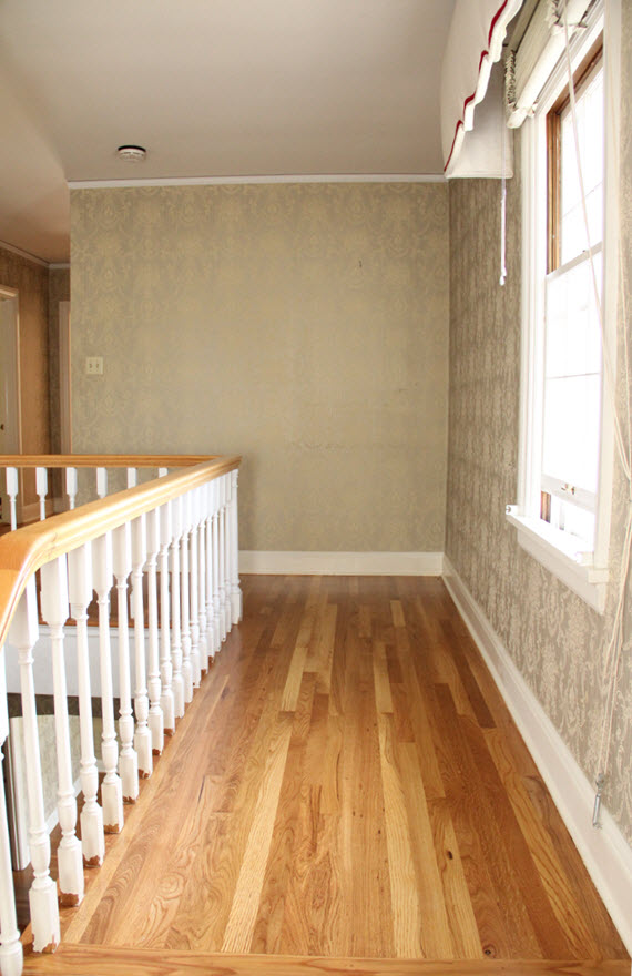
FOYER & STAIRCASE BEFORE ::
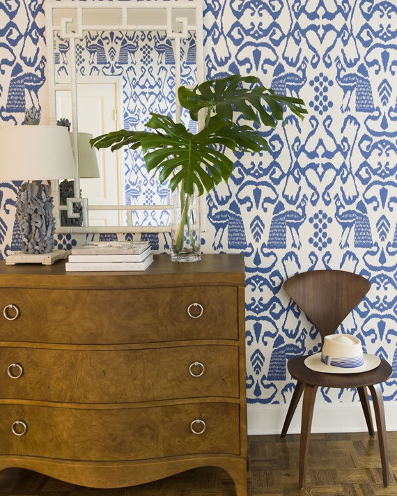
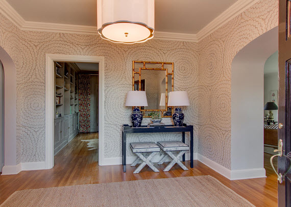
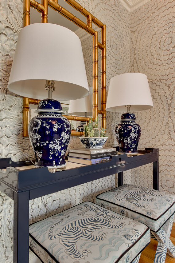
FOYER & STAIRCASE AFTER ::
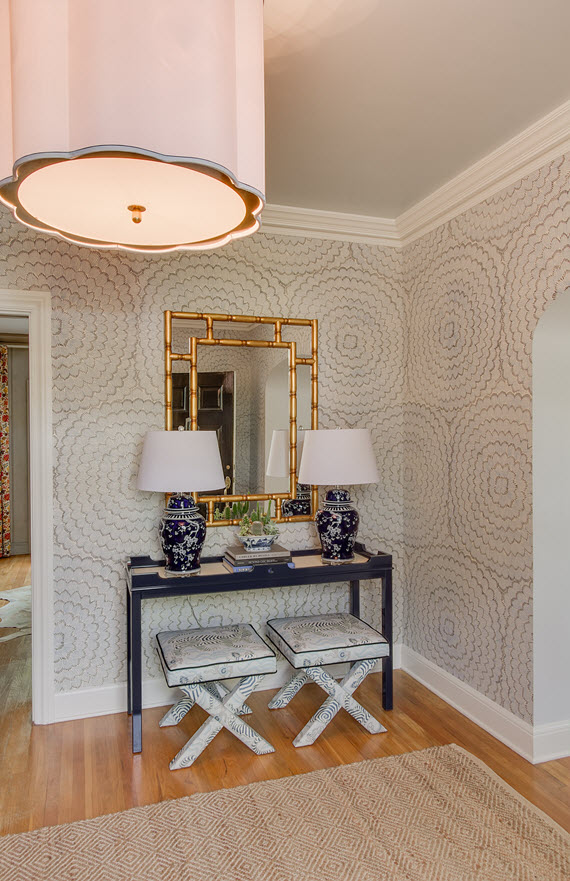
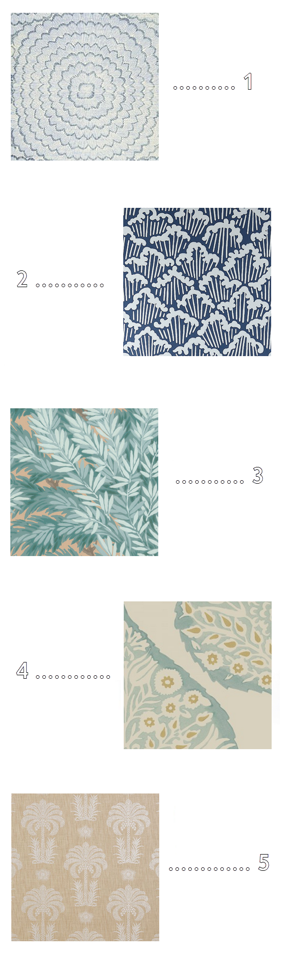
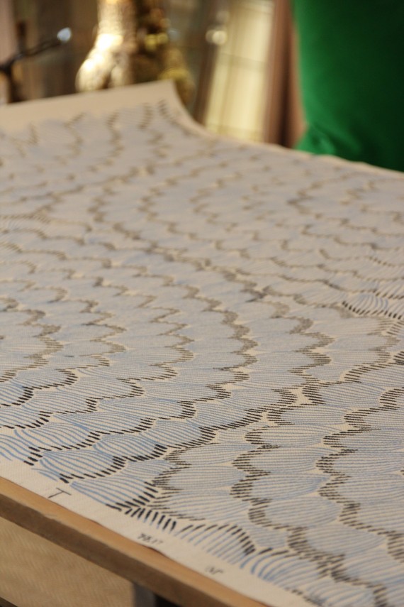
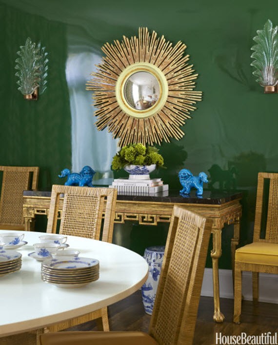
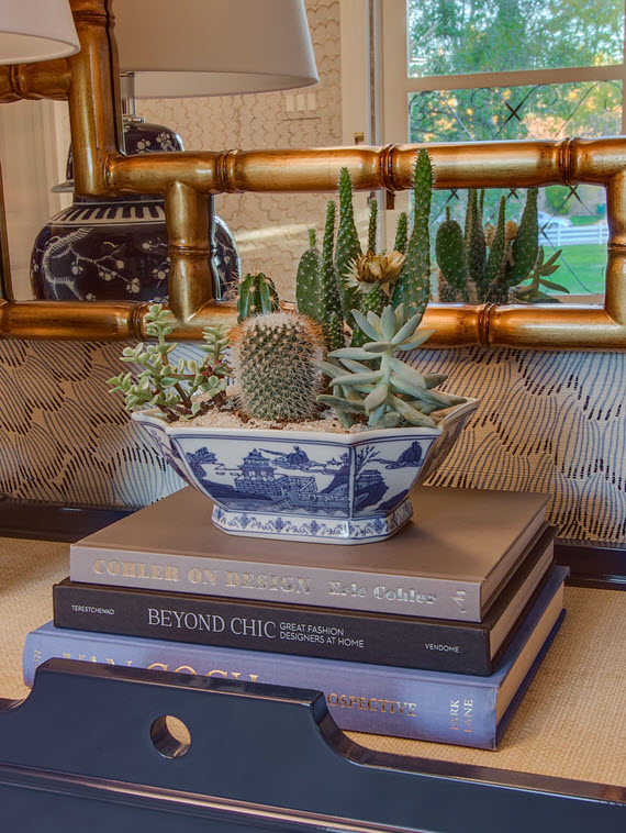
This is really a happy space. I’m in love with it all. The large-scale feather bloom wallpaper by Celerie Kemble for Schumacher sets the tone immediately. The gorgeous navy lacquer console by oomph is the perfect compliment. I’m also so pleased with the chinoserie chic touches in the fabulous x benches in Clarence Houses Tibet Print, gilded faux bamboo mirror, pair of elegant table lamps and vintage blue & white porcelain bowl housing the cacti & succulents.
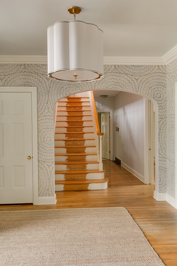
As I mentioned in this post, the stair-runner got held up in customs. Unfortunately, it still hasn’t arrived. I’m so bummed not to be able to show you a finished project, but the reality is that sometimes we have no control over these things. It’s a great lesson in patience in this need to have it now society. When it is installed, I will be sure to share it with you! I still love this image because it showcases the lovely scalloped pendant from Bellacor and high-gloss painted ceiling in Farrow & Ball’s Borrowed Light so beautifully!
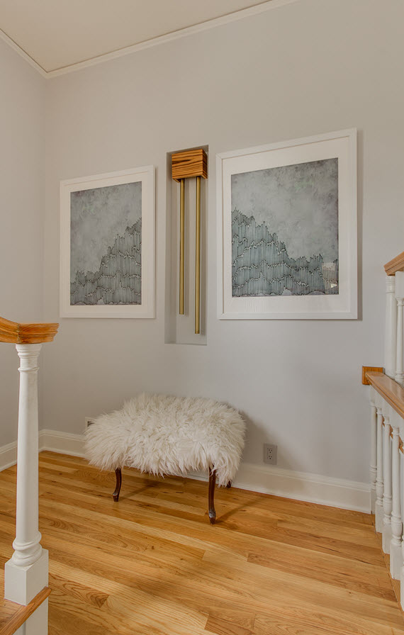
I also love how the staircase landing turned out. The dyptich artwork through Minted compliments the original door chimes which we modernized by adding a clean-lined teak cover. For texture and to balance the space, I added a small bench covered in a cozy sheepskin rug.
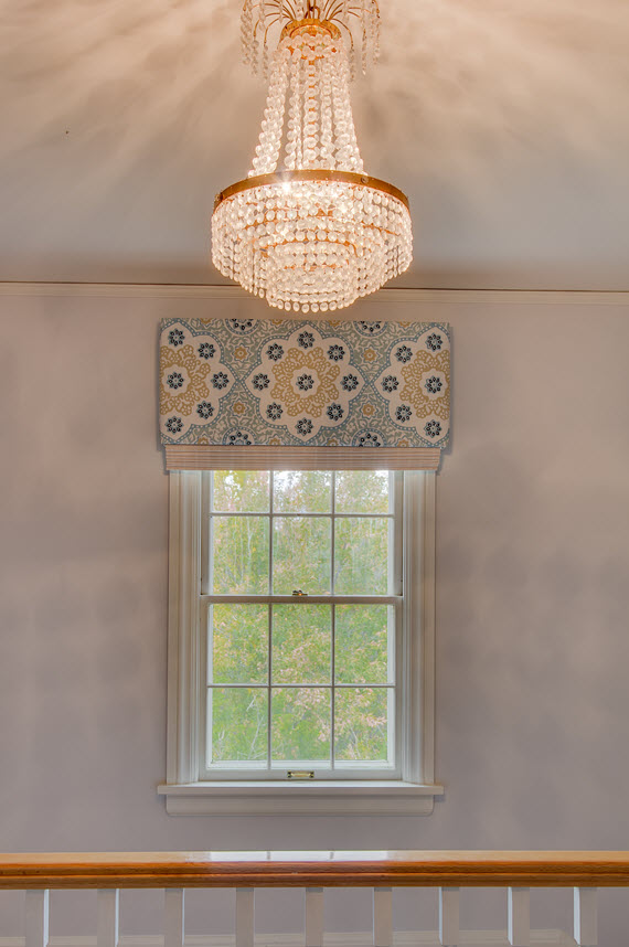
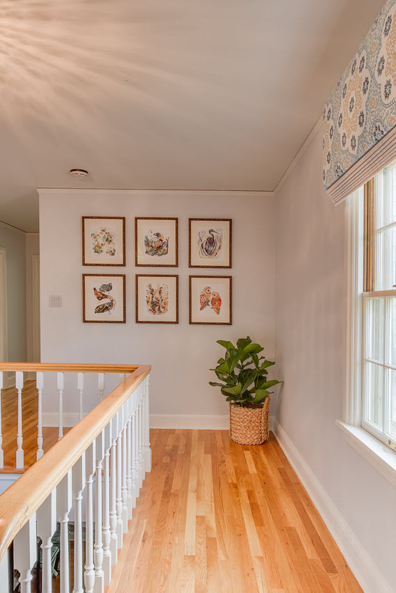
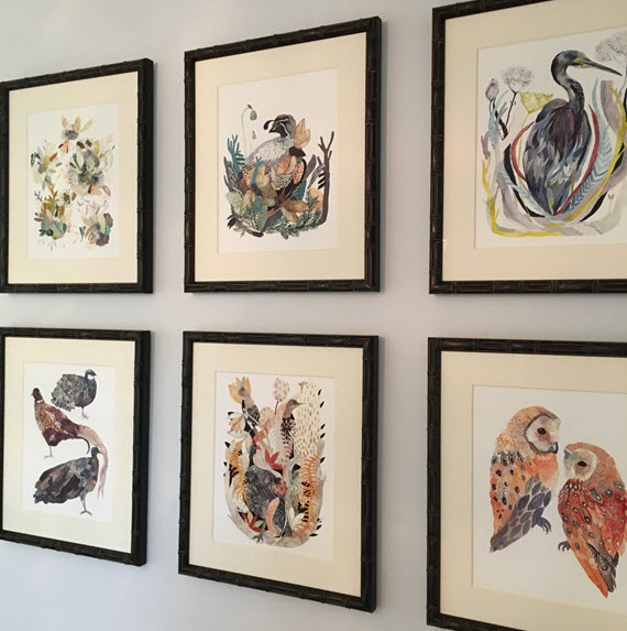
At the top of the stairs, I left the original vintage chandelier – it is so timeless that it didn’t need to be changed out. However, I updated the window valance and have it covered in a beautiful hand-blocked textile from Galbraith & Paul. It’s layered it with a matchstick woven roman shade in white. The adjacent gallery wall filled with Michelle Morin’s whimsical birds and bees is another spot that makes me smile.
SPONSORED SOURCES ::
farrow and ball paint // oomph console table // decoratorsbest fabric for x benches // bellacor pendant light // bassett mirror table lamps & wall mirror // minted dyptich artwork // lowes outdoor lantern // mark & graham doormat
ADDITIONAL SOURCES ::
celerie kemble wallpaper for schumacher // vintage blue & white bowl via chairish // artwork by michelle morin // natural diamond pattern rug // sheepskin rug for bench // corn-husk wreath // seagrass basket for the fiddle fig // x benches by livenupdesign
PHOTOGRAPHY :: candace & kurt williams of photo-tecture
Thank you so much for following my One Room Challenge journey! I’ve been so touched by all the lovely comments and encouragement.
Now to all the other final reveals of the other 19 ORC participants – I’m so excited to see all the gorgeous interiors from this talented group!
A huge thank you to Linda at Calling it Home for organizing everything, securing such fabulous sponsors and including me in The One Room Challenge Fall 2015! It was such an incredible experience and one I’d be honored to do again!
 Follow