Tag Archives | One Room Challenge

One Room Challenge :: Week 3

It’s already week three of the One Room Challenge! If you are dropping by for the first time, here’s the first and second weeks to get you caught up on all the action.

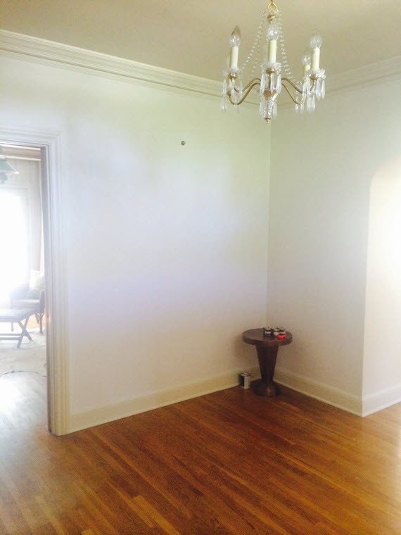
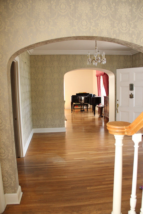
Today I’ll be sharing my process of selecting furniture for the Foyer. The 12′ x 12′ space only has one wall (opposite the front door and approximately 7′ long) that’s suitable for furniture. The question then becomes which pieces and in what configuration? Here are some of the options I considered:

fabulous entryways // Erin Gates Design

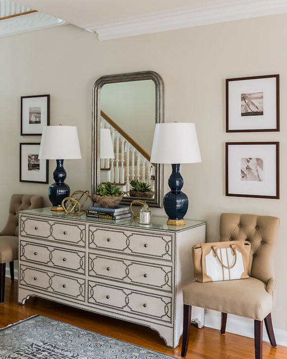
This entry by Erin Gates is beautiful and a chest flanked by upholstered chairs is a great, functional furniture arrangement for an entry. This English Colonial style dresser would have worked however, I didn’t want a visually heavy chest of drawers in the space.

small entry with baskets // via www.simplifiedbee.com

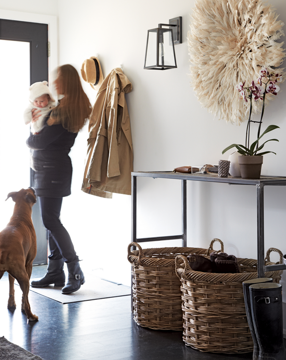
This charming small entry (via Chatelaine) features a clean-lined console table and large baskets to corral shoes. I love the simplicity and functional aspects of the space, however I was seeking more color and upholstered seating.

formal entry with bench // via www.simplifiedbee.com

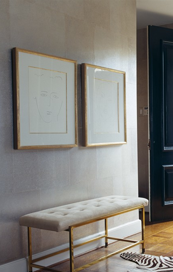
Benches are also great furniture options for Foyers. I love this tufted bench with polished brass base. Such an elegant look, however I longed for a console table. So I decided on another great furniture arrangement for our entry.

entry with console and x benches // tami ramsey

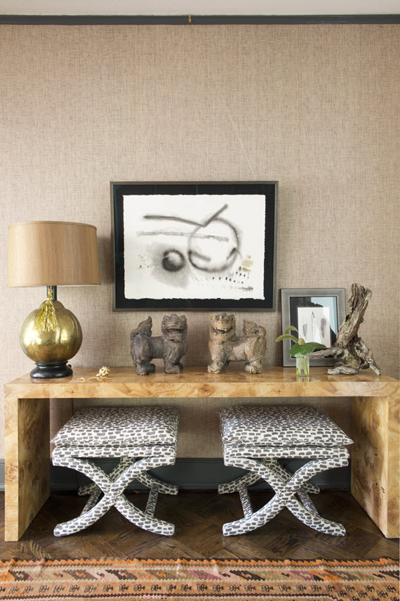
This entry designed by Tami Ramsey has a similar furniture arrangement I was looking for. A chic console and a pair of upholstered benches that could be tucked under. I love the chinoiserie touches here too!

oomph console tables // one room challenge // www.simplifiedbee.com

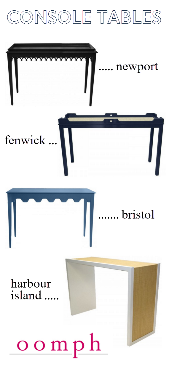
With the furniture arrangement set, I immediately thought of one company that creates the most amazing custom furniture, unique lighting and in particular gorgeous console tables: oomph. Their signature traditional, with a twist style was just what I was envisioning for the foyer. With several beautiful styles, 16+ colors and intriguing surfaces to choose from, I selected the stately Fenwick console in club navy with a linen surface. And I LOVE it. And a huge thank you to oomph for their support and sponsorship!

X bench // clarence house tibet print // by @simplifiedbee

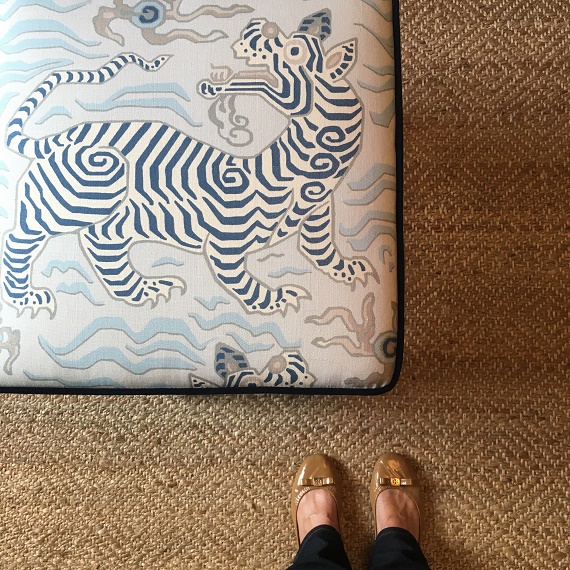
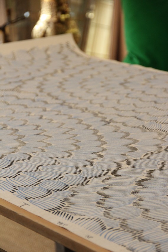
From there I selected a fabric for the pair of X benches. I’ve had my eye on Clarence Houses’ Tibet Print for some time. It’s exotic, playful and in pale blue picked up on all the right shades for the Foyer. The textile was purchased through ORC sponsor, DecoratorsBest – a go to destination for over 200,000 designer fabrics, wallpaper, trim, pillows and rugs at fantastic prices. LivenUPdesign (via Etsy) created the X benches in just the right dimensions to fit under the console table.  They centered the tiger perfectly on the tops of each bench and were so lovely to work with.

faux-bamboo mirror // sloan mirror // @simplifiedbee

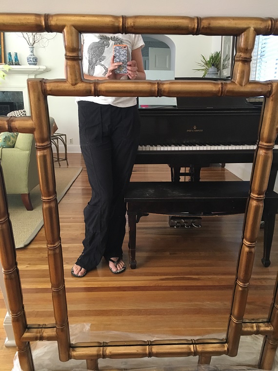
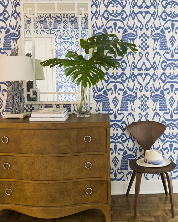
I love mirrors in entryways (they are practical and can add light to the space) and knew that I wanted to place a large one over the console table. Because I’d selected so many pieces in shades of blue, I wanted the mirror to be different. After considering tons of options through ORC sponsor Bassett Mirror (fabulous selection of lamps, mirrors and furnishings at great price points!), I selected the Sloan mirror (above). It’s rectangle shape wouldn’t compete with the wallpaper pattern like a round mirror would. I also loved the gilded faux-bamboo finish – a chic chinoiserie touch.

Here’s a look these and some other selections for the Foyer all together:

foyer selections // one room challenge // www.simplifiedbee.com

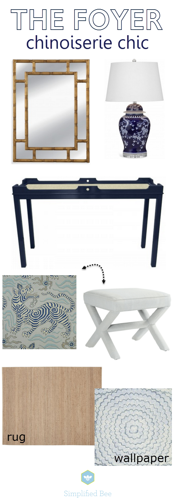
Selections for the Foyer and why:

gilded faux-bamboo mirror – because I love an entry with a mirror and love for bamboo

chinoiserie table lamp – because of their chinoiserie style and deep navy color (I’ll go into more detail regarding lighting next week!)

fenwick console table – because of it’s scale, neo-traditional style, durable lacquer finish and custom options

clarence house tibet print in pale blue  – because it’s a chic, yet playful chinoiserie print in all the right shades of blue perfect to liven up the  X benches

diamond natural fiber rug – because the space needed a neutral, warm element without a busy pattern

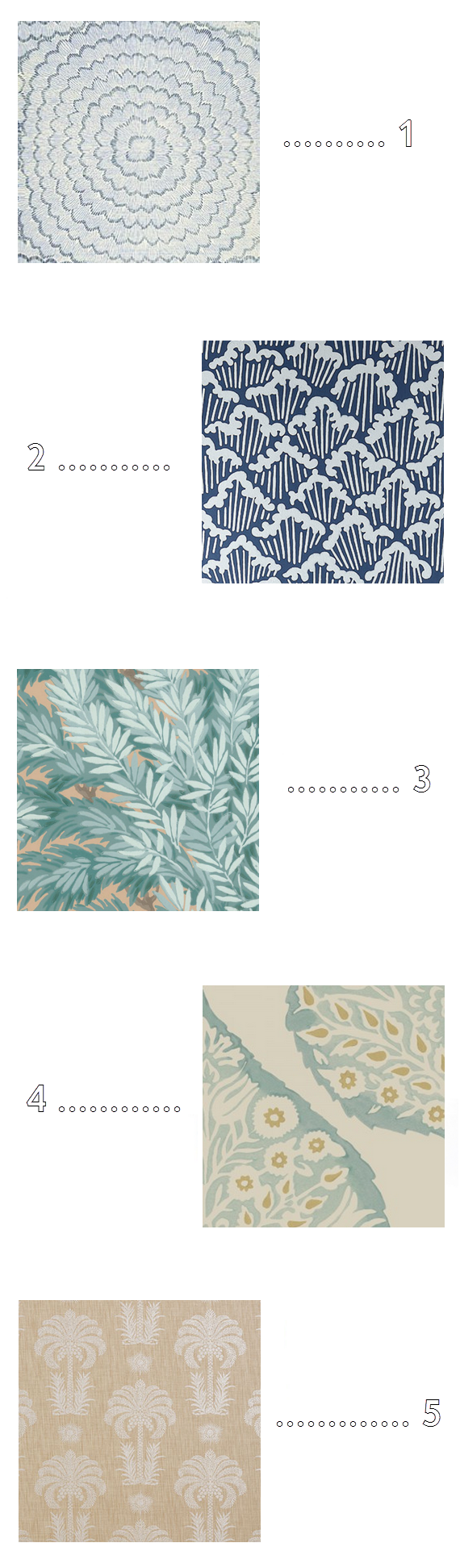
celerie kemble bloom wallpaper – for all the reasons mentioned in this post 🙂

I hope you’ll check back next week to see more progress! In the meantime, don’t forget to drop by to see what the other ORC participants are up to. There are so many incredible projects in this group!

Related Posts Plugin for WordPress, Blogger...
Read full story By on October 21, 2015 in chinoiserie, console tables, etsy, foyers, furniture, interior design, Interiors, mirrors, tables, textiles, upholstery

One Room Challenge :: Week 2

blue & white wallpaper // entry // JK Kling Associates

The vignette by JK Kling Associates above is fresh and inviting – just the way I want our Foyer to feel.  The existing 1970s textured wallpaper not only covered the walls in the Foyer, but extended down the hall, up the stairs and then down a very long hallway. It was way too much pattern and 70s flair for me, so it had to go.

wallpaper removal // one room challenge // www.simplifiedbee.comwallpaper removal // one room challenge // www.simplifiedbee.com

There is always a big unknown when you start removing wallpaper in an older house. How easily will it come off? Will the walls be in good shape? In our case, there were three layers of wallpaper. The first (hard to see in the above image) was a true paper wallpaper and had a subtle toile pattern from the 1940s. The second (my favorite) had a beautiful teal and steely blue leaf pattern. Really stunning. The third of course was the textured 1970s damask pattern in an faded olive green.

wallpaper removal // one room challenge // www.simplifiedbee.com

Once the layers of wallpaper was removed from the foyer and hallways, we were blessed with gorgeous plaster walls. Yes, the original plaster walls were in perfect condition and smooth as silk. After a coat of primer, they were ready for the next phase. Paint or wallpaper? From the start I knew I wanted to hang new wallpaper in the foyer, so that’s the first material I sourced. Here are a few that made my short list:
orange_blue_chinoiserie_wallpaper_thumb25255B125255Dfoyer design process // one room challenge // www.simplifiedbee.com

1 // 2 // 3 // 4 // 5

In the end, I selected Celerie Kemble’s Feather Bloom for Schumacher. It’s an embellished grasscloth that features a hand printed over-scaled floral motif in shades of China blue. The choice is a bold one and I’m definitely taking a risk on this!

Celerie Kemble Feather Bloom wallpaper // one room challenge // www.simplifiedbee.com

The blue color scheme was a great one as well because it coordinates with the palettes in the adjacent living room, library and dining room. It’s my opinion that color palettes in side-by-side rooms should coordinate to create flow and bridge a story from one room to the next.

paint color sampling // ORC // www.simplifiedbee.com

For this reason, it was important to select paint for the hallway walls in a color that would compliment the cool wallpaper tones, yet still be neutral and contemporary. With the help of Farrow & Ball (a fabulous ORC sponsor), I narrowed down the wall color to Blackened No. 2011. It is the coolest of their whites and changes in intensity depending on the light. A perfect color to let the beautiful architecture of the is home take center stage.

Farrow & Ball Borrowed Light // www.simplifiedbee.com

In the Foyer, I decided to add a little drama and glam by having the ceiling painted in a shade of blue. After going back and forth on Parma Gray No. 27 or Borrowed Light No. 235, I selected the lighter shade of Borrowed Light. The light blue picks up hints of gray and in a high gloss reflects light beautifully.

front door before // ORC // www.simplifiedbee.comfront door // farrow & ball pitch black // www.simplifiedbee.com

The Front Door was all white like the rest of the outside of the house, so to add contrast and to create a more stately entrance, I had the front door, screen and transom window painted black – an accent already used on the shutters throughout the house. I selected Farrow & Ball’s Pitch Black No. 256 in a high gloss. Classic. Timeless. Love it!

Here’s a breakdown of the Farrow & Ball paint colors used for my One Room Challenge. Also, be sure to check out their amazing new wallpaper collection that launched this fall!

farrow_and_ball_paint_selections_ORC

Please check back next Wednesday – I’ll be breaking down furniture selection!

Don’t forget to check out the progress of the other One Room Challenge participates… there’s lots of magic happening!

The One Room Challenge is Trademarked by Calling it Home. Huge thank you to Farrow & Ball for providing paint for the Foyer! 

Related Posts Plugin for WordPress, Blogger...
Read full story By on October 14, 2015 in color, foyers, interior design, Interiors, simplified bee portfolio, vintage, wallpaper

One Room Challenge Fall 2015 :: My Foyer

For the past few months I’ve been keeping a few secrets. The first is we’ve moved! You may have seen glimpses of our beloved ranch style home on the San Francisco Peninsula featured in Rue Magazine. We have so many fond memories of the house, neighborhood and community. It was a very difficult decision to move outside the San Francisco Bay Area and away for dear friends, but we were longing for a slower pace and to be closer to Lake Tahoe where I grew up. We were blessed to find a wonderful 1940s traditional style house in the Reno / Tahoe area that we fell in love with. The only catch is it needs a gut job ton of work. It’s the money pit an adventure! So when Linda of Calling it Home offered me a spot in her One Room Challenge (aka ORC) this fall, I jumped at the chance (that’s the 2nd big secret I’ve been keeping!). For those that don’t know, the ORC is a collection of 20 bloggers that take on the challenge of making over one room in six weeks.

One Room Challenge Fall 2015The first challenge for me in the process was determining which room would get the face-lift. The 1970s kitchen? The dis-functional laundry room? Our pink master bath? Every inch of this home and property is vintage and needs some TLC! I ended up deciding that the Foyer was a great place to start for several reasons. One, it welcomes our guests and is a great space to set the tone of the home. It is also a room that will not have any walls, windows or doors changed out or moved at a later date.

Over the course of the next few weeks, I will be sharing my design, the process and many of the sources used throughout. Each Wednesday, there will be a new blog post as well as Instagrams, Tweets and Facebook posts. I hope you will follow along!

Here’s a look at the space before – starting from the front door and leading up to the upstairs landing.

traditional front door // ORC before // www.simplifiedbee.comFoyer Before // ORC // www.simplifiedbee.comFoyer Before // ORC // www.simplifiedbee.comFoyer Before // ORC // www.simplifiedbee.comFoyer Before // ORC // www.simplifiedbee.comFoyer and Landing Before // ORC // www.simplifiedbee.com

I’m thrilled and honored to be among the following bloggers chosen for the One Room Challenge Fall 2015 edition!


ORC would like you to join in the fun too! Tomorrow, Thursday, October 8th, it’s the return of the One Room Challenge™ Linking Event. For six consecutive Thursday’s you show off your transformed room as well.

*all photos by Cristin Priest of Simplified Bee

**The One Room Challenge is Trademarked by Calling it Home

Related Posts Plugin for WordPress, Blogger...
Read full story By on October 7, 2015 in foyers, interior design, Interiors, simplified bee portfolio, traditional, wallpaper