Archive | living rooms RSS feed for this section

Design Tips For Styling a Living Room

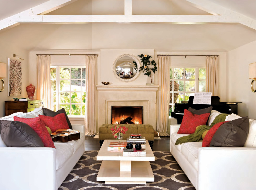
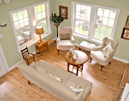
Recently, Canadian House & Home published a great blog article, Styling a Room by Michael Penney. I completely agree with Penney; It’s the layers that make a room and pull it all together visually. In the before photo above, the living room has some nice design elements, but is unbalanced, uninviting and lacks a focal point.

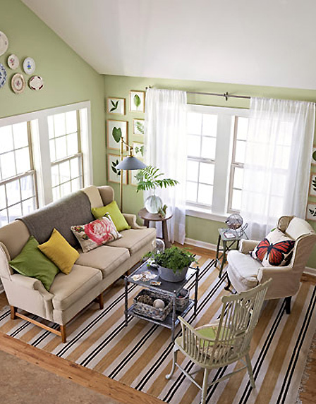
The after photo below (via Country Living), shows what a little styling can do. As Penney points out, a few design elements haven’t change including the sofa, wing chair and wall color. Here are some principles and elements of design that come to play in this redesign:

Define the Space
The most obvious addition in the room is the striped area rug. In addition to anchoring the furnishings and defining the space, it also brings needed texture to the space. When purchasing a rug, it is important to find one that is large enough so that all your furniture fits (it’s okay if the back half of a chair or sofa are not on the rug, but the front half should).

Establish a Focal Point
New drapes, parallel furniture arrangement and artwork in a vertical pattern emphasizes the room’s architectural window and creates a needed focal point in the room. However, I would have added the same drapes to the adjacent window for a more balanced look. This leads me to my next tip;

Create Balance Through Scale and Proportion
The original room also had too much visual weight or mass. In the styled room, one wing chair is replaced with a lighter Windsor chair. Mixing materials can also help balance a room. In this case a metal coffee table takes the place of a wooden one (too many wood elements in the before room). Equilibrium is also achieved by the parallel furniture grouping.

Build Color Harmony
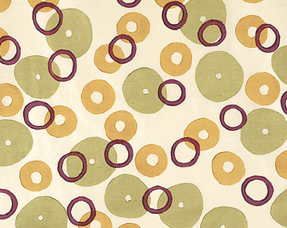
Pulling from the room’s wall color, solid yellow and green throw pillows are added to the sofa creating a more harmonious color palette. However, I would recommend at least one textile print for a pillow, window treatment or chair that pulls all of the primary colors in room’s palette together. Galbraith & Paul’s Donuts pattern in warm would be a good choice for this living room.

What elements of design helped you pull together a space?

Related Posts Plugin for WordPress, Blogger...
Read full story By on February 24, 2010 in color, Design Tips, interior design, Interiors, Living Room, living rooms, Tips/Tricks

San Francisco Indochine Style: Leslie Lundgren Design

San Francisco Peninsula-based interior designer, Leslie Lundgren worked hand-in-hand with her San Francisco client who has both French and Vietnamese ties to create a look delicately blending the two. The result is a stunning, sunlit Pacific Heights flat in a luxurious “Indochine” style. Furnishings and decorative items were either family heirlooms, picked up on travels aboard or in San Francisco’s China Town.

Lundgren used a traditional French palette of vivid yellow, jade green and coral red. Here in the living room, the walls are painted in Benjamin Moore Dalila 319. Two antique Louis XV armchairs in jade green mohair are placed in front of an antique Italian desk with exquisite marquetry. Atop the desk sits a sweet antique French mantle clock. A large Louis Philippe walnut armoire makes a beautiful backdrop.

Opposite the Louis XV chairs Lundgren places loveseat sofas in a warm coral velour fabric by Clarence House. Throw pillows in an Italian “fortuny-esque” fabric adorn the sofas. The floor to ceiling drapery fabric and silk tassels were purchased at Bouchara in Paris. A Chinese red lacquer trunk is converted into a coffee table and stands over a gorgeous silk and wool Chinese art deco rug. A beautiful French 1940’s wheat motif brass floor lamp is placed in the corner next to the sofa. The focal point of the room however, a large scale Chinese ancestor painting, is a family heirloom.

In the dining-family room, a limed-oak pedestal table is surrounded by reproduction Louis XV chairs. The worldly tablescape includes an Argentinean silver pitcher, Point a La Ligne candles and a 1970’s green vase made by a family friend. A collection of blue and white Delft plates are mounted on the wall.

In the family room, Lundgren brilliantly mixes color, texture and old & new by placing a zebra rug from Cost Plus World Market at the foot of a Chinese moon face traditional red lacquer armoire.

Lundgren creates a delightful bedroom retreat with a beautiful canopy over the bed in English Chintz fabrics. Fresh sunflowers and a green Tole Lamp add just the right decor to the red bedside table.

Lundgren’s sophisticated East meets West style is evident in this design and perfect for the culturally rich city by the bay.

Leslie Lundgren Design * leslie@maisonmondiale.com

I don’t know about you, but I’m still drooling over those antique Louis XV armchairs in jade green mohair!

*photos courtesy of Leslie Lundgren Design

Related Posts Plugin for WordPress, Blogger...
Read full story By on February 17, 2010 in antiques, chinoiserie, interior design, living rooms, upholstery

Painting an Old Brick Fireplace

This post was originally published in December 2009 and​ with fireplace season here I thought it would be a great time to re-share with everyone.

Decorating your fireplace mantel is one thing, but what if your brick fireplace is distressed, cracked or just an eye-sore? With economic times being tight, most don’t have extra cash to hire a professional mason to repair damaged brick and crumbled mortar.

One solution is to simply paint over old, dingy brick. Painting bricks white like in this living room from young house love, creates a clean and contemporary look.

Of course I wouldn’t think of painting an antique fireplace like the one shown above, but would consider it if constructed in the 1960s or 1980s, which is when the majority of masonry fireplaces in the United States were built.

Because I have never had to restore a brick fireplace, I assumed that just any old semi-gloss paint and technique would due. After looking into it further, I found that it is difficult to keep the brick’s look and texture when simply using standard paint. In addition, standard paint is not designed to be heat resistant and will blister and peel if it gets too hot.

Here is a before {above} and after image of a red brick fireplace that was restored with a new coat of paint from Brick-Anew – a kit designed for you to change your brick’s color while keeping the texture. I haven’t used the product, but the transformation as you can see is impressive.

In addition to painting the bricks, the homeowner removed the built-in stair-step brick shelves using a chisel. A simple mantel was added to finish off the look. What an improvement, don’t you think?

*images courtesy of Coastal Living, Young House Love and Brick-Anew

**disclosure – Brick-Anew is a Simplified Bee affiliate partner

Related Posts Plugin for WordPress, Blogger...
Read full story By on December 10, 2009 in interior design, living rooms

Tia Zoldan Interiors – Sophisticated Del Mar Home

Los Angeles-based interior designer, Tia Zoldan was tasked with the challenge of transforming a traditional home into a sophisticated space that remained beach-casual and kid-friendly. And, boy did she succeed. The single-story 4,000 square foot three bedroom, four bath home located in Del Mar, California had an existing semi-open floor plan. To ensure visual flow and connectivity, Zoldan used a common color scheme of gray, white and black as a base with hints of bright color throughout the home.

In the living room, Zoldan lines the room with custom sofas by Holly Hunt in a durable, brushed white velvet (she swears it’s a kid-friendly fabric and even tested it by spilling coffee on it!). The symmetrical sofa arrangement forces our attention the the gorgeous limestone fireplace. Zoldan infuses vivid color by adding charcoal gray and bright pink throw pillows to the sofas and an avocado green tufted bench in front of the fireplace. The unifying hand-knotted wool and silk rug is Tibetan and is gorgeous over the dark walnut floors.

The dining room is a bit eclectic with modern, traditional and vintage elements, but Zoldan pulls it together brilliantly. I love the upholstered white chairs with with backs in a bold, textured orange fabric. The light fixture from Foscarini and the zigzag rug by Jonathan Adler add more whimsical elements.

Natural light floods the simple, yet stunning white kitchen. The counter-high table with wooden top serves multiple purposes – it adds visual warmth, a place for family members to gather and of course, an additional food prep area. The white backless stools are from Design Within Reach.

The media room features a large, inviting sectional sofa covered in a gray vintage velvet. Again, Zoldan adds vibrant pops of color with a collection of solid and geometric throw pillows. I am curious to know what color gray paint she used on the walls and cabinets.

The sweet, yet sophisticated girl’s room in purple, pearl and beige is certainly one that any age would love. The beautifully designed headboard is brilliant with the pearlescent wallpaper, mirrored chest and chenille rug by Madeline Weinrib. I should have featured this room in a previous post,
Interior Design Color Trends for 2010 – Purple.

The tranquil, airy master bedroom features beautiful windows with ocean views. Zoldan uses the perfect mix of colors throughout the room. The dark gray custom bench and tufted headboard contrast beautifully with milky bed linens.

The serene master bathroom is perfection. The beautiful floor-to-ceiling Calcutta marble tile was vertically set. The raspberry bench with lucite X legs and glass light fixture are fabulous!

I am loving Zoldan’s design and the down-to-earth feeling this home communicates. How about you?

*images from Luxe Magazine
Related Posts Plugin for WordPress, Blogger...
Read full story By on November 12, 2009 in bathrooms, bedrooms, dining rooms, girl's bedroom, interior design, kitchens, living rooms