Archive | interior design RSS feed for this section

Interior Design Tips for Maximizing a Small Living Space

I’m thrilled to announce that Michaela of Michaela Noelle Designs and an interior design student will be a summer contributor here at Simplified Bee. Earlier this year she wrote a great article on Color Psychology in Interior Design. Today, she will be giving us design tips for small spaces. Thanks Michaela!


I’m so excited to be here sharing on Simplified Bee today. I adore Cristin- we had the chance to meet a few months ago and she really is such an inspiration to me.  Today, she’s asked me to share my take on easy ways to maximize a small space.  This past school year I lived in a very tiny apartment, and while I couldn’t make any serious changes because the apartments were owned by the school, I sure spent plenty of hours thinking about what I’d do if I could!  That’s just how the designer brain works…always thinking of how to improve a space (: 


Let’s dive in!

Top Ways to Maximize Your Small Space:

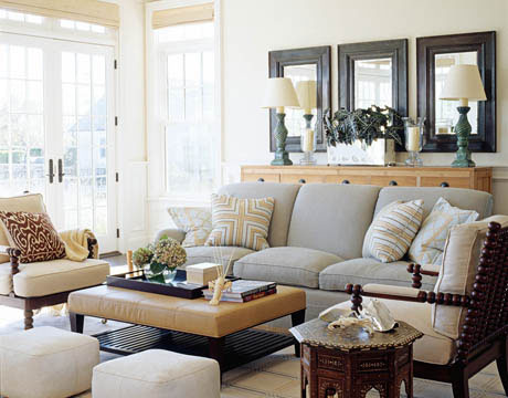
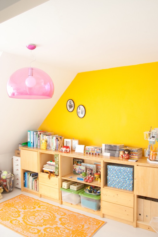
1. Lighter is Brighter.  Soft, neutral colored walls always makes a space appear larger.  While an accent wall here or there is a great idea, darker colors tend to impose on a space, making it feel smaller.  Some smart color choices would be light blue, beige, light gray or a pale yellow.  Add brighter colors in smaller doses like pillows, curtains and art work, if you wish.
Young House Love
House Beautiful
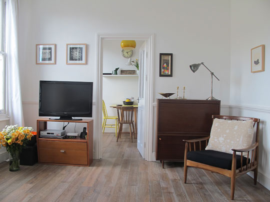
2.  Consistency.  Having a uniform floor running throughout your small space is a way to trick the eye into thinking the space is longer or wider.
Apartment Therapy
3. Mirror, Mirror on the Wall.  Hanging mirrors is a great way to visually maximize space, as it reflects light and enlarges the depth of perception.
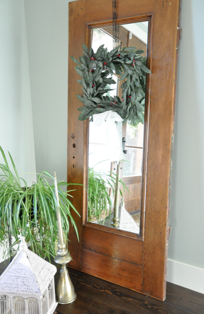
Danielle Oakey Interiors
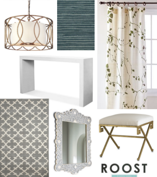
4. Let There be Light.  Smart lighting choices found in fun pendants, chandeliers and other ambient lighting will help keep the space light and bright, thus making it feel nice and spacious.
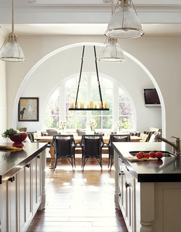
House Beautiful

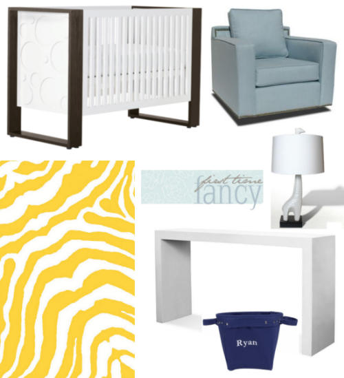
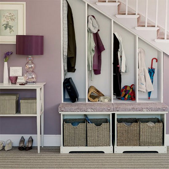
5.  Tuck it Away.  Perhaps the most important way to keep your space feeling larger than it is, would be storage.  There are so many creative ways to keep your clutter out of sight.  Vertical storage in bookcases is a great space saver.  It’s also a fun way to add personality- decorating your bookshelves.  Other storage options include ottomans, buffet tables for your eating space, or a dresser for your entry table.  If you don’t have a linen closet, a dresser is a great option! No one has to know what’s in those drawers (:
Apartment Therapy
Pinterest
With some of these tips implemented into a small home or apartment, you’re bound to fool your guests when the guess your square footage. Hope these helped! Thanks again for having me, Cristin!


xoxo,

Photobucket

Related Posts Plugin for WordPress, Blogger...
Read full story By on June 13, 2011 in Design Tips, home organization, interior design, lighting, storage

Interview with New York Interior Designer Sara Gilbane

Earlier this year, the seasoned, Traditional Home and youngster, Lonny collaborated to create a new digital shelter magazine, TRADhome. In it’s debut issue, TRADhome names 20 New Traditional Designers to Watch. On the coveted list is New York-base interior designer, Sara Gilbane. She is known for her classic modern-traditional style and artfully combining low-key and elegant pieces. Sara’s interiors are chic, yet grounded in practicality.
 
blue-white-suzani-bedding_thumb1
Simplified Bee: When did you know you wanted to be an interior designer? 

Sara Gilbane: After my first day of work at Kemble Interiors. I was thrilled to be working with Celerie Kemble and Christina Murphy and once I dove into those fabrics I never looked back!

blue-and-white-kitchen-banquette-noo

SB: How would you describe your personal style? 

SG: I come from a traditional background and love bold color and pattern mixed with neutrals. My style has a bit of an eclectic loved feel with a sense of calm.

sara-gilbane-living-room-tradhome_th
SB: Who would you most like to collaborate with on a project? 

SG: Architects Peter Pennoyer or Gil Schafer. 

favorite interior designer paints gilbane_thumb[1]
SB: Do you have “go to” paint colors? If so, which ones? 

SG: Benjamin Moore Linen White, Dove White, and Super White are always used on my moldings. Farrow and Ball Skylight is another favorite- a pale grey blue that makes you feel like you have been enveloped in a cloud.

sara-gilbane-bedroom-canopy-suzani_t
SB: Which of today’s interior design trends are here to stay and which ones will we see fade away?

SG: Ikat, zebra, sisal, jewel tones, reclaimed wood, and bold color are all trending but they are classics and will never go away. Perhaps neon is one trend we will (gladly) see go.

sara-gilbane-bedroom-greek-key-beddi
SB: Where do you recommend clients splurge versus save? 

SG: Splurge on drapes, wallpaper, and a custom sofa ( you will LIVE on this for 20 years and it will be amazingly comfortable). Save on cocktail table, side tables, lamps. With this splurge/ save combo the splurge items are so unique people assume the rest of your pieces are special. Then again…. if you fall in love with something, buy it. Since you love it you will always find a way of working it into your next home.

gray-white-linen-dresser-nursery-roo[2]
raspberry-storytime-rocker-chic-nurs[2]
SB: I love the timelessness of the nursery you designed that was featured in TRADhome. Tell us about your favorite design elements in the space. 

SG: We used a classic wool rug with a timeless geometric pattern in charcoal grey, celadon green, and slate blue to hide stains. The room had a tremendously high ceiling so we added silver star wallpaper on the ceiling and a custom painted pale blue and white circus tent stripe on the walls to add a sense of whimsy to the room. The deep mulberry colored rocking chair is one of my favorite pieces. It is so comfortable and the shape makes it perfect for a growing child ( not stuck in a nursery forever).

built-in-bookcase-and-bench-window-s[2]

SB: You are embracing social media and write a blog {Travel for Design}, are on Facebook and can be found tweeting {https://twitter.com/sgilbane}. Do you prefer one over the other? What is your advice to other interior designers who are timid about trying social media marketing outlets? 

SG: I love the blog though I do not have nearly enough time to update it as much as I would like to. I need to be better with tweeting! I would advise other designers not to be timid. I was not sure anyone would read our blog and we have over 6,000 hits a day! Go forth and blog, tweet, and tumble!

lotus-pendant-lighting-dining-room-t[1]

SB: Fill in the blank. No room is complete without… 

SG: Art.

chic-paisley-headboard-nailhead-trim[2]

SB: What’s next for Sara Gilbane Interiors? 

SG: I would love to design a range of fabrics and wallpapers for one of the fabric houses. I am fabric obsessed!

Related Posts Plugin for WordPress, Blogger...
Read full story By on June 2, 2011 in baby nursery room, bedrooms, dining rooms, interior design, interview, living rooms

Design Blogger Series #6: What Would You Do?

For the sixth  Design Blogger Series: What Would You Do?,  I invited four talented design bloggers – all of whom have up incoming careers in the design field. Michaela of Michaela Noelle Designs, Kerry of First Time Fancy, Marissa of Roost, and Mackenzie of Design Darling were asked to design a space around the sleek,  white lacquer console by Jonathan Adler by incorporating four or so home décor items of their choosing.
white lacquer console table jonathan adler
Made in Vietnam using traditional, artisanal techniques, the “minimalist sparkle” Jonathan Adler console is coated in twelve layers of lacquer. It is quite a process; Every coat is allowed to dry for 48 hours and water-sanded before the next coat is applied.
gray turquoise entryway design
{Foyer by Michaela of Michaela Noelle Designs}
“My style is a mix of modern and vintage, so I knew I wanted to add a touch of vintage with the juxtaposition of a few whimsical items.  I can see this console table in a foyer. I imagine the walls painted this cool shade of gray {Benjamin Moore’s Cobblestone Path} to add just the right amount of contrast between the white items and the walls. A classic zebra patterned rug in gray and ivory will cover the floors.  The curtains are consistent with the geometric shape of the console, but also point to a more vintage feel with the addition of the turquoise organic swirls. An echo of the turquoise is found in the lamp to be placed on the console. The modern white chair will sit to one side of the credenza, providing a chic place to slip on your shoes before you head out.  To brighten up the space, above the console I would layer an oil painting from Jen Ramos with an eclectic, mismatched mirrors …and let’s be honest, we all want to check our lip gloss one more time before running out the door!”

* Simplified Bee’s favorite thing about Michaela’s design: the oil painting by Jen Ramos.

{Nursery by Kerry of First Time Fancy}
“Most of the time, if you give someone a console table, they will automatically think entryway or living room. Maybe it’s because I have some serious baby brain recently, but I put together a sweet little nursery using the lacquer console. I picked the Jennifer Delonge Glam Glider because I love the simple lines of it, and think it looks like the perfect spot to curl up with a babe in the wee hours of the night. The Aerial Crib mimics the same clean lines, while the Tiger Boo rug brings some fun and colour to the space. Then, to give the console purpose in the space, I picked the Jonathan Adler Giraffe Lamp to go on top, and some Pottery Barn canvas buckets for storing baby toys underneath. If we had, had a bigger budget for our own nursery, I am sure at least a few of these pieces would have made their way in.”

* Simplified Bee’s favorite thing about Kerry’s design: thinking out of the box and placing the console in a nursery!

{Foyer by Marissa of Roost}
“I am usually drawn to pretty traditional design, so it was fun for me to step out of the box to use this cool modern console in my imaginary entryway design! I started with Navy Bean Grasscloth from Phillip Jeffries. Grasscloth is so classic and works well with a lot of styles.  In my imaginary entry, there is a nice big set of windows, which I would frame with Lyrical Branches Curtains from World Market. A lot of the other elements I chose for this room are very symmetrical and/or geometric, so I like the flowing, organic lines of the branch pattern. Under foot, I chose the grey Riviera Rug from Calypso St. Barth, and overhead, Troy Lighting’s amazing Sausalito Pendant. I love gold accents–so glamorous and refined. Under the console, more gold with a pair of Circe Benches with Greek key detail, which I’d reupholster in Tapdance by Stout Fabrics, available at Decorator’s Best. I love mirrors in entry ways (or anywhere, really), and I chose Horchow’s Bone Inlay Mirror as the statement piece for this entry. I can’t get over how beautiful and intricate it is! This is a pretty pricey little design, but a girl can dream. Or surf Craigslist to DIY some of it myself!”

* Simplified Bee’s favorite thing about Marissa’s design: it’s a toss up between the bone inlay mirror and the Greek key bench.

preppy orange pink foyer design darling
{Foyer by Mackenzie of Design Darling}
“I love Jonathan Adler having interned for him last summer so this challenge was a real treat! I envision his divine lacquer console in a playfully chic foyer. My first move is to soften its straight lines with a curvy framed mirror and to-die-for vintage chairs. His traditional-with-a-twist zebra rug is a must and I love that the Quadrille Kazak pillow ties in both the orange and the hot pink. Topped with a sparkly chandelier, it’s everything a preppy foyer should be!”

* Simplified Bee’s favorite thing about Mackenzie’s design: the pillow in Quadrille Kazak {swoon} – it pulls it all together beautifully.


Don’t you love what these gals have created? Each of these spaces has a distinct feeling, but I couldn’t help but notice the similarities: 1. Three out of the four used the lacquer console in a foyer, 2. Three out of the four coupled it with an animal print rug, 3. All paired it with a upholstered chair or bench, 4. All incorporated lighting that makes a strong statement. What similarities or differences do see?

Also, a big thank you to Michaela, Kerry, Marissa and Mackenzie for participating in this series!

xo,
Related Posts Plugin for WordPress, Blogger...
Read full story By on May 18, 2011 in design blogger series, foyers, furniture, interior design

Interior Designer: Amanda Nisbet’s NYC Home

Colorful, layered and inviting. Amanda Nisbet’s designs are some of my favorites. Recently New York Social Diary interviewed Amanda and toured her lovely New York City home. Let’s take a closer look…

new york entryway bark skin wall covering nisbet

In the front entry {above} colorful tulips greet guests and bark skin handmade paper from Caba Company covers the walls.

amanad nisbet formal living room yellow orange

In the living room, Amanda divides the space into two seating areas. A console table separates the sofas and houses a pair of Aurora double gourd lamps by Christopher Spitzmiller. A macassar ebony coffee table from Pollack is placed in front of a sofa topped with raspberry and tangerine pillows {fabric from Manuel Canovas}.

living room orange drapes amanda nisbet

Original artwork in various styles is hung throughout the living room. Between the widows draped in tangerine fabric by Pierre Frey, an abstract painting by artist Maureen Russell is hung.  For a coffee table, Amanda selects a playful ottoman upholstered in a zebra print.

orange yellow formal living room amanda nisbet

Adding wonderful texture, an oval, handmade ceramic mirror by artist Eve Kaplan is hung above the fireplace mantel. Amanda is a master of mixing styles, colors and pattern. Here she pairs modern, purple velvet covered Lucite stools with gilt French console from Gerald Bland. The console is layered with colorful books, family photographs and modern art.

amanda nisbet living room yellow drapes
I love to see how a room evolves overtime. Here’s a photo of Amanda’s living room a couple of years ago. As you can see some changes have been made. The drapes {now tangerine}, stools {replaced the pillow tucked under the console} and sofa {darker upholstery fabric} are all new.

amanda nisbet dining room formal

The formal dining room features beautiful parquet wooden floors, crystal scones from Niermann Weeks and stunning crystal girandoles atop the dining table {a family heirloom}. Between the windows artwork, ‘White Wave’ by James Nares coordinates with the lilac covered dining chairs and really pops against the Venetian plaster walls.

ikat tufted chairs brown white

Love these tufted chairs covered in a brown silk ikat fabric with black lacquer legs flanking the traditional fireplace mantel in the dining room.

master bedroom pink white amanda nisbet

Amanda’s master bedroom is serene. A muted palette of pink and yellow are quiet feminine. Farrow & Ball ‘Tarlow’ covers the walls. A built-in, white bookcase provides additional storage and adds visual interest to the room.

christopher farr springtime rose canopy bed

A sweet canopy in ‘Springtime Rose’ fabric by Christopher Farr frames the bed beautifully.

pink wallpaper bathroom amanda nisbet

The color pink is carried into the master bath with the ‘Pali’ wallpaper by Manuel Canovas. It is a bold statement and apparently one that surprised her husband. 

girls bedroom lavender amanda nisbet

Amanda’s daughter’s bedroom features shades of lavender in the Roman shade, throw pillows {love the ikat!} and throw at the foot of the bed. And more outstanding artwork!

boys room wallpaper ceiling amanda nisbet

Here is a look at Amanda’s boy’s bedroom. The persimmon banded headboard with nail head, vintage tree art and wallpaper ceiling are my design  favorite elements.

Jalapeno Pepper Benjamin Moore walls study

Benjamin Moore’s Jalapeño Pepper covers the walls in the study. Gorgeous ikat pillows by Madeline Weinrib are layered on the sofa and slipper chair.  A pair of 1940’s brass bar stools are place in front of the sofa and used as drink tables.

amanda nisbet breakfast nook green leather banquette

The eat-in kitchen breakfast nook has also been updated {see the old version below}. The cozy banquette is now covered in an avocado leather or vinyl fabric and a banded Roman shade replaces blinds.  The chairs, table and photo art remain the same.


amanda nisbet kitchen nook floral

Which room is your favorite?
Related Posts Plugin for WordPress, Blogger...
Read full story By on May 16, 2011 in breakfast nooks, interior design, living rooms