Archive | interior design RSS feed for this section

Baby, Baby – Gender Neutral Nursery Designs

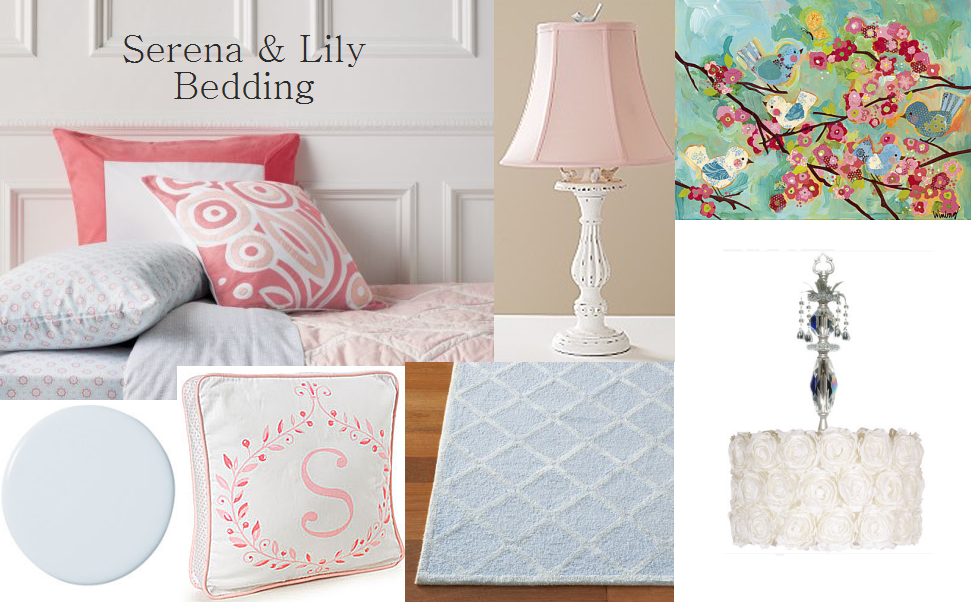
Designing a baby nursery can be so much fun. However, for parents who are keeping the baby’s sex a surprise or want to reuse the room for future siblings, planning a gender neutral nursery can sometimes be a design challenge. A good starting place when creating a unisex nursery is to select a soothing color palette. Browsing crib bedding, artwork or taking cues from nature may help get your creative juices flowing.


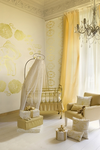
A soft yellow always makes a wonderful backdrop for your nursery. This French inspired nursery is warming and soothing in a golden yellow monochromatic color scheme. The chandelier is gorgeous – works for a boy or girl. Wouldn’t you agree?


Yellow is also great when combined with accent colors. In this case shades of green are added to create an analogous color scheme. This nursery was designed for my first daughter – thinking someday we might have a son – but my second daughter used it too. The crib bedding by Wendy Bellissimo inspired the room’s color palette. And the antiqued white sleigh crib by Ragazzi (now out of business) converted to a toddler bed which we loved. Yes, the mattress is slanted in the picture – our little one at the time had a bad case of reflux.The vintage dresser which also served as the changing table was purchased at a yard sale for two dollars (yep, that’s correct).

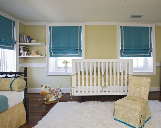
In this yellow nursery room South Carolina-based designer, Angie Hranowsky, adds accents of turquoise in the Roman shades, slipper chair and bed linens. Be bold with blues – they’re not just for boys anymore. Striking a perfect balance between masculinity and femininity, the soft shaggy white area rug gives the room texture and contrasts nicely with the heavy, dark wooden flooring.

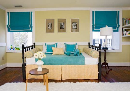
Keeping the room organized and functional will help you in the long run. Hranowsky wisely adds a daybed to the nursery’s design. It will certainly come in handy for those middle of the night awakenings.
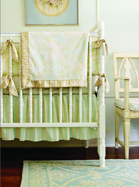
Here is a sweet nursery in beige, pale turquoise and a minty green – another great color palette for a boy or girl. Mixing patterns and textures is also a good technique when designing an interior. Here the candy striped crib skirt and ornate patterned rug work well together.

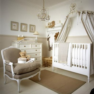
A neutral color palette is also another great choice for a unisex nursery. The simple white crib becomes the focal point with the romantic canopy framing it. I especially like the brown and white bergere chair – a little unexpected in a nursery.

The crib bedding in chocolate, butter yellow and robin’s egg blue sets the color scheme in this modern, gender neutral nursery. The wall is painted a tranquil shade of blue. A hand-painted wall mural like this one with a monkey in a tree is a darling way to incorporate nature into your design. Your little one will love it too!
For more nursery room design inspiration, you may enjoy reading Oh Boy! – Nursery Rooms or Sweet Baby – Tranquil Gender Neutral Nursery.

* images from Simplified Bee, Decor pad and Angie Hranowsky Design

Related Posts Plugin for WordPress, Blogger...
Read full story By on September 4, 2009 in baby and children, baby nursery room, interior design

Simply Stunning – Luxurious Master Bathroom Design

This summer I had the pleasure of meeting Debbie Grewal, a very talented San Francisco Peninsula-based interior designer. She recently completed this luxurious master bath in a Woodside, California home (pictured above). Before designing residential homes, Grewal worked for 17 years on the commercial side of interior design. Some of her many projects included corporate offices, private banks, senior living facilities and a dining yacht. During this time she occasionally designed for high-end residential clients and realized her passion for personal design and detail. In more recent years she has shifted to all types of residential design including new construction and specification/consulting on custom homes.

Grewal created a serene spa-like bath that started with the fireplace – a “must” for the homeowner who envisioned a tranquil retreat. The stately, dark mahogany stained fireplace is surrounded in gorgeous Walker Zanger Tuscany tiles in Driftwood. The trellis patterned fireplace screen by Restoration Hardware is the perfect finishing touch. The fireplace focal point is wonderfully flanked by the shower and sunken tub.

Bathroom design has become a favorite of Grewal. She loves tile and stone, and I know why after seeing this bathroom. The tub is surrounded by a gorgeous slab of Calacatta Gold marble from Da Vinci Marble and nicely positioned under double hung windows that provide lots of natural light and beautiful views of the garden. The satin nickel hardware is by the Rohl Country Bath Collection and pulls out the lovely gray in the marble.


Here’s a close-up of two glass vases filled with beautiful bath soaps and sponges – love how they vary in height and are finished off with silky dark brown ropes and tassels.

The handsome double sink vanity by Xylem in espresso finish houses Kohler Devonshire white undercounter sinks and is topped with Calacatta Gold marble. Again the plumbing fixtures are by Rohl Country Bath Collection in satin nickel. I love the stunning mirror Grewal selected from Aaron Brothers.

OK, isn’t this simply the most beautiful shower you’ve seen? Look closely at the wall; Grewal has Calacatta Manhattan 12″x18″ marble tiles for the lower half and 6″x9″ cut tiles in the upper half. The wall border and showerbox inset are in Dark Travertine, Opus Anticato mosaic tiles by Walker Zanger.

Here is a view of the amazing shower floor. The inset is tile in Calacatta long offset brick and beautifully trimmed in Dark Travertine.

The simple frameless double shower doors and panels are in a heavy Starphire glass and adorned with satin nickel hardware by Portals. Look, a second showerhead; This one is a rainhead – divine!

Grewal is quite the color expert too. She always tells her clients that paint is their most inexpensive source of decorating. For the walls she selected Northhampton Putty (HC-89) by Benjamin Moore; for the ceiling Latte by Restoration Hardware, and for the trim, doors and wainscoting, Mayonnaise (OC-85) also by Benjamin Moore. The bathroom’s two lovely chandeliers are by Restoration Hardware.

The woodwork throughout the bath is exceptional. The gorgeous reclaimed pine wood flooring was hand scraped. And the wainscoting was masterfully installed by Bay Area Molding. Look how it wraps around near the glass shower doors – the attention to detail is beautiful and doesn’t go unnoticed.

The Kohler Memoirs toilet is tucked away for privacy – love this! Grewal definitely has a knack of blending design elements such as color, texture, lighting, finishes and scale of furnishings. Even the smallest accessory isn’t ignored – don’t you just love the taupe and chocolate monogram towels she had made by Restoration Hardware?

Grewal best describes her design style as transitional, eclectic and casual elegance. She strives for well balanced rooms with impact and definitely succeeds with this stunning master bath – wouldn’t you agree?

Debbie Grewal Designs ~ 650-342-8299 ~ grewaldebbie@hotmail.com

“The best accolade is knowing the interiors perfectly reflect the style and attitude of the people who live there.” ~ Debbie Grewal Designs


*images from Debbie Grewal Designs

Related Posts Plugin for WordPress, Blogger...
Read full story By on September 1, 2009 in bathrooms, color, interior design, lighting, tile

Custom Ribbon Message Board for Tween Room

The girl’s tween bedroom I am designing is not complete, but is coming together very nicely. To help keep my little client stylishly organized, I created a ribbon message board that will hang above her desk. Here was my thought process and how I did it.

For visual interest, I like to to repeat a pattern here and there in the room. I selected a cotton twill fabric with trellis pattern in coral and thought it worked perfectly with the new Serena & Lily Aqua Trellis Sheet Set shown above.

It is a fairly easy DIY project, but does take some time. First, I staple-gunned the coral trellis fabric with a thin layer of batting under it to a stretched painter’s canvas.

Baby blue grosgrain ribbon was laid out in a criss-cross diamond pattern and then staple-gunned to the back of the canvas. Clear floral buttons were sewn where the ribbons crossed. The buttons are darling and add just the right touch of sparkle.

Here’s a view of the finished product. It turned out great and I hope my little client loves it as much as I do!

*images from Serena & Lily, Simplified Bee, PBK, Posh Tots
Related Posts Plugin for WordPress, Blogger...
Read full story By on August 31, 2009 in baby and children, girl's bedroom, interior design, organization tips, simplified bee portfolio

Retro 70s Decor – Scottsdale Arizona Condo

My grandfather was from our nation’s heartland – Omaha, Nebraska. During the harsh Midwestern winters, he and his wife would migrate south to the Arizona desert. They purchased a condo in Scottsdale in 1973 and because it was the “model” it was professionally designed and furnished.

Recently the three bedroom / two bath condo was sold, but photos were taken of the interior and I thought they would be fun to share. My grandparents never remodeled and therefore it’s a time capsule back to the 70s.

Dark red 12″x12″ tiles floored the double door entryway which led to a small atrium.

Here is a view of the atrium from the living room. The retro shag lime green wall-to-wall carpet was installed in the living, dining and bedrooms.

The living room’s bright, yet cool mix of yellow, green and white was a very popular color scheme in the 70s. The brick wall and fireplace were all painted in neutral white allowing the colors to really pop. Floral patterns were also dominant during this era. The lovely yellow and white floral sofa was purchased for $819 – almost 40 years ago. And the green wing chair green was $219.

My favorite element in this room was the leather top writing desk in a Mediterranean Cherry. It cost $339 back in 1973. The handsome brass and alabaster bookends were $29.

Here is a view of the dining room that was open to the kitchen and living room. I am not positive, but I think the chairs were reupholstered at one point in time.

The round game table in a dark antique finish was in a third bedroom that served as the den. The lighting in this picture is not ideal, but these chairs with nailhead trim are upholstered in a fun retro crushed velvet orange are fantastic – the color is making a comeback.

The guest bedroom had two lovely twin beds each with matching floral quilts. I just loved the faux bamboo headboards in brushed lemon with white. The sweet night stand is also in the same finish.

The masterAlign Left bedroom showcased a beautiful king size bed in a gold and lime throw spread – gotta love the trim! I found it interesting that the stone wall was kept natural. My favorite elements in the room were the matching Italian Faience white table lamps and tufted yellow bench. Both are popular today.

Hope you enjoyed this retro condo tour – can’t you just hear John Travolta singing Stayin’ Alive?
*images of Simplified Bee
Related Posts Plugin for WordPress, Blogger...
Read full story By on August 25, 2009 in bedrooms, dining rooms, interior design, living rooms, vintage