Archive | color RSS feed for this section

Winter White Interior Design & The Snow Man

The Snow Man

One must have a mind of winter
To regard the frost and the boughs
Of the pine-trees crusted with snow;


And have been cold a long time
To behold the junipers shagged with ice,
The spruces rough in the distant glitter

Of the January sun; and not to think
Of any misery in the sound of the wind,
In the sound of a few leaves,

Which is the sound of the land
Full of the same wind
That is blowing in the same bare place

For the listener, who listens in the snow,
And, nothing himself, beholds
Nothing that is not there and the nothing that is.

~ Wallace Stevens

* images courtesy of Veranda, House Beautiful and Simplified Bee

Related Posts Plugin for WordPress, Blogger...
Read full story By on December 21, 2009 in color, interior design

Tribute to Turquoise – 2010 Pantone Color of the Year

Three cheers for turquoise! Pantone 15-5519 {aka turquoise} was recently declared the 2010 color of the year – here’s the press release.

{turquoise jewelry via Veranda}

“In many cultures, Turquoise occupies a very special position in the world of color,” explains Leatrice Eiseman, executive director of the Pantone Color Institute®. “It is believed to be a protective talisman, a color of deep compassion and healing, and a color of faith and truth, inspired by water and sky. Through years of color word-association studies, we also find that Turquoise represents an escape to many – taking them to a tropical paradise that is pleasant and inviting, even if only a fantasy.”

To celebrate the news, here are a few images showcasing my favorite color, turquoise. And a big thank you to fellow blogger and turquoise lover, Erin from House of Turquoise for her endless inspiration.

{Suzanne Kasler}

{Katie Ridder}

{Catalonia Small Chandelier – Shine}

{Kelly Wearstler}

{Veranda and Nathan Turner}

{Horchow}

{Paulette Lamp in Aqua Cased GlassDoxa Home}

{Veranda and Elizabeth Dinkel}

{Blue Links Needlepoint Pillow – Pieces}

{Atmosphere Home Essentials}

{Turqouise Foo Dogs – Pieces}

Related Posts Plugin for WordPress, Blogger...
Read full story By on December 18, 2009 in color, interior design

Interior Design Color Trends for 2010 – Purple

It’s royal, healing and eccentric. You may either love it or hate it. But, get ready purple is making a comeback and is a big color trend for 2010.

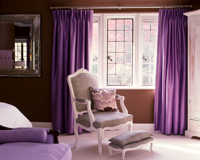
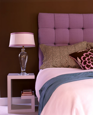
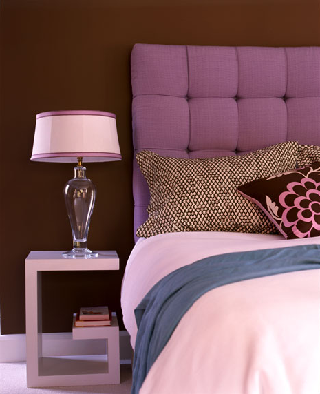
Trend setting interior designers have already added shades of purple back into their color schemes. New York-based designer, Amanda Nisbet created a dramatic bedroom in purple, brown and white. Loving the Louis XV chair and foot stool in white with brown and white contemporary upholstery! And the throw pillow pulls the color scheme together perfectly.

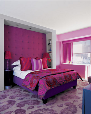
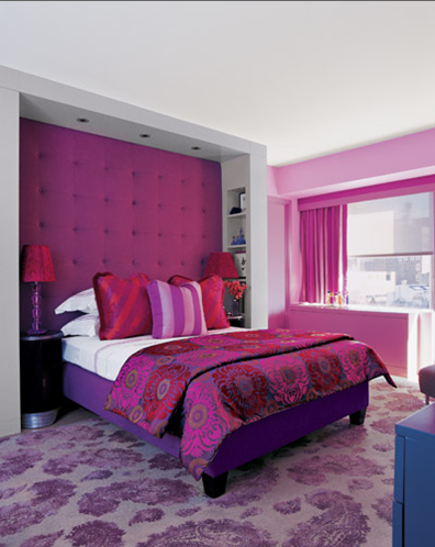
The master of color, Jamie Drake designs a stunning Manhattan bedroom in magenta, fuchsia and purple. Creating a focal point, Drake adds a dramatic custom button-tufted headboard wall in chenille from Cowton & Tout called Brasilia Lilas. The floral brocade bedspread is also from Cowtan & Tout.

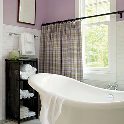
Designer Phillip Sides creates a soothing bathroom in the North Carolina home by using white subway tiles and painting the walls a soft lavendar – Classic Lilac (1002-5C) by Valspar. The cafe curtains in Manuel Canovas Suzon by Cowtan & Tout are hung mid-window to allow for natural light while still giving needed privacy.

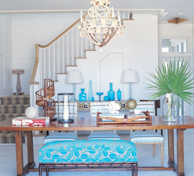
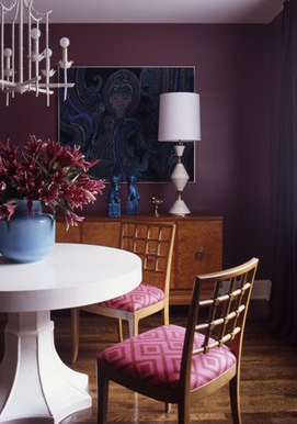
Charleston South Carolina’s Angie Hranowsky designed this ecclectic dining room with striking walls in plum. It work beautifully with the white accents – table, chandelier and table lamp and hints of blue – vases.

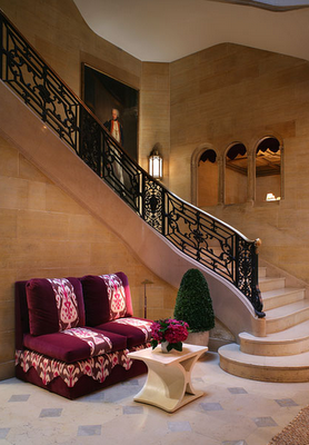
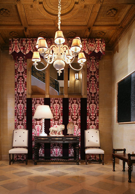
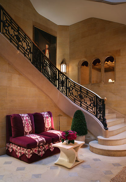
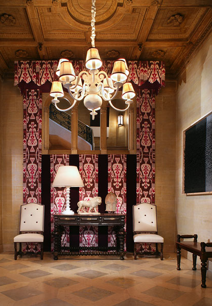
New York-based designer, Christopher Maya combines shades of purple and pink to create an exquisite formal foyer and vestibule at this year’s Kips Bay Show House.

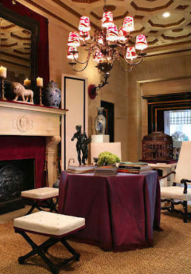
Maya beautifully fuses new and old decor elements throughout the space making it a perfect place to entertain guest or read alone by the fireplace.

As we head into 2010 you will see more textile and furniture designers launching lines with shades of purple, but here are some trend-setters available today.

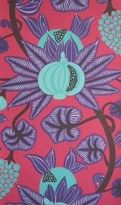
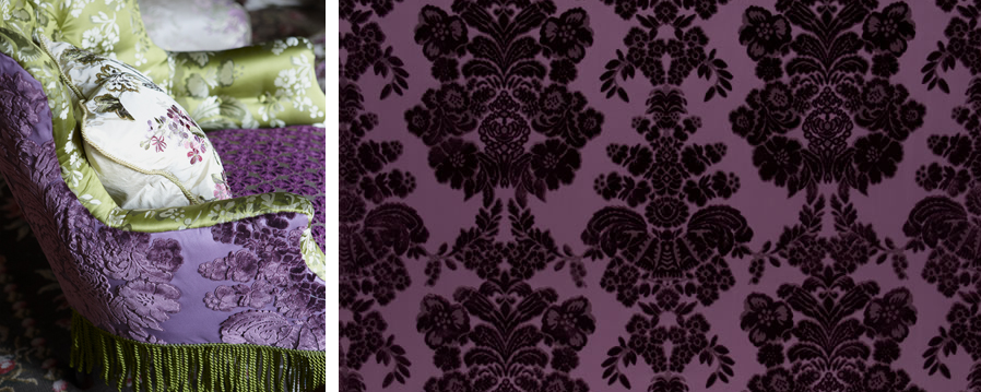
Osborne & Little’s richly colored pomegranate and grapevine wallpaper – Maharani W6022/01-07

Designers Guild – Darnley in Heather – silk velvet with classical motif in Heather

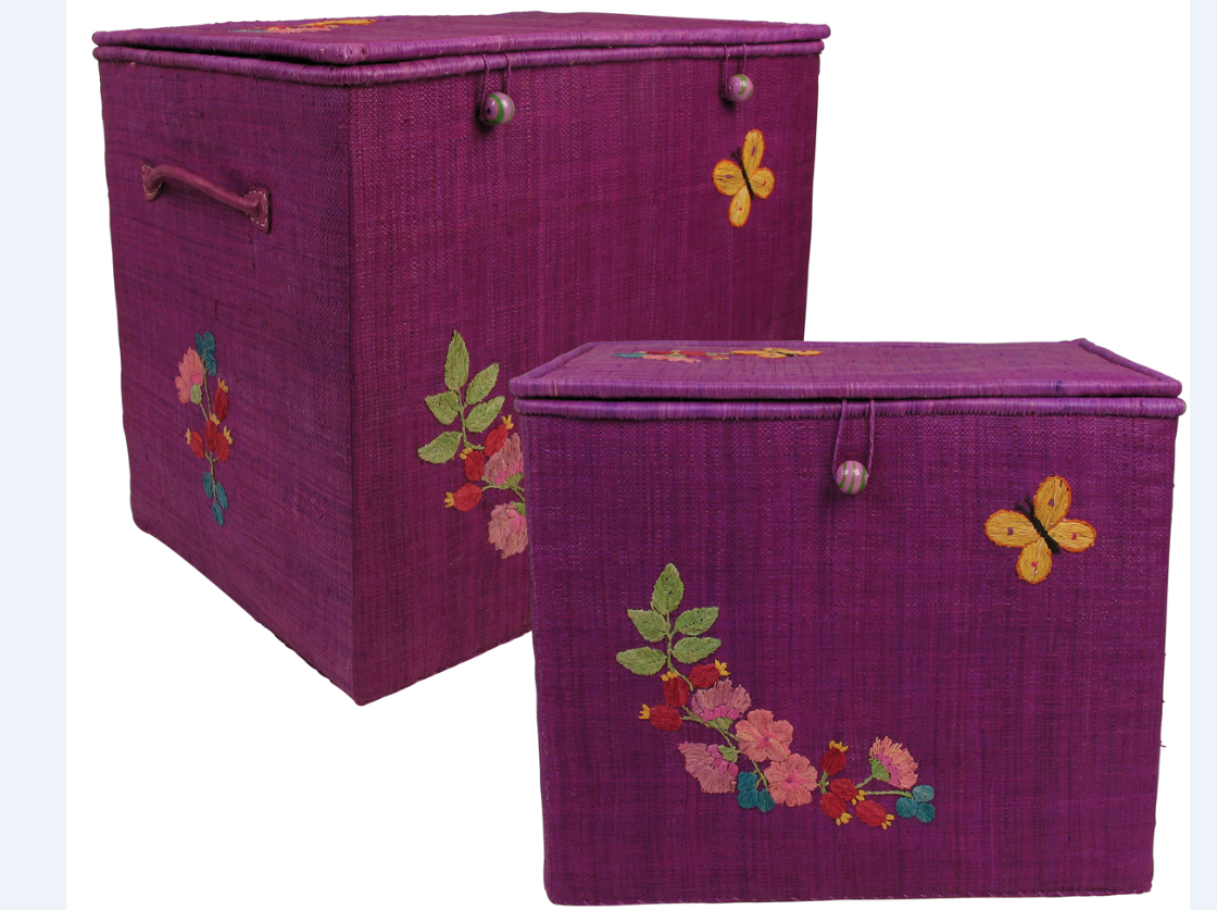
Large raffia storage boxes/coffee table with embroidery in purple

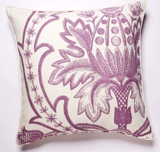
Thomas Paul – Broderie Pillow in Violet


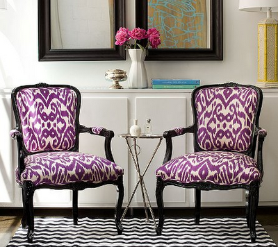
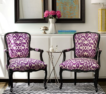
Pair of black Louis XV chairs in contrasting Madeline Weinrib’s Purple Luce

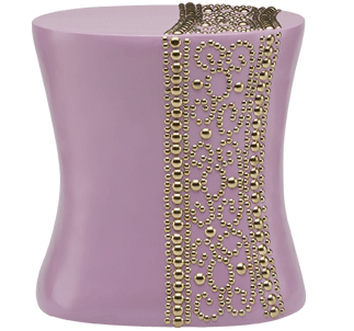
Istanbul Table in lavendar with gold nail head

Will you be welcoming purple back into your home in 2010?

Related Posts Plugin for WordPress, Blogger...
Read full story By on October 27, 2009 in bedrooms, color, foyers, interior design, upholstery

Colorful Designer Front Doors and Paint Samples

Have you thought about painting your front door? It can be a great place to add color and communicate your personal sense of style. Lately, I have been attracted to colorful front doors. Here are some examples paired with a similar paint color to help you in the selection process.

This sweet pink front door looks great with the cottage’s gray shingle siding and white trim – pink would certainly not go with just any color scheme. It definitely evokes a welcoming, relaxed and more feminine feeling. Now picture this same door in black. Still a great color choice, but would give off a more formal feeling. Thanks to The Pinque, Inc Diaries for this lovely image!

Here is a striking luscious red door by designer Suzanne Tucker. She used a high quality gloss by Dutch Boy that resists dirt, oil and grease. The red really works with the gray siding and white trim. In Feng Shui, a red door symbolizes the mouth of the home. It is thought a red door attracts chi – positive energy – to the house. We all can use some of that!

This Baltimore home with dark gray siding and white trim – hey a pattern here! – looks stylish and modern with a vibrant front door in orange. The color orange denotes energy, warmth and cheerfulness. An orange front door would also look great with another opposing exterior color scheme like light blue siding and navy blue trim.

Sunny, cheery and inviting. This natural brick home with white trim looks stunning with a bright canary yellow door. If you like this look Benjamin Moore’s Yellow Tone might do the trick.

This home found on Real Simple was painted a softer yellow. The pale yellow accent is a perfect choice for the muted gray shingle siding and white trim. Love it.

This chic foyer designed by Albert Hadley features a bright chartreuse front door. It is not clear what color the exterior siding and trim is, but this door color would look great with shades of gray, blue or brown with a white trim.

Designer Kathryn Ireland brightens a Spanish Colonial Revival in Southern California with a stunning teal painted door. It is a perfect color selection for the home’s white exterior.

The front door of designer Miles Reed’s New York townhouse has been blogged about many times before, but it is one of my favorites. The soft shade of turquoise is brilliant with the brick in muted gray and trim in white. The door’s nickel hardware is exquisite too. A turquoise door would also look great on a house with tan siding and white white trim.
What color do you like for a front door?

Related Posts Plugin for WordPress, Blogger...
Read full story By on October 14, 2009 in color, Design Tips, home exterior / curb appeal, interior design