Archive | color RSS feed for this section

Book Review :: A House in the Country

Book Review // A House in the Country // via @simplifiedbee

What happens when a renowned architect and an A-list interior designer collaborate to build their dream home? The magical result is chronicled in a must have new decor book, A House in the Country which invites us in the one-of-a-kind Greek Revival-inspired house of Peter Pennoyer (architect) and Katie Ridder (designer). The creative power couple spent years searching for just the right property and in 2009 found a ranch house on six-and-a-half acres in Millbrook, New York. With more than 300 photos and illustrations, Peter and Katie invite us into their home and share the story behind the transformation. The book is simply organized into three sections – Exterior, Interior and Garden. It’s evident from just the first few page turns, that the home’s architecture and interior design are totally in sync. Don’t let the exterior traditional architecture fool you either – the home’s interior is colorful and full of modern touches. Katie’s bold use of color including pink and purple – beautifully connects and defines the spaces in Peter’s open-floor plan. In addition, the home’s garden is sensational and I love how the book dives into the smallest details including plant selection.

This home is extraordinary and the book captures it amazingly. Here is just a sampling of the stunning images.

A+House+in+the+Country+Book+Reviewfoyer // purple tile // katie ridderentry // katie ridder

The entire house is a feat of texture, color and personality. – A House in the Country

living room // katie ridderpink library // katie ridderfloral arrangement // A House in the Country // Book Review @simplifiedbeebreakfast table // kitchen // katie riddergirl's bedroom // katie riddergeo tile floor // bathroom // katie ridder
* photography by Eric Piasecki

**this post contains affiliate links

Related Posts Plugin for WordPress, Blogger...
Read full story By on October 25, 2016 in Bathroom, Bedroom, book, book review, color, Features, flowers, foyers, Girl, girl's bedroom, interior design, Interiors, Kitchen, Living Room, living rooms, wallpaper

San Francisco Decorator Showcase :: Cheerful Girls Bedroom

girls bedroom // ann lowengart interiors // san francisco decorator showcase

Another room that caught my eye in this year’s San Francisco Decorator Showcase is the cheerful girl’s bedroom by Annie Lowengart of Ann Lowengart Interiors. “Smoll’s Room Redux” is a modern twist on the designer’s sister’s childhood bedroom. Lowengart takes a classic pink and orange color combination and adds a contemporary, chic twist using playful patterns and unexpected accent colors. However, the modern brass chandelier and colorful, geometric ceiling wallpaper (from the Flavor Paper) steals the show. I’m completely smitten with this bedroom as any little girl would be too!

girls bedroom // ann lowengart interiors // san francisco decorator showcasegirls bedroom // ann lowengart interiors // san francisco decorator showcase

With its cheerful palette and bespoke details, this inviting bedroom is perfect for the little girl who will one day live out her dreams as a strong, sophisticated woman. – Annie Lowengart, Interior Designer

girls bedroom // ann lowengart interiors // san francisco decorator showcase girls bedroom // ann lowengart interiors // san francisco decorator showcasegirls bedroom // ann lowengart interiors // san francisco decorator showcasegirls bedroom // ann lowengart interiors // san francisco decorator showcasegirls bedroom // ann lowengart interiors // san francisco decorator showcase

For more information and to purchase tickets, please visit San Francisco Decorator Showcase – tours are available now through May 30, 2016.

*photography credit: david duncan livingston

Related Posts Plugin for WordPress, Blogger...
Read full story By on May 19, 2016 in baby and children, Bedroom, bedrooms, brass, color, Girl, girl's bedroom, interior design, Interiors, teen rooms, textiles, upholstery, wallpaper, window treatments

One Room Challenge :: Week 3

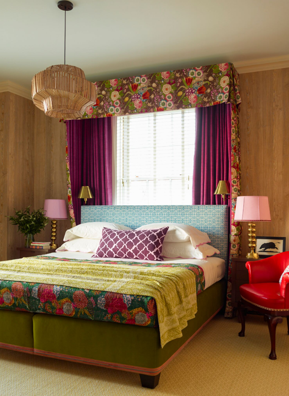
It’s week three of the One Room Challenge and our master bathroom + walk-in closet makeover is in full swing! Last week I unveiled the design direction for the project and demolition process. Today I’m excited to share with you selections made for the bathroom’s wallpaper, paint and stone.

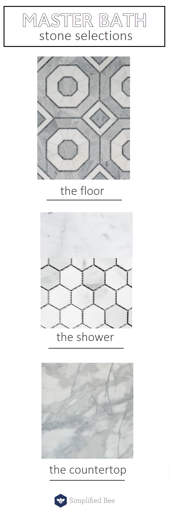
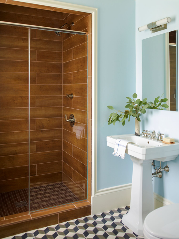
As for the stone selection, I started with the floor tile. I fell in love with the mosaic octagonal tile Villa D’Oro by Walker Zanger. It features beautiful shades of gray and white. I paired the bold patterned floor with a simple white carrara in 2″ x 2″ hexagon and 12″ x 24″ field tile for the shower. I also found a gorgeous calacatta marble slab for the vanity countertop, shower bench and doorway threshold.

stone selections // master bath // @simplifiedbee #oneroomchallenge

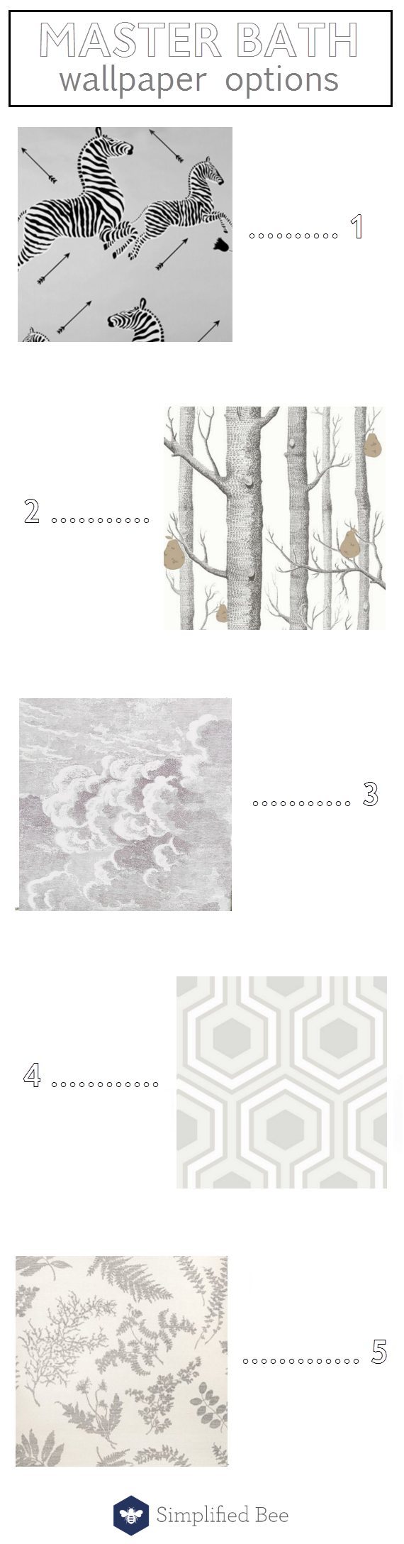
First, I knew I wanted to use pops of wallpaper in both the bathroom and closets. As you know, I have already selected Great Wave in stone by Cole & Son available through ORC sponsor, DecoratorsBest. In the bathroom we have a small water closet that I wanted to incorporate a bold pattern using wallpaper. Below are a few that were options.

master bathroom // wallpaper option // @simplifiedbee #oneroomchallenge

product links:

1 zebras in silver // 2 woods & pears in black, white and bronze // 3 nuvole mural // 4 hicks grand in dove gray // 5 wildflowers on sisal

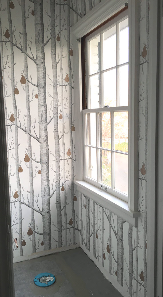
In the end, I selected Woods & Pears in black, white and bronze by Cole & Son (also available through ORC sponsor, DecoratorsBest). I have loved the Woods wallpaper for along time and was thrilled to see that it had been updated with whimsical pears in bronze. The mix of color was perfect because it would compliment all the mixed finishes in fixtures, hardware and accessories throughout the bathroom and closet. Here’s a peek at the water closet with the new wallpaper. Typically I would have the wallpaper hung last, but in this case the space was so small, the hanger wanted to go in before the tile floor, base boards and toilet were installed.

cole & son woods + pear wallpaper // one room challenge // @simplifiedbee

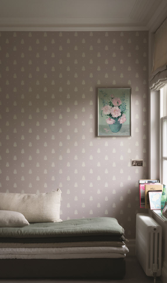
As you can see from the before images, our bathroom was pink and I loved the metallic pink wallpaper. My husband didn’t care for an all pink master bathroom however, so it all had to go. One area that I thought would be fun however to add a splash of the feminine color, was in my closets that line the master bathroom and cover the top of the make-up vanity. I’ve always adored their timeless Bumblebee wallpaper by Farrow & Ball (known for their signature paint and wallpapers and fabulous ORC sponsor). When I found out that the pattern was being released in Peignoir – a fabulous gray, pink – I had to incorporate it! I get my pink and my bees! Isn’t it perfect?

Farrow & Ball Bumblebee Wallpaper // @simplifiedbee

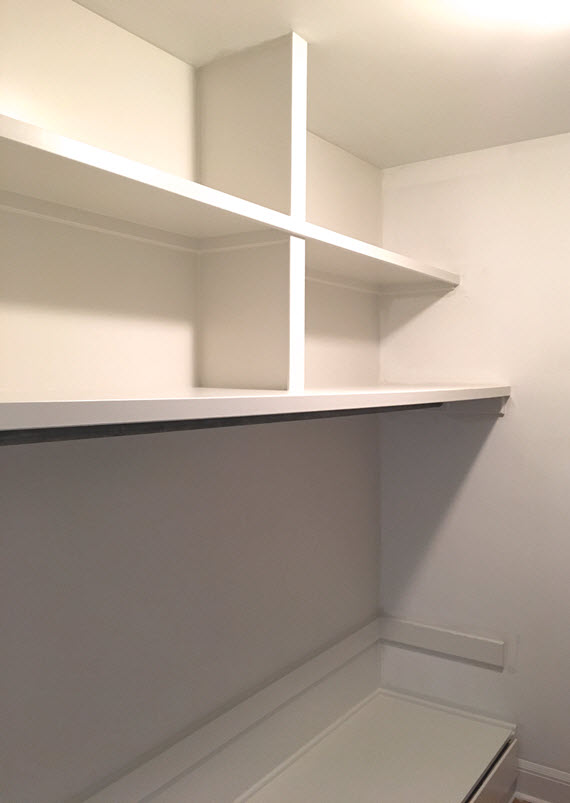
As for selecting a color for the walls in both the master bathroom and walk-in closet, I wanted to keep the spaces crisp and contemporary. I desired a neutral white that pulled a hint of gray , yet was warming. Farrow & Ball’s Strong White no. 2001 delivers both elements and was my selection for all of the cabinets, vanity, trim and walls in both spaces. In the walk-in closet, I pulled another warm – yet darker neutral – Cornforth White no. 228 for the walk-in closet’s ceiling (goes amazing with Cole & Son’s Great Wave Wallpaper) and for the base of the make-up vanity in the bathroom. For a little drama, I selected Farrow & Ball’s Worsted no. 284 for ceiling in the water closet – pulls the right shade of gray from the Woods + Pair wallpaper and octagon mosaic floor tile. farrow & ball paint colors // bathroom // @simplifiedbee #oneroomchallenge
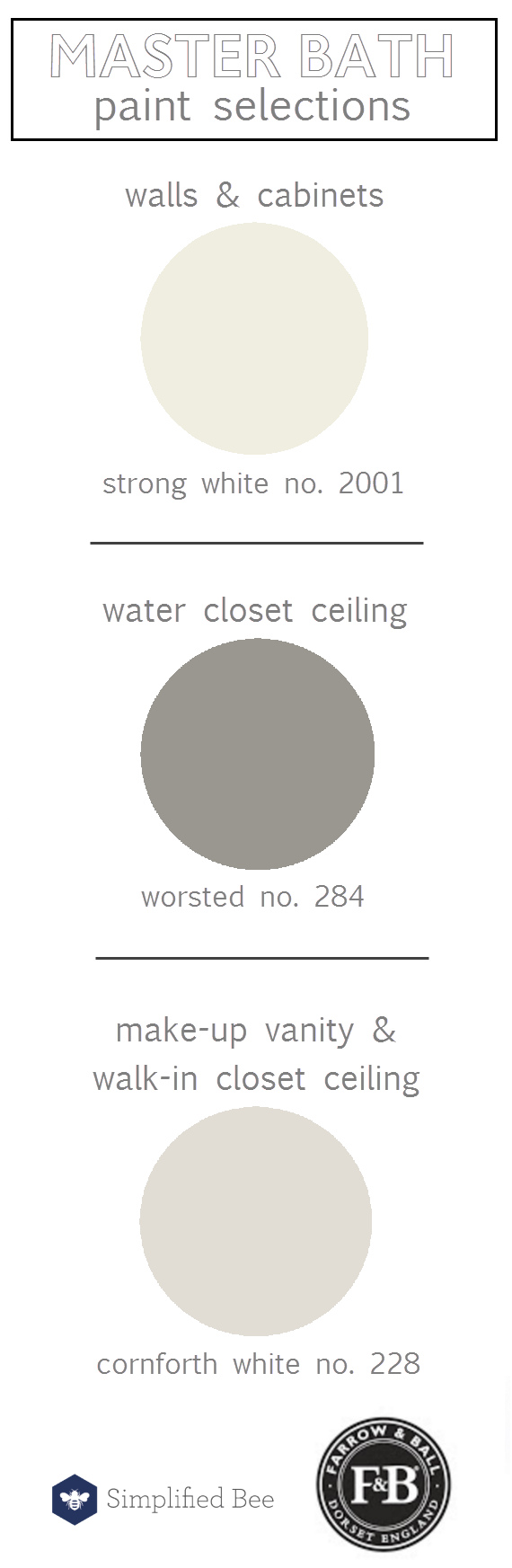
Here’s a look at the new shelving that was custom built for the walk-in closet and painted in Farrow & Ball’s Strong White. Awe… nothing like a clean closet!

walk-in closet shelving // farrow & ball strong white // @simplifiedbee

Next week I’ll be sharing the selection process for lighting, plumbing and bath fixtures! I’ve also been posting more images of my project on Instagram. And in case you missed the first two weeks, here are the links:

One Room Challenge :: Kick-off // One Room Challenge :: Week 2

I can’t wait to see what the other ORC participants are progressing! Check them out for loads of inspiration…

Media Partner House Beautiful | TM by CIH
* disclosure: some links in this post may be affiliate links
Related Posts Plugin for WordPress, Blogger...
Read full story By on April 20, 2016 in Bathroom, bathrooms, color, interior design, Interiors, wallpaper

Friday Finds :: Threshold Summer Collection at Target

disclosure: This post contains some affiliate links, which means Simplified Bee receives commission if you make a purchase using these links.

summer collection // threshold at target

Spring has just sprung, but retails have us already preparing for summer. Typically I don’t like to jump ahead too much, but the new Threshold summer collection at Target is one that I had to share. It’s that good! I’m loving all the graphic patterns, shades of blue and use of rattan – this lounge chair, bart cart and basket are all on my list! Here’s a round-up of other faves from the collection.

summer collection // threshold at target

product links:

1 // 2 // 3 // 4 // 5


Related Posts Plugin for WordPress, Blogger...
Read full story By on April 15, 2016 in chairs, color, Features, friday find, Friday Finds, pattern, throw pillows