Archive | boy’s bedroom RSS feed for this section

Red, White and Blue Color Palettes for July 4th Decorating

On July Fourth Americans will be celebrating Independence Day with favorite customs like fireworks, parades and backyard barbecues. To show our patriotism we decorate by waving American flags, hanging stars and stripes banners and draping red, white and blue garland proudly. 
As I started to look around at incorporating a little red,white and blue in my own celebration, I noticed the varied palettes that are available. Here are a few examples.


The bunk room above by Arkansas’ Bear & Hill Interiors {love the red accent ceiling and fan} and the cupcake toppers by The Tomkat Studio pulls together a classic patriot look.

Turquoise is the Pantone 2010 color of the year and not typically what you associate with “red, white and blue.” But I love the fresh, airy feel it provides. This charming little girl’s room in “Tiffany Blue” and watermelon accents  by San Francisco interior design firm, Massucco Warner Miller is one of my favorites. Amy Atlas‘ ribbon candy and Etsy’s Sparkle Power‘s La La Love You poster also use this soft, retro color scheme.
Benjamin Moore’s Ryan Red, Cloud White and Watertown offer a more subdue July 4th color palette. Here Thibaut’s Lighthouse wallpaper from their Boat House Collection is paired Martha Stewart’s Fourth of July clip-art streamer – here’s the how to.
All paint samples displayed above are from Benjamin Moore via Color Check.
Wishing you a safe and enjoyable July 4th!
Related Posts Plugin for WordPress, Blogger...
Read full story By on July 2, 2010 in bedrooms, boy's bedroom, Entertaining, Fourth of July, holiday decor

Decorating Ideas for a Little Boy’s Bedroom

Last year I wrote several posts on bedroom designs for little girls. Today, I turn the focus to those Lego building, truck pushing and football throwing little boys. Here’s some inspiration and ideas for decorating a boy’s bedroom.

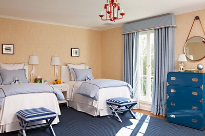
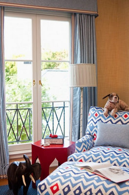
Southern California’s Elizabeth Dinkel Design Associates created this classic and timeless boys’ room. My favorite elements include the beige textured wallpaper, upholstered chair and ottoman {Quadrille Fabrics – Cap Ferrat – Navy, Blue, Red on White} and striped X benches at the foot of each bed. The custom floor to ceiling window treatments frame the large windows and coordinate beautifully with the bedding. Hits of vibrant red accents are picked up in a delightful chandelier, simple round mirror and hexagon side table.

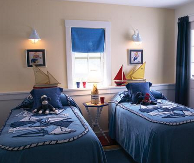
Canadian House & Home showcased this nautical themed boys’ bedroom. It is easy to go overboard with themes, but this room has the right balance. The colorful sailing ships, matching vintage bedding, wall mounted sconces above each bed are my favorite design elements.

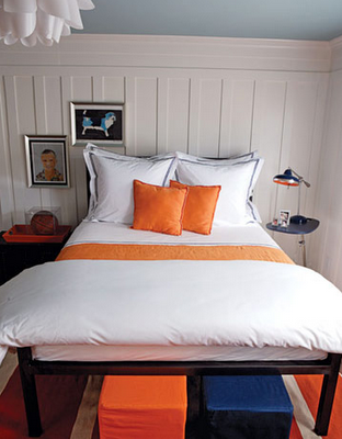
Designer, Ken Fulk creates a colorful boy’s room using neutral white, warm orange and cool blue. Mixing orange and blue, opposites on the color wheel, results in a direct complementary color scheme. The neutral crisp white bedding is Frette’s Hotel Collection and compliments the modern pendant light. Fulk has the ceiling painted a fun shade of blue – Robin’s Egg by Philip’s Perfect Colors. He has the beautiful wainscoting {swoon} covered in Benjamin Moore’s Decorator’s White.

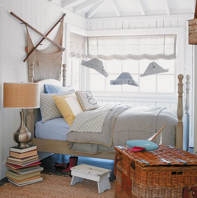
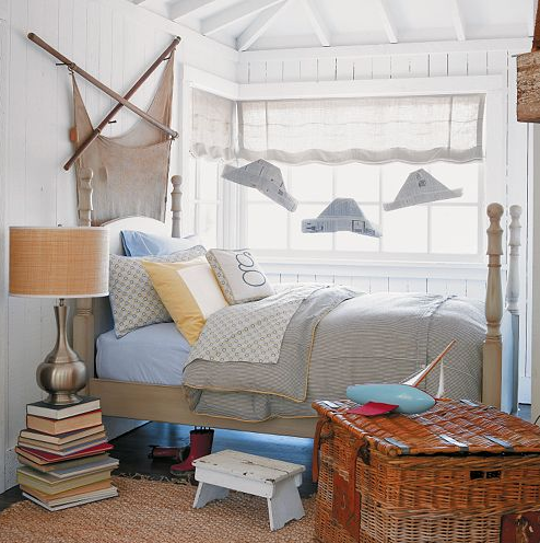
Here’s another well done nautical theme for a boy’s room. The bedding, Serena & Lily’s George Collection mixes and matches seersucker, chambray and mosaic-print to create a traditional look. Stacking books for a bedside table is a fun, inexpensive look, but not recommended for a little boy’s room – sure to be knocked down in seconds. The simple paper boats hang from the ceiling, however is a great idea and very inexpensive. Here’s the how-to.

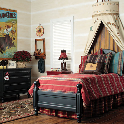
In this wild west themed bedroom courtesy of Posh Tots, the teepee bed canopy takes center stage. The dark wooden bed and dresser have a masculine feel and provide a wonderful contrast to the red southwestern bedding. The comforter’s warm horizontal pattern is repeated subtly in the wall paint and is beautifully paired with a plaid bed skirt. A fun turquoise accent pillow on the bed pick ups the same hue in the vintage cowboy wall poster.

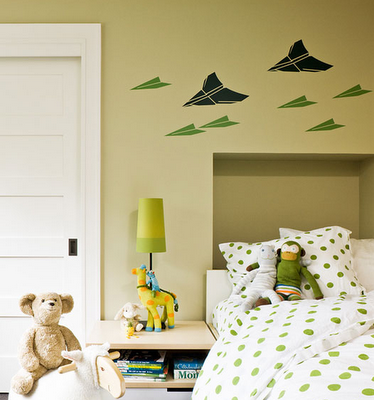
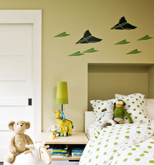
Portland, Oregon-based designer, Jessica Helgerson created this darling bedroom using a green and white color scheme. The walls are painted in a soft shade of chartreuse – perhaps Benjamin Moore’s Hibiscus? The fun airplane wall mural is painted in kelly and hunter greens.

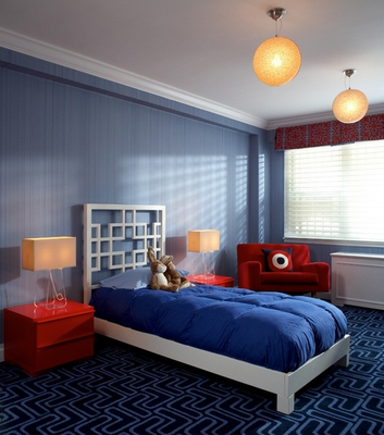
New York designer, Evelyn Benatar created a wonderful red, white and blue boy’s room using traditional and modern elements. The Greek key headboard in white is delightful and contrasts beautifully with the solid blue bedding. Matching lamps {lucite bases maybe?} and red two-drawer bedside chests flank the bed. Textured blue wallpaper coordinates nicely with the modern geometric carpet.

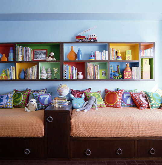
Now, how do you keep a boy’s room looking this neat? Here are some tips for storing kid’s toys and decluttering.

*images courtesy of NY Interior Design, Jessica Helgerson Interior Design, Posh Tots, Serena & Lily, House Beautiful, Canadian House & Home, Elizabeth Dinkel Design

Related Posts Plugin for WordPress, Blogger...
Read full story By on January 18, 2010 in baby and children, boy's bedroom, interior design

The King of Color – Jamie Drake NY Upper East Side Design

New York-based designer, Jamie Drake has been creating high-end interiors since his firm, Drake Design Associates launched in 1978. His A-list clients include Madonna and NYC mayor Michael Bloomberg. Drake is the king of color.

Drake’s designs are world renowned for use of sophisticated color schemes and eclectic furnishings. To achieve harmony and balance in a room, he uses at least three colors.

Here’s a tour of a luxurious skyrise home in New York on the Upper East Side designed by Drake. The living room and adjoining dining room’s vivid color palette of orange, hot pink and blues is stunning.

The multi-color animal print rug grounds the room and pulls the color scheme together brilliantly. I love those throw pillow – orange & hot pink – yum!

Wow, orange walls. Orange is a “hot” color and promotes energy in a room. You typically see orange or red & yellow combinations in fast food restaurants because they want high turn-over rates and it encourages patrons to dine quickly. Here Drake boldly paints the dining room walls a bright orange. He adds blue and white to bring balance and promote a calming feeling.

An office fit for a queen. The color purple is associated with royalty. This intriguing color is the combination of opposites hot red and cool blue. In this room, Drake adds splashes of warm coral, neutral white and playful gold to the myriad of purples for a more feminine appeal. And my heart is racing – that glamorous white lacquer and lucite desk is a dream!

Drake uses a tetrad complementary color scheme – four colors that are equidistant on the color wheel – in this very playful child’s room. This design is stylish and above all highly functional. Storage above and below the bed. I love it!!! The rainbow of colors painted in back of the shelves and in the “number” throw pillows are the best.
Related Posts Plugin for WordPress, Blogger...
Read full story By on July 27, 2009 in boy's bedroom, dining rooms, interior design, living rooms, office/study

Do What You Love – Designer Philip Gorrivan’s NYC Home

Life is too short; do what you love. New York City self-taught designer, Philip Gorrivan does just that. Before designing, Gorrivan worked at Hearst Magazines, an Internet start-up and a venture capital of sorts. The tragedy of 9/11 made a profound impact on him and he then decided to do what he loved – interior design. And aren’t we glad he did! 
Here’s a tour of his beautiful NYC home as seen in an interview with Gorrivan in New York Social Diary last year. The first photo (above) is of Gorrivan’s living room with a rich color palette of chocolate browns and golden yellows. I want that gorgeous glass top and gilded base coffee table!

The beautiful Duncan Phyfe sofa is upholstered in a Clarence House striped silk – it’s a family antique from Maine and looks stunning in front of the staircase original to the apartment.

This colorful and eclectic room serves multiple purposes – it’s a dining room when the family is entertaining and a family room when not. The Hexagon Dining Table is one of Gorrivan’s designs and it expands into an octagon when open, seating ten. I love the color and texture variation on the Jansen Dining Chairs – upholstered in Kidd Leather from Edelman and leaf motif embroidery by Elitis.

The sweet banquette is covered in Bergamo multi-striped velvet and the lovely wallcoverings are custom tinted by China Seas.

The master bedroom is my favorite room in the apartment and I originally saw it on Erin’s blog – House of Turquoise. It’s richly sophisticated, but not stuffy. The color palette sets a soothing, tranquil tone. The chocolate brown tufted headboard looks great with the complimenting lavender tufted bench at the foot of the bed. The muted turquoise seagrass wallcovering is extraordinary.

This chaise – in the style of Jean Pascaud – is Gorrivan’s favorite reading nook.

The daughter’s bedroom is fit for a princess. The soft pink & white stripes in the canopy, bedding and Roman shade look great with the contrasting bold brown & white houndstooth bed-skirt and roll-neck pillow.

The focal point of Gorrivan’s young son’s room is the gorgeous 18th century French bed framed by a beautiful striped canopy. I’ve never seen a canopy in a little boy’s room, but it looks fabulous here.

Related Posts Plugin for WordPress, Blogger...
Read full story By on July 24, 2009 in bedrooms, boy's bedroom, dining rooms, girl's bedroom, interior design, living rooms