The vignette by JK Kling Associates above is fresh and inviting – just the way I want our Foyer to feel. The existing 1970s textured wallpaper not only covered the walls in the Foyer, but extended down the hall, up the stairs and then down a very long hallway. It was way too much pattern and 70s flair for me, so it had to go.
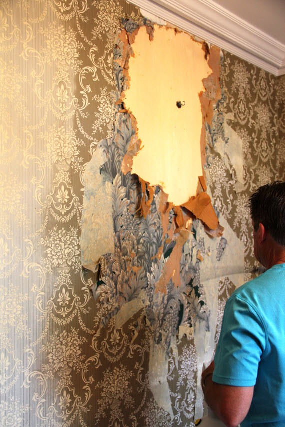
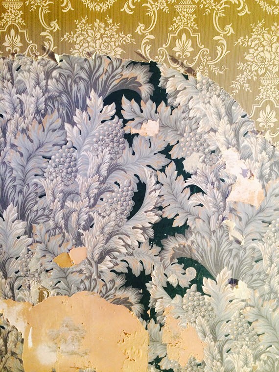
There is always a big unknown when you start removing wallpaper in an older house. How easily will it come off? Will the walls be in good shape? In our case, there were three layers of wallpaper. The first (hard to see in the above image) was a true paper wallpaper and had a subtle toile pattern from the 1940s. The second (my favorite) had a beautiful teal and steely blue leaf pattern. Really stunning. The third of course was the textured 1970s damask pattern in an faded olive green.
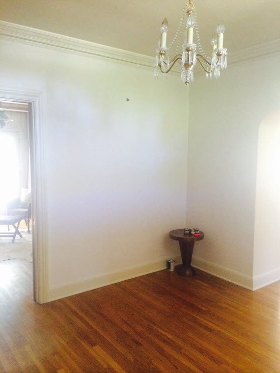
Once the layers of wallpaper was removed from the foyer and hallways, we were blessed with gorgeous plaster walls. Yes, the original plaster walls were in perfect condition and smooth as silk. After a coat of primer, they were ready for the next phase. Paint or wallpaper? From the start I knew I wanted to hang new wallpaper in the foyer, so that’s the first material I sourced. Here are a few that made my short list:
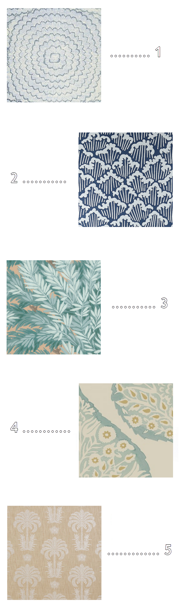
1 // 2 // 3 // 4 // 5
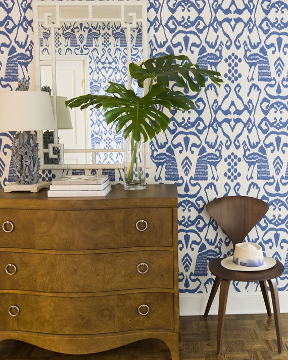
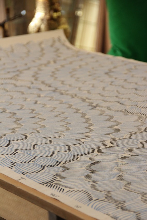
In the end, I selected Celerie Kemble’s Feather Bloom for Schumacher. It’s an embellished grasscloth that features a hand printed over-scaled floral motif in shades of China blue. The choice is a bold one and I’m definitely taking a risk on this!
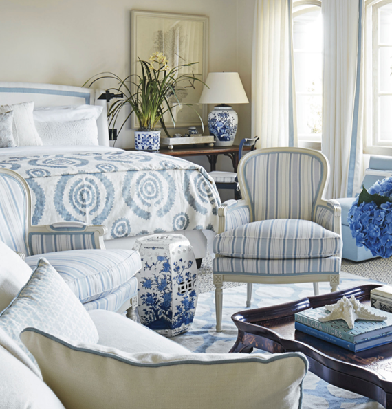
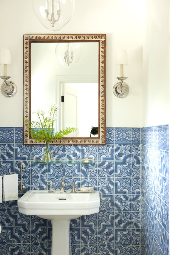
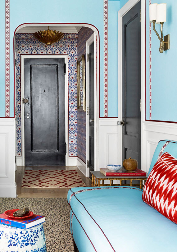
The blue color scheme was a great one as well because it coordinates with the palettes in the adjacent living room, library and dining room. It’s my opinion that color palettes in side-by-side rooms should coordinate to create flow and bridge a story from one room to the next.
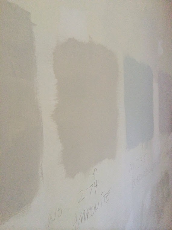
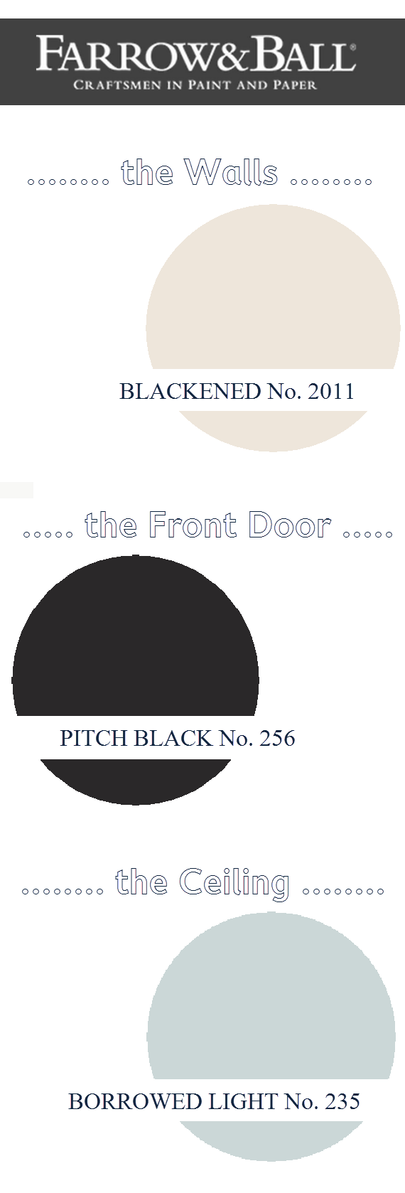
For this reason, it was important to select paint for the hallway walls in a color that would compliment the cool wallpaper tones, yet still be neutral and contemporary. With the help of Farrow & Ball (a fabulous ORC sponsor), I narrowed down the wall color to Blackened No. 2011. It is the coolest of their whites and changes in intensity depending on the light. A perfect color to let the beautiful architecture of the is home take center stage.
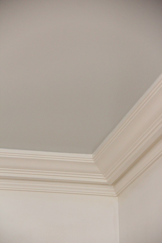
In the Foyer, I decided to add a little drama and glam by having the ceiling painted in a shade of blue. After going back and forth on Parma Gray No. 27 or Borrowed Light No. 235, I selected the lighter shade of Borrowed Light. The light blue picks up hints of gray and in a high gloss reflects light beautifully.
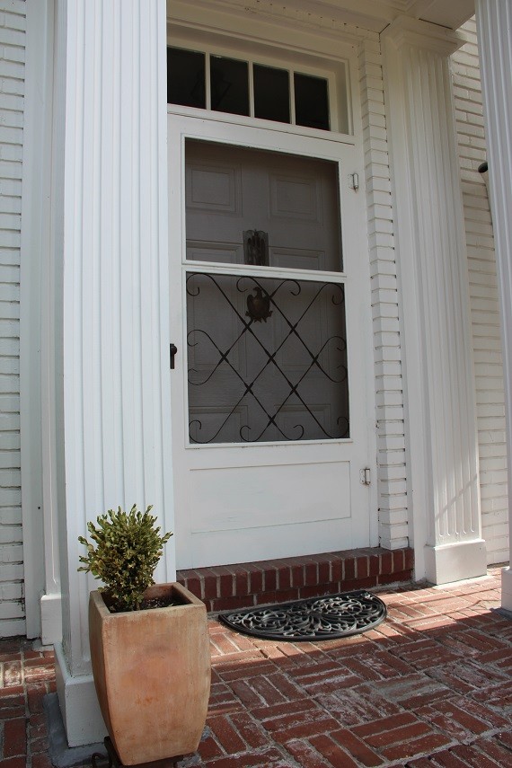
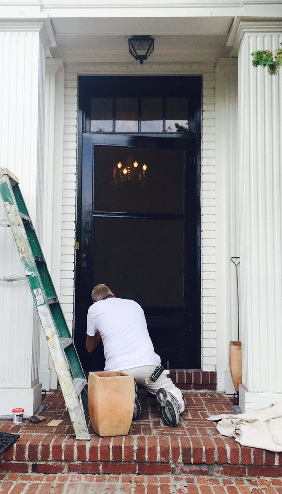
The Front Door was all white like the rest of the outside of the house, so to add contrast and to create a more stately entrance, I had the front door, screen and transom window painted black – an accent already used on the shutters throughout the house. I selected Farrow & Ball’s Pitch Black No. 256 in a high gloss. Classic. Timeless. Love it!
Here’s a breakdown of the Farrow & Ball paint colors used for my One Room Challenge. Also, be sure to check out their amazing new wallpaper collection that launched this fall!
Please check back next Wednesday – I’ll be breaking down furniture selection!
Don’t forget to check out the progress of the other One Room Challenge participates… there’s lots of magic happening!
The One Room Challenge is Trademarked by Calling it Home. Huge thank you to Farrow & Ball for providing paint for the Foyer!


 Follow